TL;DR
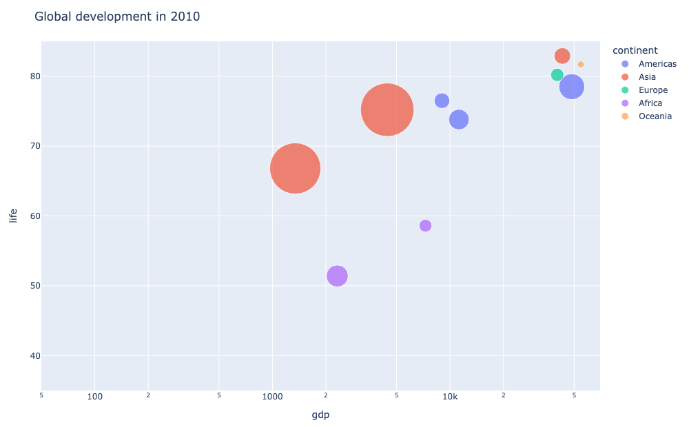
An animated bubble chart shows how several variables evolve together over time. Plotly makes a classic one with px.scatter() and animation_frame: the x and y axes hold two variables, bubble size holds a third, color groups the points, and each frame of the animation is one slice of time.
import pandas as pd
import plotly.express as px

df = pd.read_csv("data.csv")  # columns: country, year, gdp, life, population, continent

fig = px.scatter(
    df,
    x="gdp",
    y="life",
    size="population",
    color="continent",
    animation_frame="year",
    log_x=True,
    size_max=55,
)
fig.show()
Pass the time column to animation_frame and every distinct value becomes a frame. Click play to watch the bubbles move across the decades, or drag the slider to scrub to any year.
What an animated bubble chart is for
A bubble chart already packs three variables into a two-dimensional scatter: x, y, and marker size. Adding a time axis turns it into a four-dimensional story where you can watch the relationship change. It is the chart behind the famous Gapminder visualizations, and it excels at showing:
- how two metrics move together across categories
- which category grows fastest over time
- shifts in scale and position that a static snapshot hides
The example above tracks GDP per capita against life expectancy, with population as bubble size, for a few countries by decade. You can see life expectancies climb in every continent even as the wealth gap persists.
Set up the data
Plotly wants a tidy dataframe, one row per point per time slice. The minimal columns are the two axes, the size, a color group, and the time column.
import pandas as pd
import plotly.express as px

df = pd.DataFrame({
    "country":    ["USA", "USA", "India", "India"],
    "year":       [1960, 1970, 1960, 1970],
    "gdp":        [2873, 5073, 82, 106],
    "life":       [69.8, 70.9, 41.5, 49.5],
    "population": [180, 205, 442, 553],
    "continent":  ["Americas", "Americas", "Asia", "Asia"],
})

fig = px.scatter(
    df,
    x="gdp",
    y="life",
    size="population",
    color="continent",
    animation_frame="year",
)
fig.show()
Add animation_frame
animation_frame is the whole trick. Give it the time column and px groups the rows by that column and builds one frame per value.
fig = px.scatter(
    df,
    x="gdp",
    y="life",
    size="population",
    color="continent",
    animation_frame="year",
    log_x=True,
    size_max=55,
)
Two extras make the animation readable:
log_x=Truespreads out countries that differ by orders of magnitude in GDP, so the bubbles do not pile up on the left edge.size_maxcaps the largest bubble so a single huge value does not dwarf everything else.
Keep the axes fixed
The most important detail is that the axis ranges must stay the same across every frame. If they rescale each frame, the bubbles appear to jump around and the comparison is meaningless.
fig.update_layout(
    xaxis=dict(range=[50, 70000]),
    yaxis=dict(range=[35, 85]),
)
Pin range on both axes to the full spread of your data and the motion reads as movement within a stable frame of reference. With a log x-axis, the range is in powers of ten.
Make the interaction smooth
On a real Plotly figure, the animation comes with a play button and a draggable frame slider for free. You can tune how it feels:
fig.update_layout(
    updatemenus=[dict(type="buttons", showactive=False,
                      buttons=[dict(label="Play", method="animate",
                                    args=[None, dict(frame=dict(duration=600,
                                                               redraw=False),
                                                     transition=dict(duration=400))])])]
)
Keep frame.duration reasonable and redraw=False so each step updates the existing trace instead of rebuilding the plot, which keeps playback smooth.
A few practical tips
- Use a column with a fixed set of distinct values for
animation_frame, such as year or quarter. - Lock the axis ranges so frames share one frame of reference.
- Log-scale a skewed axis so bubbles stay visible across orders of magnitude.
- Hover any bubble to read its x, y, and group; the embedded chart above is live and scrubbable.
- Keep the number of frames modest. A few dozen steps animate cleanly; hundreds become a blur.