Seaborn
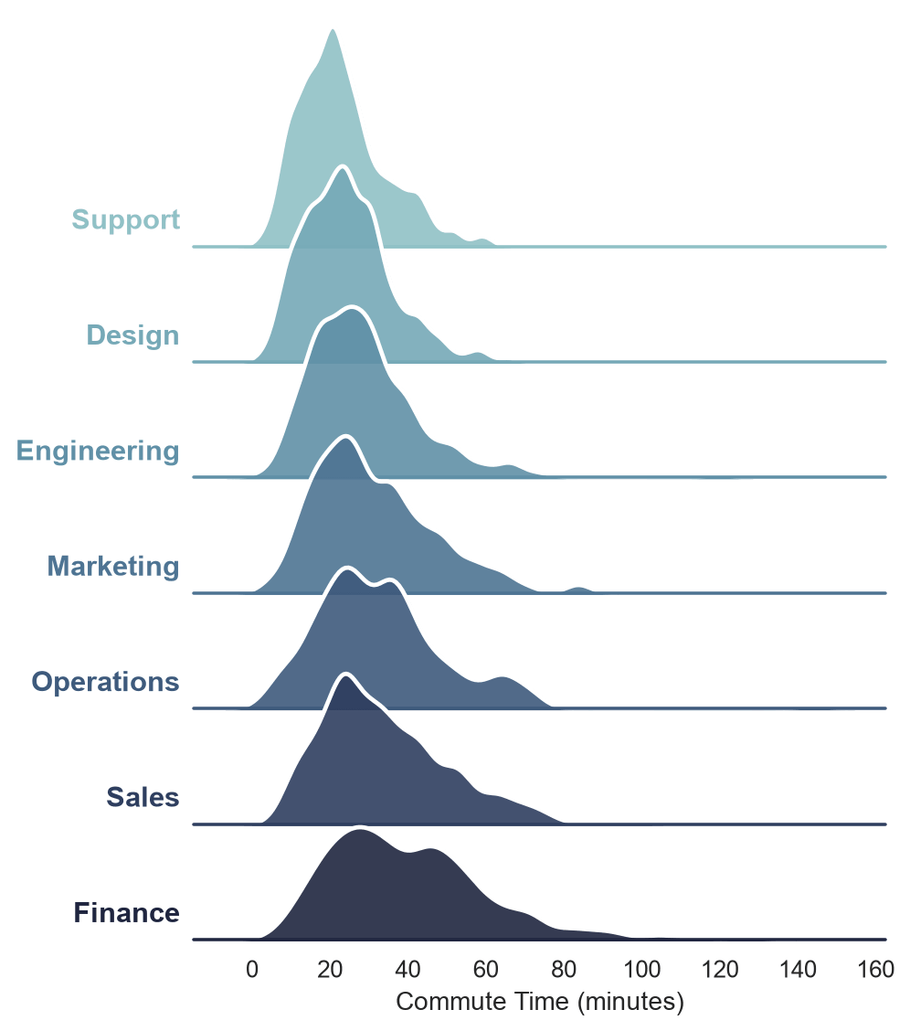
How to Create a Ridge Plot (Joyplot) in Python with Seaborn
Build a ridge plot (joyplot) in Seaborn using a FacetGrid of overlapping KDE curves.
Build a ridge plot (joyplot) in Seaborn using a FacetGrid of overlapping KDE curves.
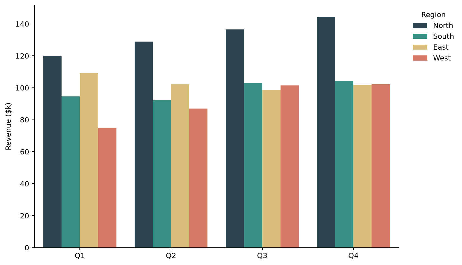
Plot grouped bar charts in Seaborn using hue, control group order, spacing, and orientation.
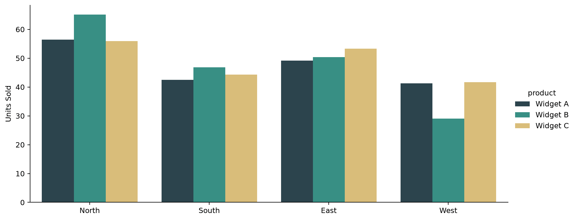
Control the size and shape of a Seaborn catplot using its height and aspect arguments instead of figsize.
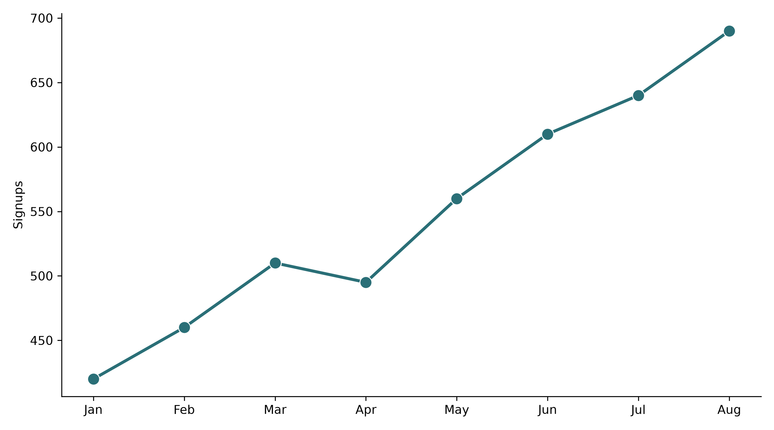
Save Seaborn plots at print- or presentation-quality resolution using dpi, bbox_inches, and vector formats.
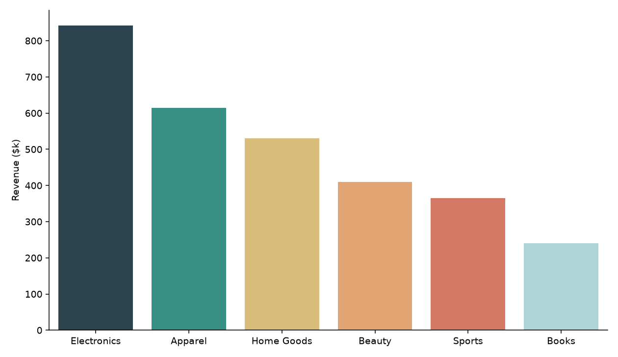
Set custom color palettes in Seaborn using hex lists, named palettes, category-to-color dictionaries, and diverging palettes.
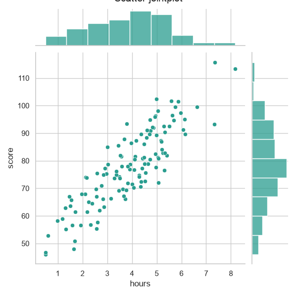
Plot bivariate distributions in Seaborn with jointplot, choosing from scatter, hex, and kde kinds.
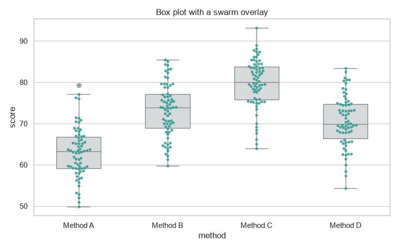
Overlay a swarm (scatter) plot on a Seaborn box plot to show every point alongside the summary.
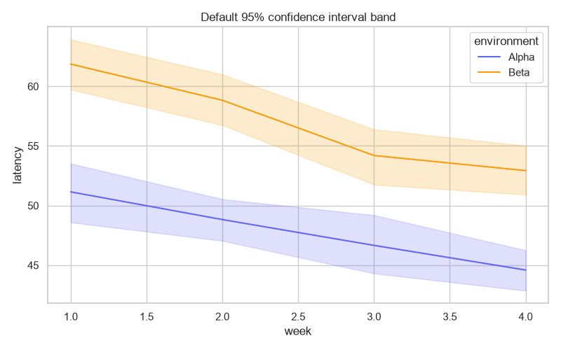
Create, modify, and remove confidence interval bands in Seaborn with the errorbar parameter.
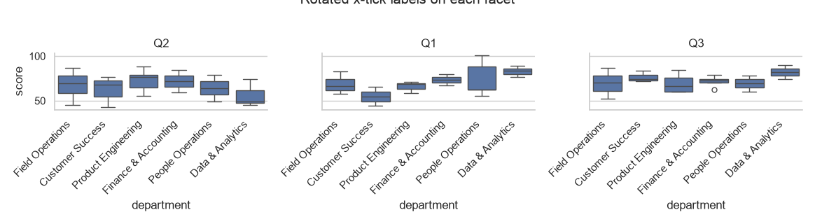
Rotate tick labels on Seaborn FacetGrid and pairplot figures with set_xticklabels and a small loop.
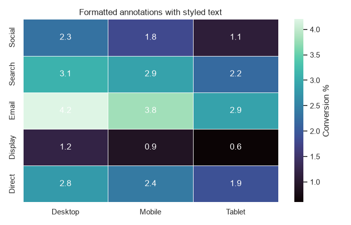
Style Seaborn heatmaps by annotating values, formatting labels, and masking cells you want to hide.
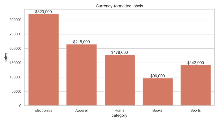
Add data values on top of Seaborn bar plots with ax.bar_label and custom formatting.
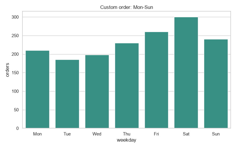
Control the x-axis category order in Seaborn with order=, CategoricalDtype, and hue_order.
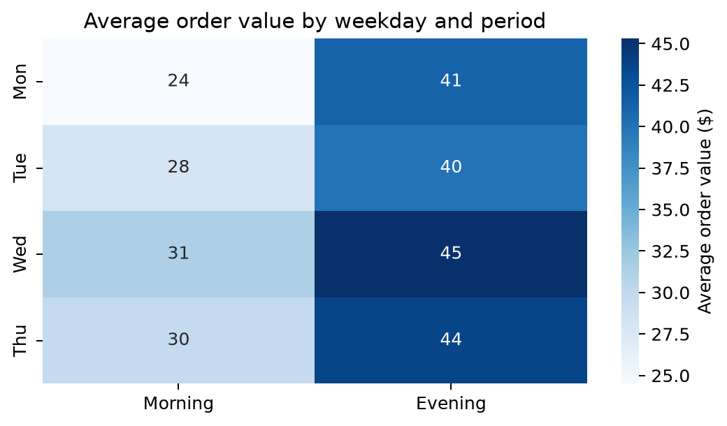
Build clear Seaborn heatmaps, from a simple matrix to annotated correlation charts.
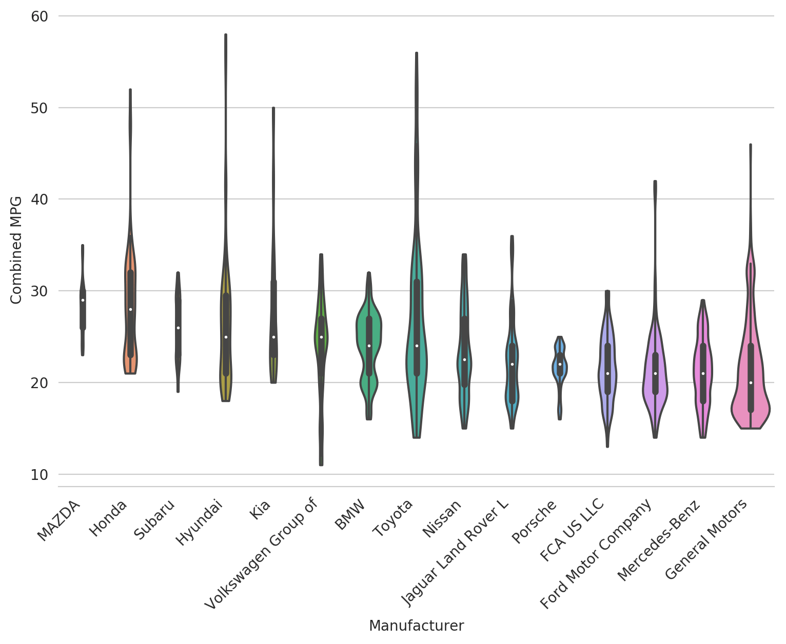
A short tutorial on creating and customizing violin plots in Seaborn