Seaborn is a statistical plotting library created by Michael Waskom, and built on top of Matplotlib. The introduction on the Seaborn site is a great follow up to this short tutorial as it talks about the philosophy of the API and goes through several more examples.
Import Seaborn and create a simple plot
The way I like to think about Seaborn is that it's a convenience wrapper around Matplotlib. Its strengths lie in making somewhat laborious Matplotlib tasks and certain statistical visualizations much faster and more intuitive. You'll often want to work in both Seaborn and Matplotlib to fine-tune a visualization, so I recommend importing them both whenever you want to use Seaborn.
# Import Matplotlib and Seaborn (and Pandas for data wrangling).
import matplotlib.pyplot as plt
import pandas as pd
import seaborn as sns
sns is the usual alias for Seaborn so try to keep to that style. Seaborn includes some convenience datsets included in the library so we'll use the tips dataset to create some sample visualizations comparing tip amount to total bill amount.
# Seaborn comes with some convenient sample datasets.
# Load the 'Tips' dataset and print out.
df = sns.load_dataset('tips')
df.head()
| total_bill | tip | sex | smoker | day | time | size | |
|---|---|---|---|---|---|---|---|
| 0 | 16.99 | 1.01 | Female | No | Sun | Dinner | 2 |
| 1 | 10.34 | 1.66 | Male | No | Sun | Dinner | 3 |
| 2 | 21.01 | 3.50 | Male | No | Sun | Dinner | 3 |
| 3 | 23.68 | 3.31 | Male | No | Sun | Dinner | 2 |
| 4 | 24.59 | 3.61 | Female | No | Sun | Dinner | 4 |
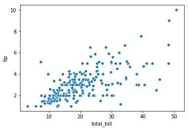
Let's compare the total bill to the tip amount left using a simple scatter plot. Seaborn provides the aptly named scatterplot() function to do just that.
# Create a simple scatter plot of total bill vs tip amount.
sns.scatterplot(x='total_bill', y='tip', data=df)
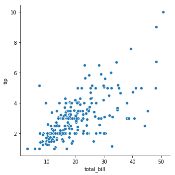
A potentially better way to create this chart in Seaborn though is to use the relplot() function which stands for Relational Plot, essentially, plotting the relationship between variables. relplot() gives a bit more flexibility and functionality since it wraps the plot in a Facet Grid for easier faceting.
# This time use `relplot()` instead, short for Relational Plot.
# This wraps the scatter in a Facet Grid which comes with
# a different styling.
sns.relplot(x='total_bill', y='tip', data=df)
Adding some color
Let's add some dimensionality to the plot by incorporating other variables available in the dataset like sex (gender), time (time of day - either lunch or dinner), and day (day of week).
First we'll map day of week to color so that each day of the week shows up as a different color; the parameter to use for this is hue (unfortunately...).
# Add a color dimension.
sns.relplot(x='total_bill', y='tip', hue='day', data=df)
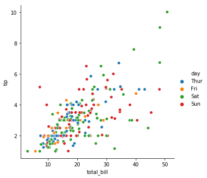
Simple and intuitive. There are other convenience mappings available like size and style as well that can be helpful.
# Add a bunch of dimensions!
sns.relplot(x='total_bill', y='tip', hue='day',
            style='sex', size='size', data=df)
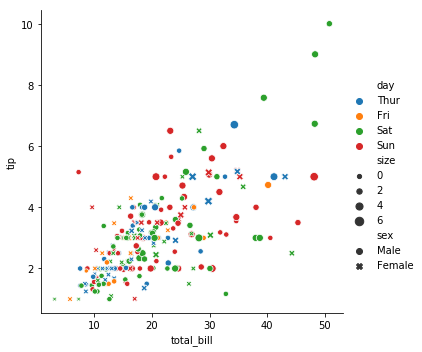
Pretty nice right? Much faster than trying to code this all up in Matplotlib.
Fitting your data
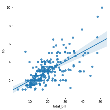
Seaborn really starts to shine though when creating more sophisticated statistical plots. One of the simplest use cases is just to fit our data with a linear regression. You can simply use lmplot() to do just that.
# Let's fit a line through the data.
sns.lmplot(x='total_bill', y='tip', data=df)
Seaborn is intuitive and consistent so we can use many of the same parameters as we did above to create more interesting versions of this. Below we cut the data by time of day (using hue again) to see if people tip more during lunch or dinner.
# Do people tend to tip more at lunch or dinner?
sns.lmplot(x='total_bill', y='tip', hue='time', data=df)
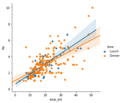
Looks like people feel a bit more generous during lunch surprisingly..
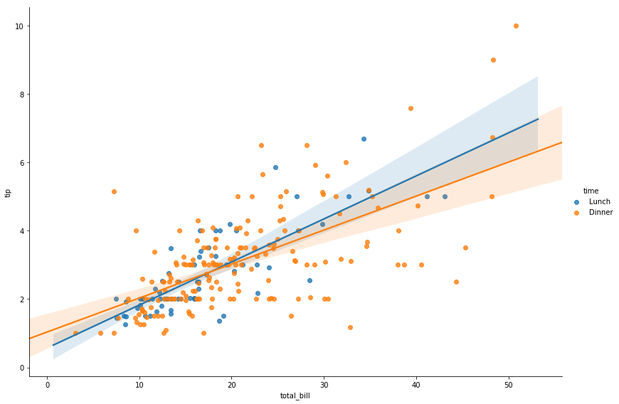
Lastly, let's make the plot a bit larger and wider to be a slightly better size for publishing.
# Set the height larger (default is 5) and move to a wider
# aspect ratio (default is 1).
sns.lmplot(x='total_bill', y='tip', hue='time', data=df,
           height=8, aspect=1.4)
That's it for now, hope you have a solid enough understanding now to get started using this great library.