
Confidence intervals show how much a summary statistic might vary, and Seaborn draws them for you by default. In current Seaborn the errorbar parameter controls them, so this post focuses on that API rather than the older ci argument.
Quick Example
Pass an errorbar tuple to sns.lineplot() to set the level of the confidence interval band.
import seaborn as sns

sns.lineplot(
    data=df,
    x="week",
    y="latency",
    hue="environment",
    errorbar=("ci", 95),
)
This draws a 95% confidence interval band around each line. Use errorbar=None to drop the band, and "sd" or "se" to show standard deviation or standard error instead.
How Seaborn handles confidence intervals
Seaborn estimates a summary statistic (the mean by default) at each x position, then draws a band around it. It does this for any plot that aggregates data, including lineplot, barplot, pointplot, and their relplot / catplot wrappers. Before seaborn 0.12 this was controlled by ci; it has since been replaced by errorbar.
sns.lineplot(data=df, x="week", y="latency", hue="environment")
By default the band is a 95% bootstrap confidence interval, so this first chart already shows the band. It uses the observations at each x value to estimate the interval.
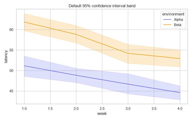
Create a confidence interval band
Set the level with a tuple. The first element is the estimator ("ci"), the second is the confidence level.
sns.lineplot(
    data=df,
    x="week",
    y="latency",
    hue="environment",
    errorbar=("ci", 90),
)
A ("ci", 95) is the common default, but you can choose 90 or 99 to widen or narrow the band. You can also control the number of bootstrap resamples with n_boot.
Modify the uncertainty measure
Instead of a confidence interval, show the standard deviation or standard error. Both accept a simple string, no tuple needed.
# One standard deviation around the mean.
sns.lineplot(data=df, x="week", y="latency", hue="environment", errorbar="sd")

# One standard error around the mean.
sns.lineplot(data=df, x="week", y="latency", hue="environment", errorbar="se")
Standard deviation describes the spread of the data, while standard error and confidence intervals describe the uncertainty in the mean. Choose whichever matches the story you are telling.
Choose a band or error bars
Line and point plots support two err_style options: a filled "band" or discrete "bars".
sns.lineplot(
    data=df,
    x="week",
    y="latency",
    hue="environment",
    errorbar="sd",
    err_style="bars",
)
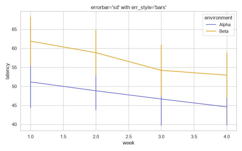
err_style="band" is the default for line plots. err_style="bars" renders vertical error bars at each x position, which pairs well with a standard deviation.
Remove the confidence interval
To turn the band off entirely, pass errorbar=None. This is the clean way to get a plain line or bar chart without uncertainty markers.
sns.lineplot(data=df, x="week", y="latency", hue="environment", errorbar=None)
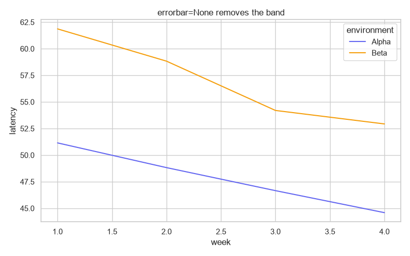
With errorbar=None the lines are drawn bare. This is often what you want for a clean comparison or when the uncertainty is not part of the message.
Confidence intervals on bar plots
The same errorbar parameter works on barplot and pointplot so bars get error caps.
sns.barplot(data=df, x="week", y="latency", hue="environment", errorbar=("ci", 95))
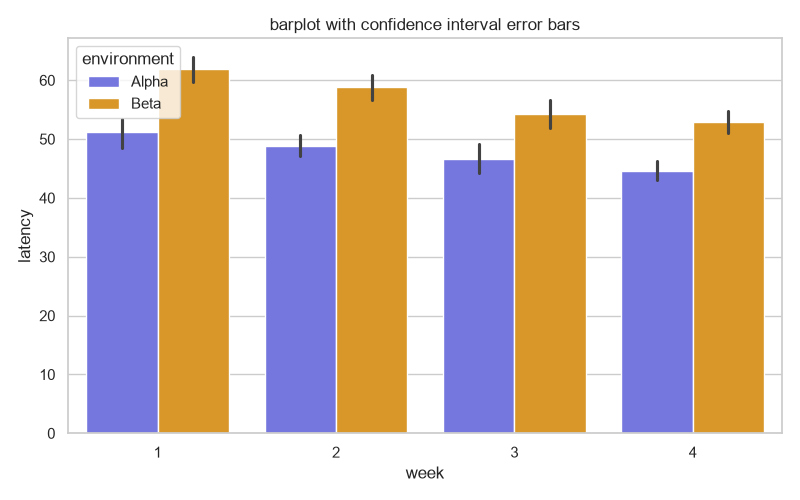
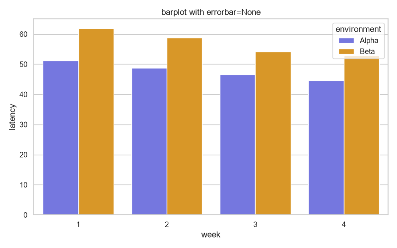
Set errorbar=None to remove the error caps from the bars.
Practical Tips
- Use
errorbar=("ci", 95)for a confidence interval anderrorbar="sd"or"se"for spread of the data. - Remove bands or error bars with
errorbar=Nonewhen uncertainty is not part of the story. - Use
err_style="band"versus"bars"+err_kwsto change the look of the uncertainty. - Remember
ciwas removed; update old code that still passescito useerrorbar. - A band needs repeated observations at each x value, so aggregate plots are where these features show up.