Violin plots are a great tool to have as an analyst because they allow you to see the underlying distribution of the data while still keeping things clean and simple. You can think of them as a combination of a box plot and a KDE (Kernel Density Estimate) plot. You get both the high-level summary a box plot gives you and the lower-level insights into the actual distribution of the data that a KDE plot gives you.
Get some data
Let's use some real data for this. The EPA, via www.fueleconomy.gov, releases a gold mine of data regarding gas mileage (and other attributes) of cars being sold in the US. It's a bit messy, but I've cleaned it up a bit and we can access it via github.
import matplotlib.pyplot as plt
import pandas as pd
import seaborn as sns

# Read in the data from github.
fuel_economy = pd.read_csv('https://raw.githubusercontent.com/getup8/datasets/master/2019_Car_Fuel_Economy.csv')

df = fuel_economy.copy()
The data has 52 columns so I won't print it here, but feel free to peruse it via github. Essentially, we have a row per car, with dozens of attributes about that car like miles per gallon (MPG) estimates, manufacturer, year, transmission details, etc.
For this analysis, let's just focus on the combined MPG estimate and get a sense for which manufacturer is making the most eco-friendly vehicles.
Our first inclination might be to just create a bar chart.
(df[['Manufacturer', 'Comb FE (Guide) - Conventional Fuel']]
    .groupby('Manufacturer')
    .mean()
    .sort_values('Comb FE (Guide) - Conventional Fuel')
    .plot(kind='bar'))
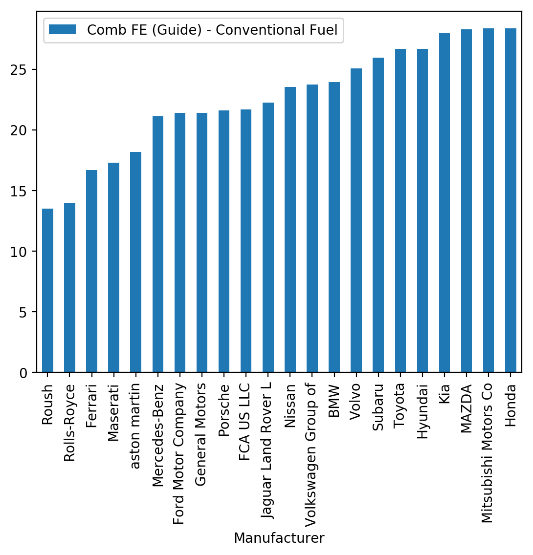
It's helpful, but it really doesn't it tell us that much about how many cars the Manufacturer makes in general, whether they have some high MPG cars and some low MPG cars (or just a few in the middle), etc. This is where violin plots can help.
Before moving on, let's just trim the data down and rename the MPG variable to be a bit more concise.
df.rename(columns={'Comb FE (Guide) - Conventional Fuel': 'Combined MPG'},
          inplace=True)

# Just get the two columns we need for now.
df_mpg = df[['Manufacturer', 'Combined MPG']]

sizes = df_mpg.groupby('Manufacturer').size()

df_mpg.set_index('Manufacturer', inplace=True)

# Let's remove any manufacturers that make fewer 20 or fewer models.
df_mpg_filtered = df_mpg.loc[sizes[sizes > 20].index].reset_index()

df_mpg_filtered.head()
| Manufacturer | Combined MPG | |
|---|---|---|
| 0 | Hyundai | 58 |
| 1 | Toyota | 56 |
| 2 | Hyundai | 55 |
| 3 | Honda | 52 |
| 4 | Toyota | 52 |
The default Violin Plot
Seaborn makes it super simple to create a violin plot: sns.violinplot(). The only required parameters are the data itself (in long/tidy format) and the x and y variables we want to plot. Note that you should send the "raw" data into a violin plot, not an aggregated version of it.
# Change to a bit better style and larger figure.
sns.set_style('whitegrid')
fig, ax = plt.subplots(figsize=(9, 6))

# Plot our violins.
sns.violinplot(x='Manufacturer', y='Combined MPG', data=df_mpg_filtered)

# Rotate the x-axis labels and remove the plot border on the left.
_ = plt.xticks(rotation=45, ha='right')
sns.despine(left=True)
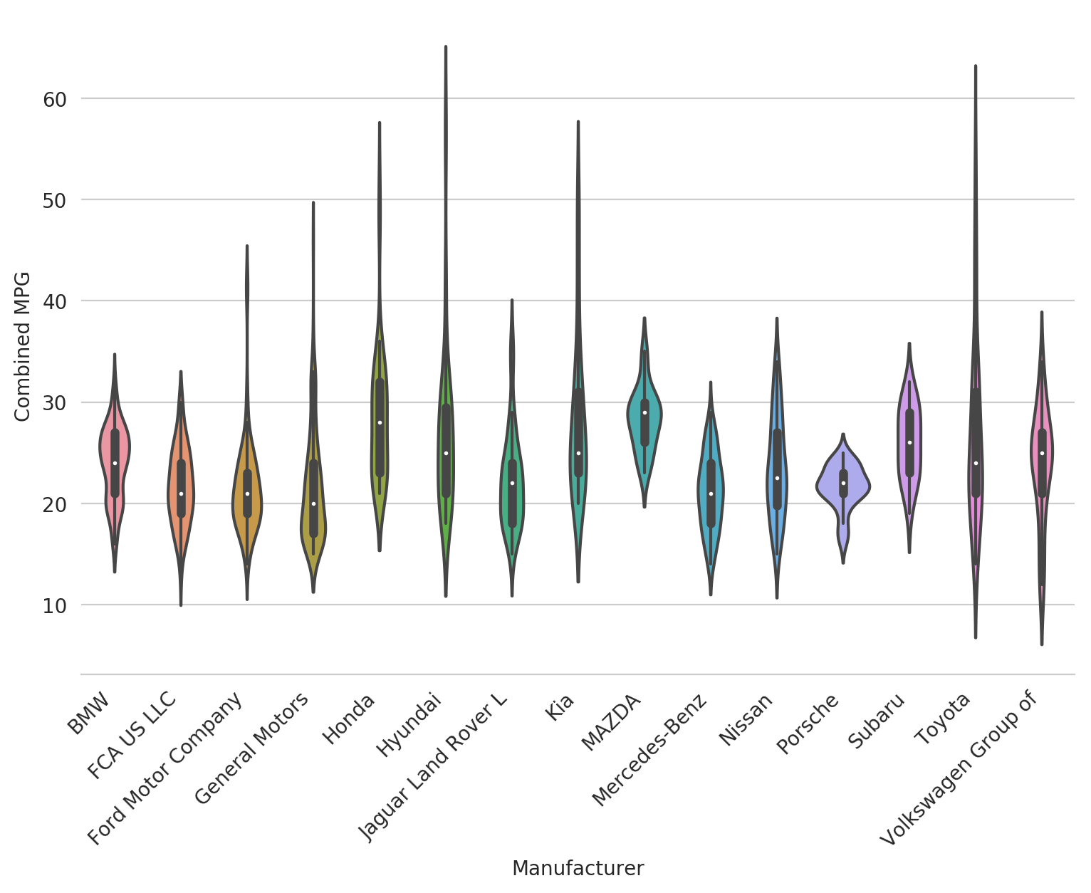
Pretty huh? Seaborn's default violin plot is really nice. It shows an actual box plot inside of the violin with the median as a white dot. It normalizes the area of all the violins themselves so you can see the underlying distribution pretty well for each category. And the distribution itself is smoothed nicely to get a general sense of what's going on in the data.
However, it's not that easy to see what's really going on and to draw insights out. Let's customize it a bit and see what we can find.
Customizing the Violin Plot
Changing the order
Let's first change the order of the violions so they're ranked, from highest to lowest, by the median MPG of the manufacturer. We do this using the order argument which takes a list of values in the order you'd like to see them.
ordered = df_mpg_filtered.groupby('Manufacturer').median().sort_values(
    'Combined MPG', ascending=False).index

fig, ax = plt.subplots(figsize=(9, 6))
sns.violinplot(x='Manufacturer', y='Combined MPG', data=df_mpg_filtered,
               order=ordered)

_ = plt.xticks(rotation=45, ha='right')
sns.despine(left=True)
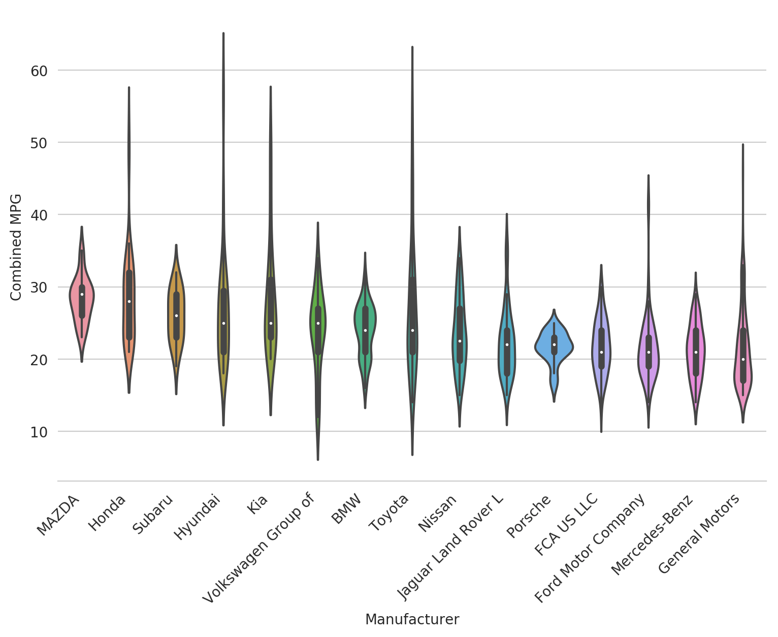
Now it's a bit easier to tell what's going on - Mazda has some pretty high MPG cars and a tight distribution, Mercedes makes mostly low MPG cars, and General Motors is pretty low on average but might have a few exceptions.
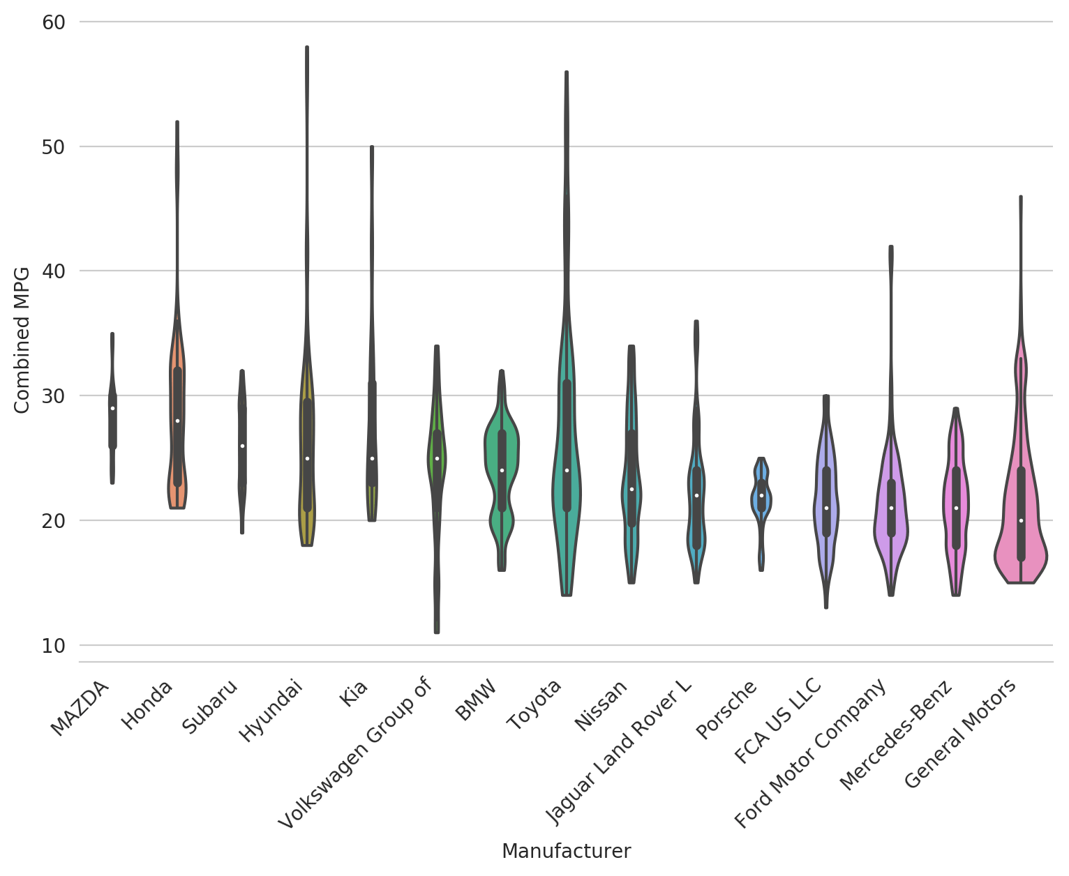
Adjust cut and scale
The violin plot creates a smooth distribution on top of the data which gives it a nice shape but might actually be a bit misleading. To stop the violin where the data itself stops, we can use cut=0.
The other thing we'll adjust here is the scale. The default is area which makes each violin the same area. The other two options are count which scales the violin by the number of data points in the category, and width, which sets the width to be constant for each violin.
To get a sense for how many cars each manufacturer actually makes, let's use scale=count.
fig, ax = plt.subplots(figsize=(9, 6))
sns.violinplot(x='Manufacturer', y='Combined MPG', data=df_mpg_filtered,
               order=ordered, cut=0, scale='count')

_ = plt.xticks(rotation=45, ha='right')
sns.despine(left=True)
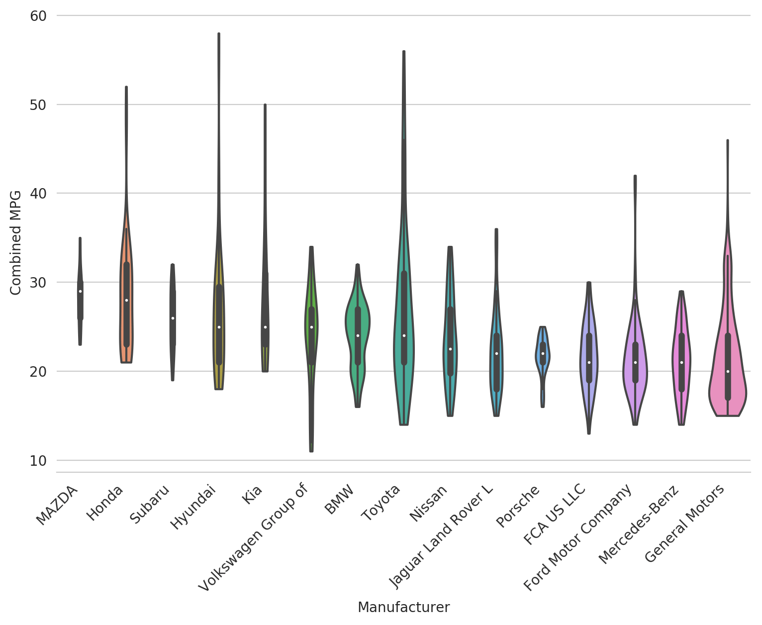
Now we can see a few things: * Mazda and Suburu don't make very many types of cars; GM makes a lot * Hyundai, Toyota and GM don't have as bad of MPG in the tails as we thought
Cool right? Let's make one more subtle adjustment.
Adjusting kernel bandwidth
As previously mentioned, a density estimate creates the nice curve of the violin. But what if we want a bit more detail there and for it to be less smoothed? You can use the bw argument - the lower the number, the more detail you'll see in the violin. Let's adjust ours down to 0.25 to get some extra granularity.
fig, ax = plt.subplots(figsize=(9, 6))
sns.violinplot(x='Manufacturer', y='Combined MPG', data=df_mpg_filtered,
               order=ordered, cut=0, scale='count', bw=0.25)

_ = plt.xticks(rotation=45, ha='right')
sns.despine(left=True)
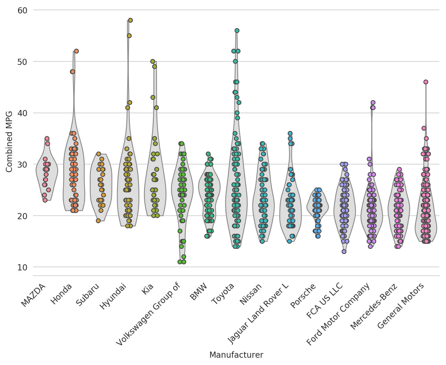
Bonus Feature: Layering Violin Plots
In some cases, you want even more granularity in the visualization and want to see each underlying data point (or at least most). In that case, you can try layering a strip plot or swarm plot on top of the violin plot to get the best of both worlds.
fig, ax = plt.subplots(figsize=(9, 6))
sns.violinplot(x='Manufacturer', y='Combined MPG', data=df_mpg_filtered, cut=0,
               scale='width', inner=None, linewidth=1, color='#DDDDDD',
               saturation=1, order=ordered)

sns.stripplot(x='Manufacturer', y='Combined MPG', data=df_mpg_filtered,
              jitter=True, linewidth=1, order=ordered)

_ = plt.xticks(rotation=45, ha='right')

sns.despine(left=True)
Now let's add another layer on top to really highlight the median and 25th and 75th percentiles.
fig, ax = plt.subplots(figsize=(9, 6))
sns.violinplot(x='Manufacturer', y='Combined MPG', data=df_mpg_filtered, cut=0,
               scale='width', inner=None, linewidth=1, color='#DDDDDD',
               saturation=1, order=ordered, bw=0.2)

sns.stripplot(x='Manufacturer', y='Combined MPG', data=df_mpg_filtered,
              jitter=True, linewidth=1, order=ordered)

medians = df_mpg_filtered.groupby('Manufacturer').median().reset_index()
q25 = df_mpg_filtered.groupby('Manufacturer').quantile(0.25).reset_index()
q75 = df_mpg_filtered.groupby('Manufacturer').quantile(0.75).reset_index()

sns.swarmplot(x='Manufacturer', y='Combined MPG', data=medians, order=ordered,
              color='white', edgecolor='black', linewidth=1, size=8)

sns.swarmplot(x='Manufacturer', y='Combined MPG', data=q25, order=ordered,
              color='red', edgecolor='black', linewidth=1, size=6)

sns.swarmplot(x='Manufacturer', y='Combined MPG', data=q75, order=ordered,
              color='red', edgecolor='black', linewidth=1, size=6)

_ = plt.xticks(rotation=45, ha='right')

sns.despine(left=True)
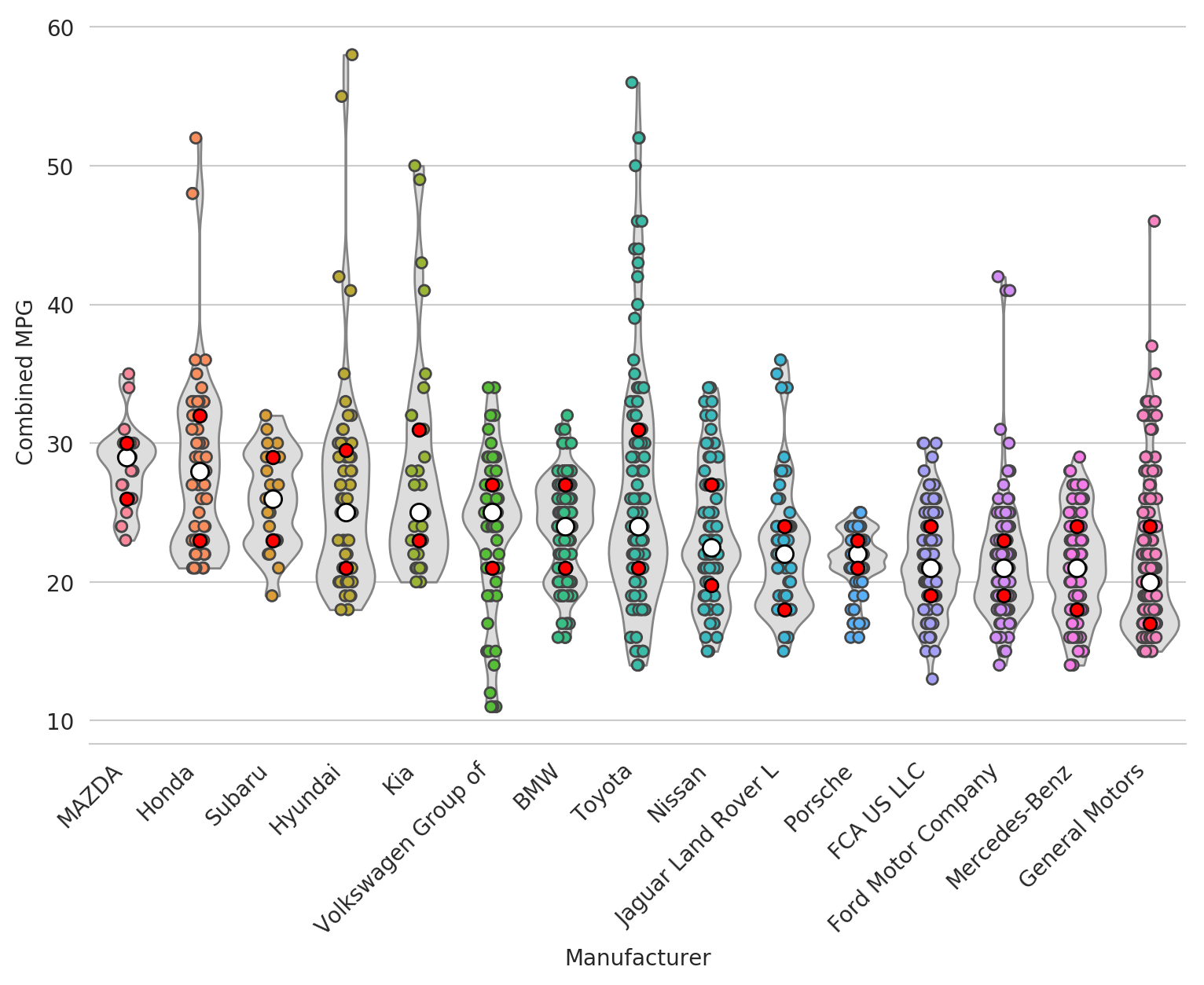
A bit messy.. but still pretty cool and definitely useful in some cases.
Hope you enjoyed! Oh.. and don't buy any of these cars by the way, buy an EV instead :)