
Seaborn draws categorical axes in alphabetical order by default, which is rarely the order you want. This post shows the few ways to take control and put categories where they belong.
Quick Example
Pass an order list to the plotting function. That single argument sets the exact x-axis order, and it works for barplot, boxplot, violinplot, boxenplot, and their catplot cousins.
import pandas as pd
import seaborn as sns

df = pd.DataFrame({
    "weekday": ["Mon", "Tue", "Wed", "Thu", "Fri", "Sat", "Sun"],
    "orders":  [210, 185, 198, 230, 260, 300, 240],
})

sns.barplot(
    data=df,
    x="weekday",
    y="orders",
    order=["Mon", "Tue", "Wed", "Thu", "Fri", "Sat", "Sun"],
)
Why order matters
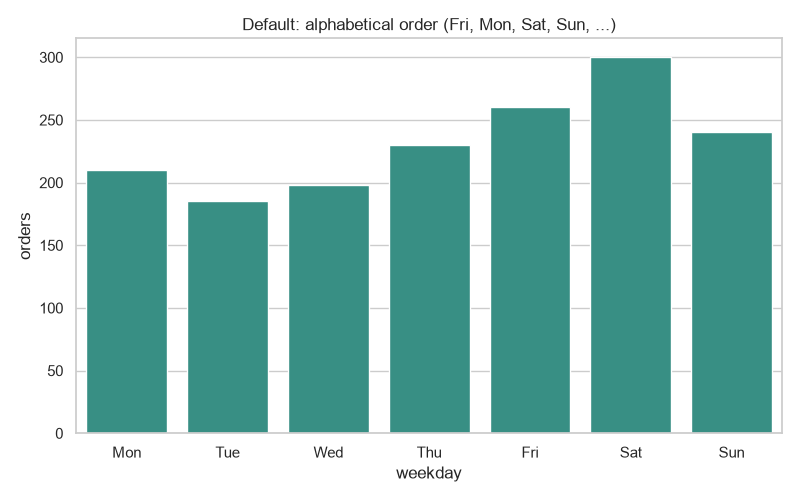
Most categorical data has a natural sequence, but seaborn does not read your mind. It sorts the categories alphabetically. For weekdays that produces Fri, Mon, Sat, Sun, Thu, Tue, Wed, which is confusing when you meant Monday through Sunday.
sns.barplot(data=df, x="weekday", y="orders")
Set the order with order=
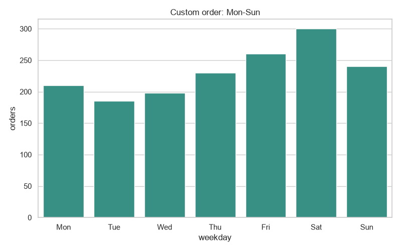
Give order the categories in the order you want and seaborn arranges them exactly that way.
sns.barplot(
    data=df,
    x="weekday",
    y="orders",
    order=["Mon", "Tue", "Wed", "Thu", "Fri", "Sat", "Sun"],
)
Any categories you leave out of order are simply dropped, so you can also use it to show only a subset.
Order by value
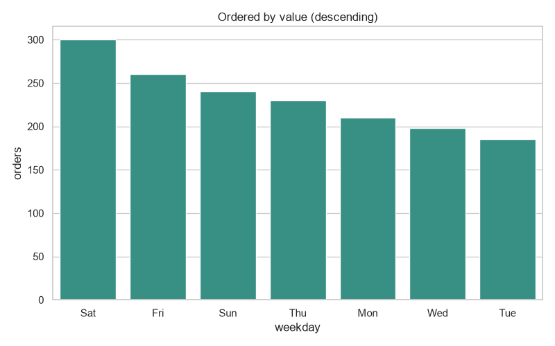
Instead of typing the list by hand, derive it from the data. This sorts the bars from highest to lowest (or the reverse) so the chart tells a story about size.
ordered = df.sort_values("orders", ascending=False)["weekday"].tolist()

sns.barplot(data=df, x="weekday", y="orders", order=ordered)
Order the legend with hue_order
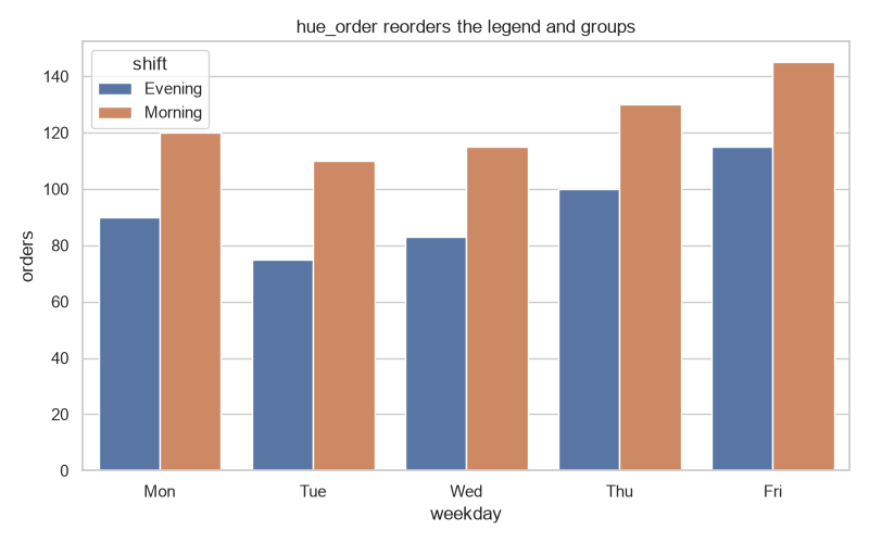
The order argument handles the x-axis, but when you add a hue, the groups in the legend are ordered by hue_order. Set it the same way to control which group appears first in the legend and within each cluster of bars.
sns.barplot(
    data=df,
    x="weekday",
    y="orders",
    hue="shift",
    hue_order=["Evening", "Morning"],
)
Make the column categorical
For a one-time global fix, turn the column into an ordered categorical dtype. Every seaborn function then respects that order without you passing order each time.
from pandas.api.types import CategoricalDtype

week = CategoricalDtype(
    categories=["Mon", "Tue", "Wed", "Thu", "Fri", "Sat", "Sun"],
    ordered=True,
)
df["weekday"] = df["weekday"].astype(week)

sns.barplot(data=df, x="weekday", y="orders")
Setting ordered=True fixes the display order, while ordered=False leaves the sorting to seaborn.
Practical Tips
- Prefer
order=when the order is a one-off choice for a single chart. - Use an ordered
CategoricalDtypewhen the same ordering should apply everywhere in your analysis. - To sort by a numeric column, sort the data and pass the resulting category list to
order. - Remember
hue_orderfor the legend andorderfor the axis; they are separate controls. orderalso filters out categories you omit, which is handy for showing a subset.