
A heatmap turns a table of numbers into a chart where color carries the value. They work especially well when the pattern matters more than any single number: a correlation matrix, activity by hour and day, sales by product and month, or a grid of model results.
For most day-to-day work, Seaborn's heatmap() is the right starting point. It handles DataFrames, labels, annotations, and colorbars with very little setup.
A quick heatmap with Seaborn
Here is a small table of orders by weekday and time of day. Rows become the y-axis, columns become the x-axis, and the cell color represents the number of orders.
import pandas as pd
import seaborn as sns
import matplotlib.pyplot as plt

orders = pd.DataFrame(
    {
        "Morning": [18, 22, 25, 24, 16],
        "Afternoon": [31, 35, 38, 34, 28],
        "Evening": [14, 19, 23, 21, 17],
    },
    index=["Monday", "Tuesday", "Wednesday", "Thursday", "Friday"],
)

fig, ax = plt.subplots(figsize=(7, 4))
sns.heatmap(orders, ax=ax)
ax.set_title("Orders by weekday and time of day")
plt.show()
The default chart is a good first check, but it makes the reader look back and forth between the colorbar and the cells. When the table is small, printing the values in the cells makes the chart much easier to scan.
Add values, gridlines, and a better color palette
Set annot=True to draw the values in each cell. fmt="d" formats these whole-number counts without decimal places. The linewidths and linecolor arguments add separation without turning the grid into the main event.
fig, ax = plt.subplots(figsize=(7, 4))

sns.heatmap(
    orders,
    annot=True,
    fmt="d",
    cmap="YlGnBu",
    linewidths=0.5,
    linecolor="white",
    cbar_kws={"label": "Orders"},
    ax=ax,
)

ax.set_title("Orders by weekday and time of day")
ax.set_xlabel("")
ax.set_ylabel("")
plt.tight_layout()
plt.show()
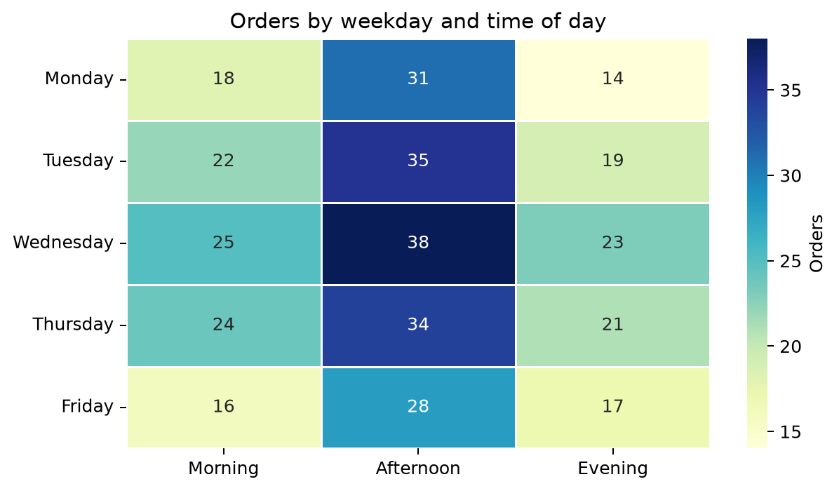
YlGnBu is a sequential palette: it moves from light to dark as values increase. That makes it a good choice for counts, amounts, or other data that only moves in one direction.
Turn long data into a heatmap
Real data often arrives with one row per observation rather than as a finished grid. A heatmap needs a matrix; pivot_table() is useful to reshape the data.
This example starts with individual order records. It calculates the average order value for every weekday and time-of-day combination.
sales = pd.DataFrame(
    {
        "weekday": ["Mon", "Mon", "Tue", "Tue", "Wed", "Wed", "Thu", "Thu"],
        "period": ["Morning", "Evening", "Morning", "Evening", "Morning", "Evening", "Morning", "Evening"],
        "order_value": [24.50, 41.20, 28.10, 39.90, 31.40, 45.30, 29.80, 43.70],
    }
)

heatmap_data = sales.pivot_table(
    index="weekday",
    columns="period",
    values="order_value",
    aggfunc="mean",
)

# Put the labels in a useful order instead of alphabetical order.
heatmap_data = heatmap_data.reindex(["Mon", "Tue", "Wed", "Thu"])
heatmap_data = heatmap_data.reindex(columns=["Morning", "Evening"])

fig, ax = plt.subplots(figsize=(6, 3.5))
sns.heatmap(
    heatmap_data,
    annot=True,
    fmt=".0f",
    cmap="Blues",
    cbar_kws={"label": "Average order value ($)"},
    ax=ax,
)
ax.set_title("Average order value by weekday and period")
ax.set_xlabel("")
ax.set_ylabel("")
plt.tight_layout()
plt.show()
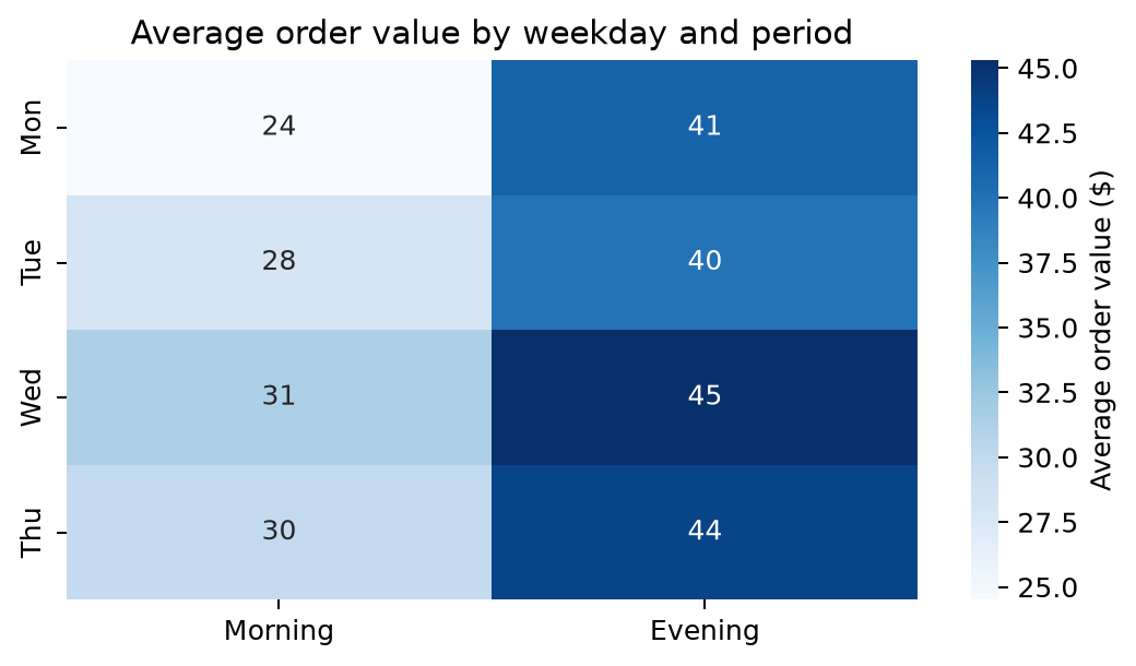
The important part is the reshape:
sales.pivot_table(
    index="weekday",       # heatmap rows
    columns="period",      # heatmap columns
    values="order_value",  # values represented by color
    aggfunc="mean",        # how to combine repeated row/column pairs
)
Use sum, count, median, or another aggregation when it better matches the question. pivot() only works when every row-and-column combination appears once; pivot_table() is the safer default when duplicate combinations are possible.
Create a correlation heatmap
Correlation matrices are one of the most common heatmap uses. Because correlations range from -1 to 1, they need a diverging palette: one color for negative values, another for positive values, and a neutral midpoint at zero.
penguins = pd.DataFrame(
    {
        "bill_length_mm": [39.1, 40.3, 42.0, 43.2, 45.1, 46.4, 48.0, 49.3],
        "bill_depth_mm": [18.7, 18.0, 18.5, 17.3, 16.8, 17.1, 15.9, 16.2],
        "flipper_length_mm": [181, 185, 190, 195, 201, 205, 211, 215],
        "body_mass_g": [3750, 3900, 4050, 4200, 4600, 4800, 5100, 5350],
    }
)

correlations = penguins[
    ["bill_length_mm", "bill_depth_mm", "flipper_length_mm", "body_mass_g"]
].corr()

fig, ax = plt.subplots(figsize=(7, 5))
sns.heatmap(
    correlations,
    annot=True,
    fmt=".2f",
    cmap="vlag",
    center=0,
    vmin=-1,
    vmax=1,
    square=True,
    linewidths=0.5,
    cbar_kws={"label": "Correlation"},
    ax=ax,
)

ax.set_title("Penguin measurement correlations")
plt.tight_layout()
plt.show()
center=0 is doing real work here. Without it, a palette can make zero look colored when the observed values happen to be mostly positive. Setting both vmin=-1 and vmax=1 keeps the meaning of the colors consistent with the full correlation scale.
The diagonal is always 1 because each column is perfectly correlated with itself. You can hide that repeated half of the chart when it is distracting.
import numpy as np

mask = np.triu(np.ones_like(correlations, dtype=bool))

fig, ax = plt.subplots(figsize=(7, 5))
sns.heatmap(
    correlations,
    mask=mask,
    annot=True,
    fmt=".2f",
    cmap="vlag",
    center=0,
    vmin=-1,
    vmax=1,
    square=True,
    linewidths=0.5,
    ax=ax,
)
ax.set_title("Penguin measurement correlations")
plt.tight_layout()
plt.show()
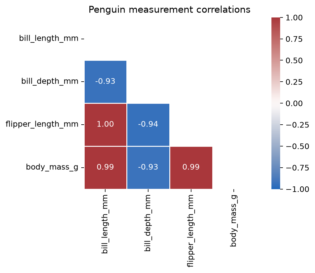
np.triu() creates a mask for the upper triangle, including the diagonal. Seaborn leaves those cells blank and shows only the lower half.
Handle missing combinations honestly
If a row-and-column combination is absent in the source data, pivot_table() leaves a missing value (NaN). Seaborn draws missing cells as blank by default, which is often the right choice: a missing measurement is not the same as zero.
If a missing combination truly means zero, make that decision explicit before plotting:
heatmap_data = heatmap_data.fillna(0)
For a larger chart, labels in every cell quickly become cluttered. In that case, turn annotations off and rely on the colorbar:
sns.heatmap(heatmap_data, cmap="Blues", annot=False)
A practical heatmap checklist
- Use a sequential palette for values that run from low to high, such as counts and revenue.
- Use a diverging palette with a meaningful center for data that can move above or below a reference value, such as correlations or changes from baseline.
- Keep a fixed
vminandvmaxwhen readers will compare multiple heatmaps. - Annotate small matrices; leave annotations off for large ones.
- Label the colorbar with the unit, not just a generic word like “value.”
- Treat missing data and zeros differently unless you have a reason to combine them.
The chart should make a pattern easier to see than the original table. If the cells have no meaningful order, or readers need exact row-level detail, a different chart or the table itself may be a better choice.