
Seaborn does not put values on top of bars for you, but the bars live on a matplotlib axes, so ax.bar_label() drops labels in place with one line. This post shows how to add, format, and position those labels.
Quick Example
After creating a Seaborn bar plot, grab the first bar container and pass it to ax.bar_label(). That is the whole pattern.
import matplotlib.pyplot as plt
import seaborn as sns

fig, ax = plt.subplots()
sns.barplot(data=df, x="category", y="sales", errorbar=None, ax=ax)
ax.bar_label(ax.containers[0])
Each ax.containers[i] holds one group of bars, so this labels every bar in the first (and usually only) group.
Why labels help
A bar chart with a labeled axis still forces the reader to trace each bar over to the axis to read its exact value. Putting the number right on top removes that step and makes the chart self-explanatory. It matters most when values are close together or when you want a specific figure like a currency amount to be obvious.
Add labels with ax.bar_label
The default output just places the raw value above each bar with a little padding.
fig, ax = plt.subplots(figsize=(9, 5))
sns.barplot(data=df, x="category", y="sales", color="#e76f51", errorbar=None, ax=ax)
ax.bar_label(ax.containers[0])
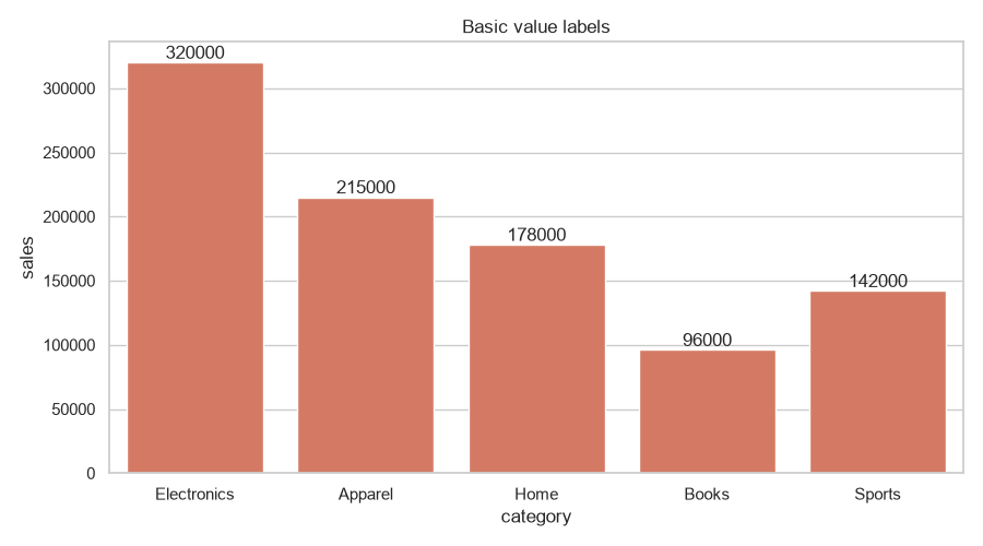
A few options on ax.bar_label() matter:
fmtcontrols the label text, either a format string like"%d"or a function.paddingadds (or subtracts) space between the bar edge and the label.label_typechooses where to put it:"edge"(default, on top) or"center"(middle of the bar).
Format the labels
A format string prints the number as is. To turn 320000 into $320,000, use a callable that does the formatting for each value.
ax.bar_label(ax.containers[0], fmt=lambda v: f"${v:,.0f}")
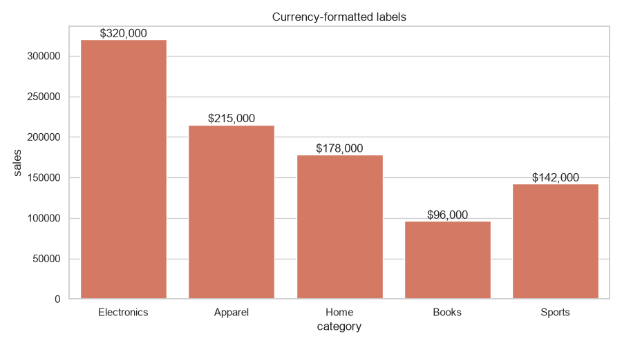
The callable receives each bar's value, so you can round, add currency, abbreviate to thousands, or build any string you need. This is the cleanest way to format labels instead of fighting the plain fmt format strings.
Labels on horizontal bars
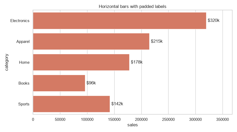
ax.bar_label() works the same way when the bars are horizontal. Pass orient="h" and the labels sit to the right of each bar. Give the axis a little headroom so the labels are not clipped at the edge.
fig, ax = plt.subplots(figsize=(9, 5))
sns.barplot(data=df, x="sales", y="category", orient="h", color="#e76f51",
            errorbar=None, ax=ax)
ax.bar_label(ax.containers[0], fmt=lambda v: f"${v/1000:,.0f}k", padding=4)
ax.set(xlim=(0, df["sales"].max() * 1.15))
Label grouped bars
When you pass hue, seaborn draws multiple groups, each in its own ax.containers entry. Loop over them and label every container.
sns.barplot(data=df, x="category", y="sales", hue="region",
            errorbar=None, ax=ax)
for container in ax.containers:
    ax.bar_label(container, fmt=lambda v: f"${v/1000:,.0f}k")
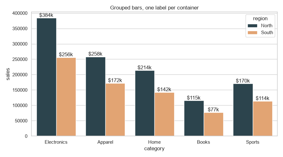
Because each hue group has its own container, labeling only ax.containers[0] would skip the other groups. The loop handles all of them in one pass.
Practical Tips
- Use
ax.bar_label()instead of hand-placing text withax.text(); it automatically aligns to each bar. - Give a callable to
fmtwhenever you need currency, percentages, or abbreviated numbers. - Raise the
ylimtop margin (e.g.,ax.set_ylim(0, df["sales"].max() * 1.15)) so stacked or near-top labels are not clipped. - Loop over
ax.containersto label grouped bars fromhue. - For very tall or thin bars,
label_type="center"or a small font size keeps labels readable.