
A box plot summarizes a distribution, but it hides the raw points behind quartiles and whiskers. A swarm plot restores them, so you see both the summary and every individual value on the same chart.
Quick Example
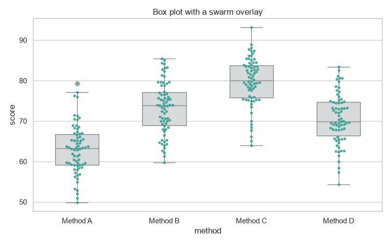
Create the boxplot and the swarmplot on the same axes, sharing the same x and y.
import matplotlib.pyplot as plt
import seaborn as sns

fig, ax = plt.subplots()
sns.boxplot(data=df, x="method", y="score", color="#d5dbdb", ax=ax)
sns.swarmplot(data=df, x="method", y="score", color="#2a9d8f", size=4, ax=ax)
The box plot draws its summary first, then the swarm lays the points inside it without overlap. Use gray for the boxes so the colored points stay the focus.
Why overlay a swarm
A box plot condenses a distribution to median, quartiles, and outliers. That is useful, but it hides the shape and lets you miss gaps or a very bimodal set of values. A swarm plot places each raw observation as a point, offset so points do not collide. Together they give the clean summary and the full detail in one figure.
sns.boxplot(data=df, x="method", y="score", color="#d5dbdb", ax=ax)
sns.swarmplot(data=df, x="method", y="score", color="#2a9d8f", size=4, ax=ax)
Align hue groups with dodge
When you add a hue to both plots, the groups must line up. boxplot dodges its groups by default, but swarmplot needs dodge=True so its points shift to the same positions.
sns.boxplot(data=df, x="method", y="score", hue="cohort",
            palette=["#4c78a8", "#e45756"], width=0.5, ax=ax)
sns.swarmplot(data=df, x="method", y="score", hue="cohort",
              palette=["#4c78a8", "#e45756"], dodge=True, size=3, ax=ax)
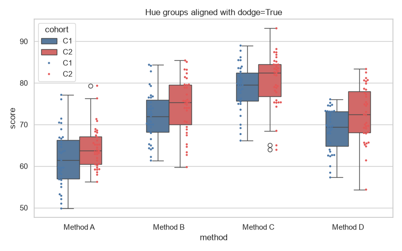
Forget dodge=True and the swarm points pile into the middle instead of sitting over their own boxes. Sharing the same palette keeps the boxes and points color-consistent.
Style the overlay
A few options keep the combined chart readable.
sns.boxplot(data=df, x="method", y="score", width=0.6,
            color="#d5dbdb", fliersize=0, ax=ax)
sns.swarmplot(data=df, x="method", y="score", size=4,
              color="#1f77b4", edgecolor="white", linewidth=1.0, ax=ax)
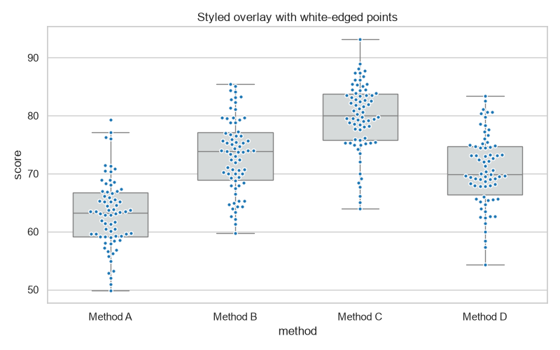
sns.boxplot(width=0.5)narrows the boxes so they do not swallow the points.fliersize=0hides the box's own outlier markers, since the swarm already shows every point.size,edgecolor, andlinewidthshape the points; white edges separate overlapping dots.
Use a stripplot for jitter instead
Swarm points sit exactly on their values, which can push dots wide with some data. stripplot adds random jitter instead, which keeps the points compact when a category has many observations.
sns.boxplot(data=df, x="method", y="score", color="#d5dbdb", ax=ax)
sns.stripplot(data=df, x="method", y="score", jitter=0.3,
              size=4, color="#8e44ad", alpha=0.7, ax=ax)
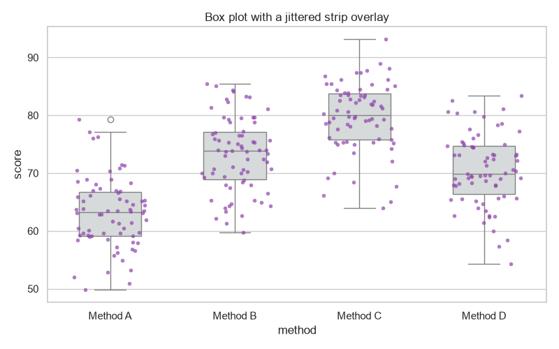
Use jitter (0 to 1) to control the spread. The strip plot is a lighter-weight alternative when exact point positions or overlaps do not matter.
Practical Tips
- Plot the box first and the swarm second so the points draw on top.
- Use a neutral box color and a distinct point color so the raw data stands out.
- Set
dodge=Trueon the swarm when you use ahue. - Narrow the boxes with
widthand hide box fliers since the swarm shows all points. - Turn to
stripplotwithjitterwhen a category has so many points that the swarm gets too wide.