
Seaborn picks colors for you by default, but the palette argument accepts a lot more than a preset name. This post covers passing your own hex codes, using named/generated palettes, mapping specific colors to specific categories, and building a diverging palette for data with a meaningful zero point.
Quick Example
Pass a list of hex codes straight to palette, one color per category.
import matplotlib.pyplot as plt
import seaborn as sns

custom_colors = ["#264653", "#2a9d8f", "#e9c46a", "#f4a261", "#e76f51", "#a8dadc"]

fig, ax = plt.subplots()
sns.barplot(data=df, x="category", y="revenue", hue="category",
            palette=custom_colors, legend=False, ax=ax)
Seaborn assigns colors from the list in the order the categories appear on the axis.
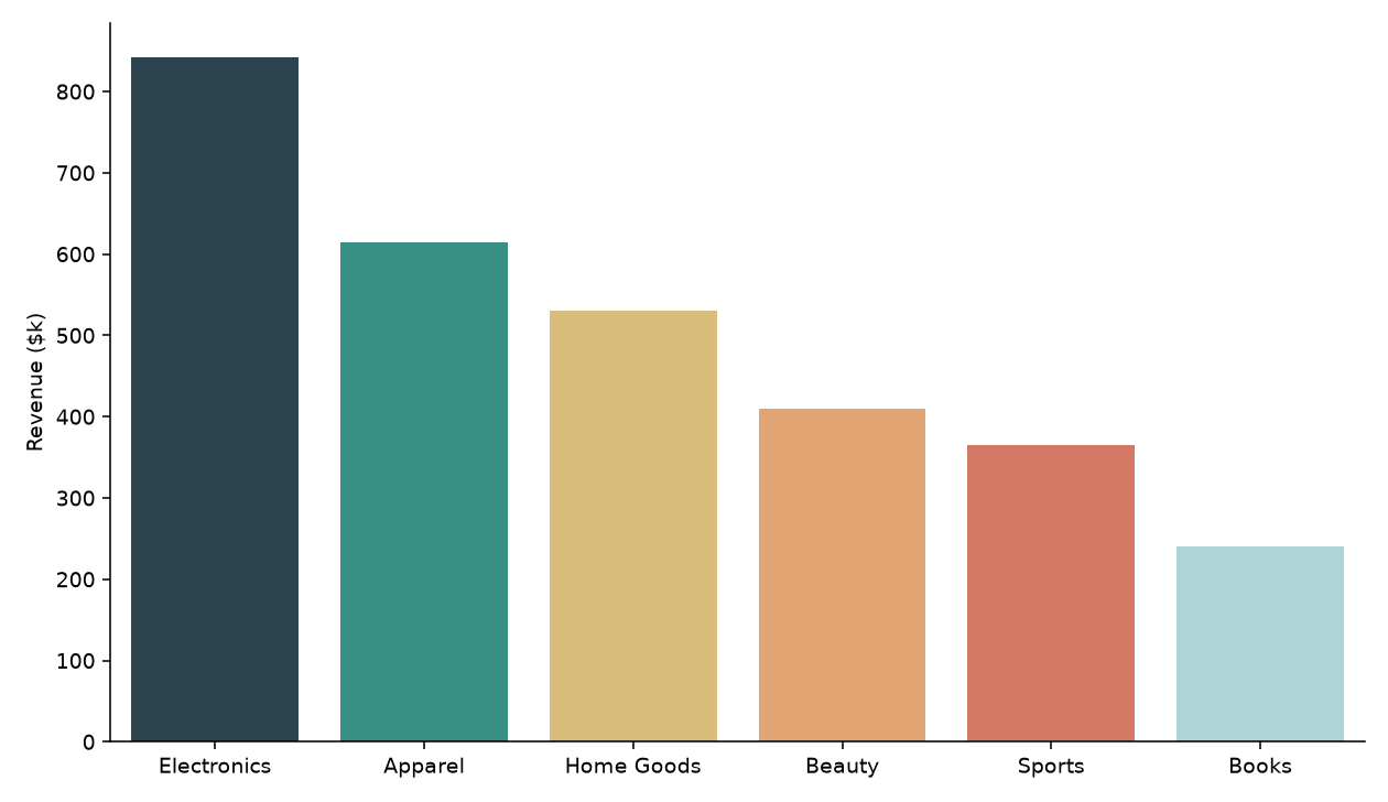
Note the hue="category" combined with legend=False. This is the current Seaborn pattern for coloring a plot that only has one variable on the x-axis; passing palette without a hue throws a deprecation warning in recent versions.
Named and generated palettes
Seaborn ships with named palettes, and a lot of them are borrowed from matplotlib's colormaps: "viridis", "mako", "flare", "rocket", "crest", plus the classic "Set2", "pastel", and "deep" families. Pass the name as a string and Seaborn samples it across your categories.
fig, ax = plt.subplots()
sns.barplot(data=df, x="sessions", y="channel", hue="channel",
            palette="mako", legend=False, orient="h", ax=ax)
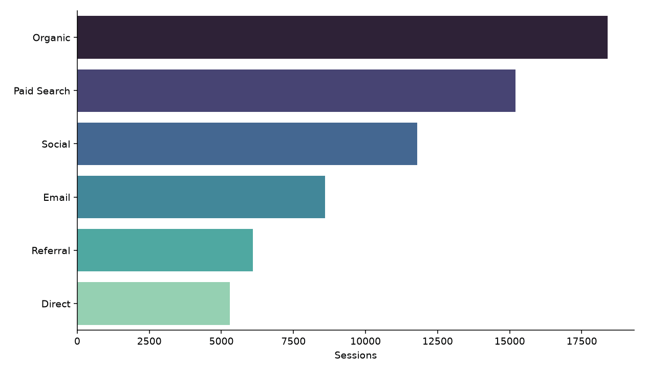
"mako" and "rocket" are sequential, dark-to-light palettes that work well when the categories have a natural order, like this chart sorted from highest to lowest traffic. sns.color_palette("mako", n_colors=6) returns the actual RGB tuples if you want to inspect or reuse them outside of a plot.
Map specific colors to specific categories
A plain list assigns colors by position, which breaks if you filter the data or the category order changes. Pass a dictionary instead and Seaborn matches each key to its category regardless of order.
carrier_colors = {
    "FedEx": "#4d148c",
    "UPS": "#351c15",
    "USPS": "#004b87",
    "DHL": "#ffcc00",
}

fig, ax = plt.subplots()
sns.boxplot(data=df, x="carrier", y="delivery_days", hue="carrier",
            palette=carrier_colors, legend=False, ax=ax)
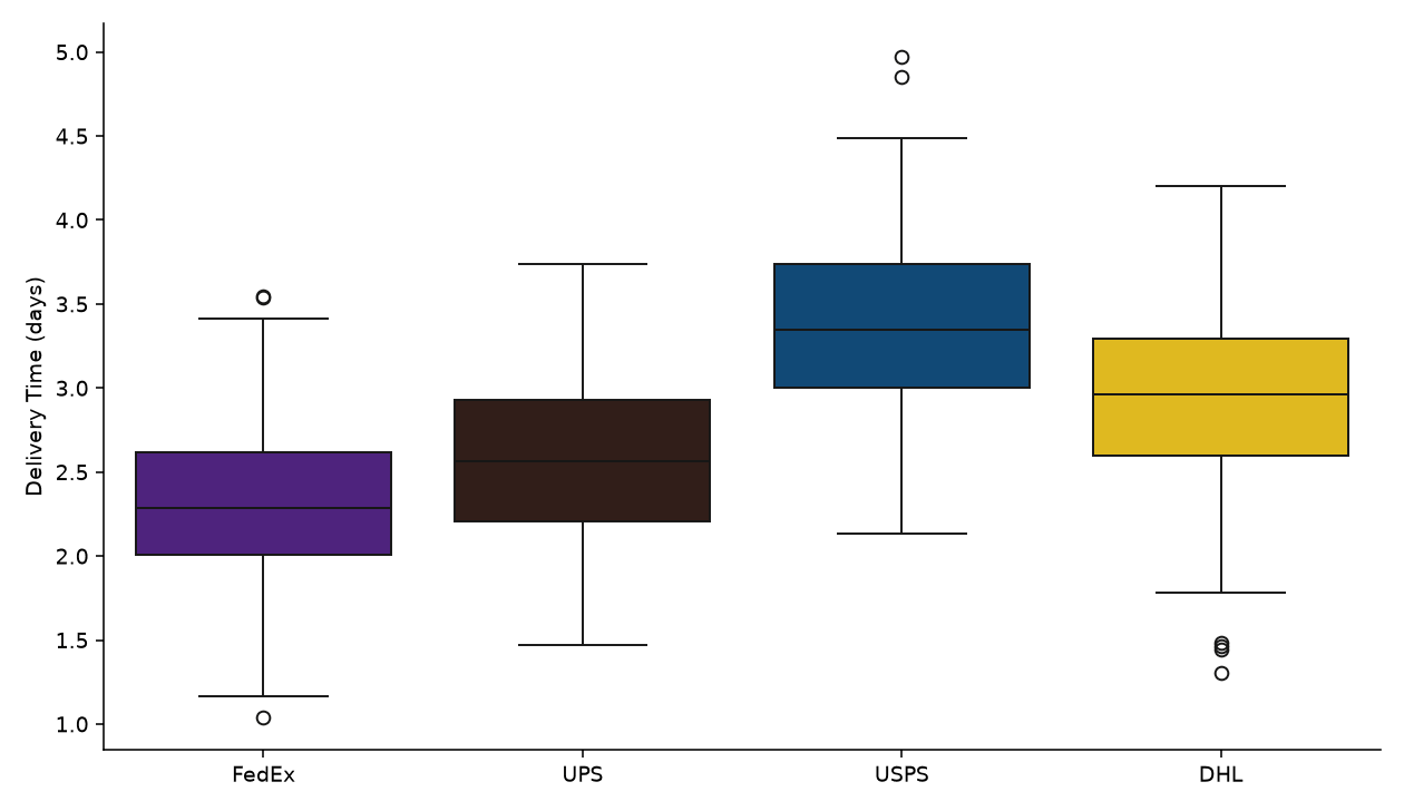
This is the version to reach for when a category needs a fixed, recognizable color, like a brand's own color, a status ("good"/"bad"), or any label that shows up across several charts and should look the same in every one of them.
Diverging palettes for data with a meaningful zero
A sequential palette assumes low-to-high is the only thing that matters. When values can be positive or negative around a real zero point, like growth rates, a diverging palette makes the sign of the value visible at a glance. sns.diverging_palette() builds one from two hues.
diverging = sns.diverging_palette(15, 145, s=75, l=45, n=256)

norm = plt.Normalize(-df["growth"].abs().max(), df["growth"].abs().max())
bar_colors = [diverging[int(norm(v) * 255)] for v in df["growth"]]

fig, ax = plt.subplots()
sns.barplot(data=df, x="department", y="growth", hue="department",
            palette=bar_colors, legend=False, ax=ax)
ax.axhline(0, color="#444444", linewidth=0.9)
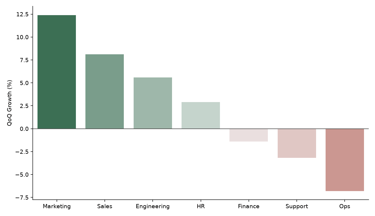
The two hue arguments (15 and 145 above) are positions on the color wheel, red and green in this case. s and l control saturation and lightness, and n sets how many discrete steps the palette is split into. Normalizing each value to a 0–255 index before indexing into the palette is what centers the color scale on zero rather than on the data's midpoint.
Set a palette for the whole session
Calling sns.set_palette() once applies a palette to every plot for the rest of the session, so you are not repeating palette=... on each call.
sns.set_palette(custom_colors)

# Every plot from here on uses custom_colors automatically.
sns.barplot(data=df, x="category", y="revenue", ax=ax)
This is worth doing early in a notebook or script if a project has a consistent set of brand or theme colors, rather than passing the same list into every chart function.
Practical Tips
- Use a plain list when color order should just follow category order on the axis; use a dictionary when specific categories need specific, stable colors.
- Sequential palettes (
"mako","rocket","crest") suit ordered or ranked data; diverging palettes suit signed data with a meaningful zero. sns.color_palette(name, n_colors=n)returns the actual color list, useful for previewing a palette or reusing the same colors in a legend built by hand.- Recent Seaborn versions want a
huecolumn alongsidepalette, even for single-variable plots; pair it withlegend=Falseto avoid a redundant legend. - Call
sns.set_palette()once at the top of a notebook instead of repeating the samepaletteargument on every chart.