
A plain sns.heatmap() gets the pattern across, but styling decides how easily readers can extract the exact numbers. This post covers the two big levers: annotating the values and masking the cells you do not want shown.
Quick Example
Turn on annot=True to draw each value in its cell, fmt to control its format, and annot_kws to style the text.
import matplotlib.pyplot as plt
import seaborn as sns

fig, ax = plt.subplots()
sns.heatmap(
    data,
    annot=True,
    fmt=".1f",
    annot_kws={"size": 12},
    cmap="mako",
    ax=ax,
)
This example uses conversion rates (percent) by marketing channel and device, a small matrix where exact values matter.
Annotate the values
annot=True is the switch that prints the number inside every cell. fmt tells it how to format those numbers.
sns.heatmap(
    conv,
    annot=True,
    fmt=".1f",
    cmap="mako",
    linewidths=0.5,
    linecolor="white",
    annot_kws={"size": 12, "color": "white"},
    cbar_kws={"label": "Conversion %"},
)
fmt=".1f"keeps one decimal place.fmt="d"prints whole integers.linewidthsandlinecoloradd the white grid that separates cells.
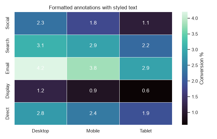
The white annotation text (annot_kws={"color": "white"}) is readable against the darker mako cells. On a light colormap, leave the text black.
Annotate with strings
Sometimes you want more than the raw number. Pass a DataFrame of strings to annot and heatmap prints exactly those strings.
conv_str = conv.map(lambda v: f"{v:.1f}%")

sns.heatmap(
    conv,
    annot=conv_str,
    fmt="",
    cmap="YlOrBr",
    linewidths=0.5,
    linecolor="white",
    annot_kws={"size": 12},
)
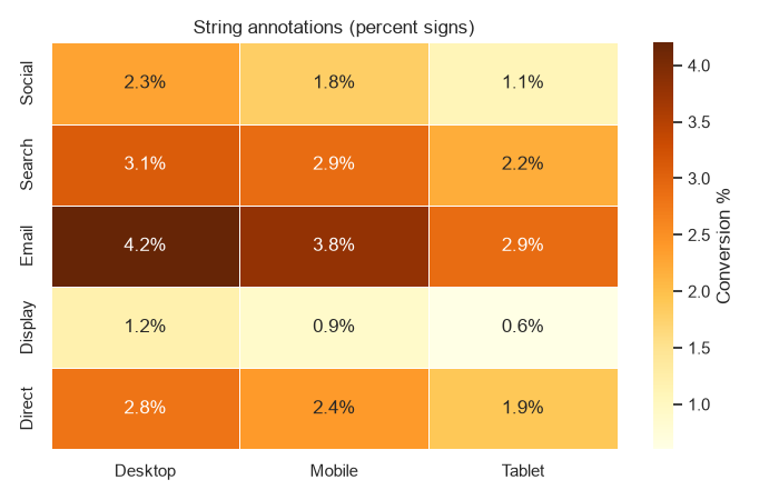
Building the label with .map() lets you append a %, add a currency symbol, or abbreviate to thousands, all while the cell color still comes from the numeric data.
Style the annotation text
annot_kws forwards keyword arguments to the text objects, so you can change the font size, weight, and color.
annot_kws={"size": 12, "color": "white", "va": "center", "ha": "center"}
A font size between 10 and 14 keeps labels legible without crowding the cells. When a heatmap mixes light and dark cells, you can set the text color to match whichever end of the colormap your important cells sit on.
Mask cells with a threshold
Masking hides cells you do not want to read. The mask argument takes a boolean array of the same shape as the data, and heatmap leaves every True cell blank. A threshold mask is a clean way to focus attention on the strong performers.
mask = conv < 1.5

sns.heatmap(
    conv,
    mask=mask,
    annot=True,
    fmt=".1f",
    cmap="YlOrBr",
    linewidths=0.5,
    linecolor="white",
)
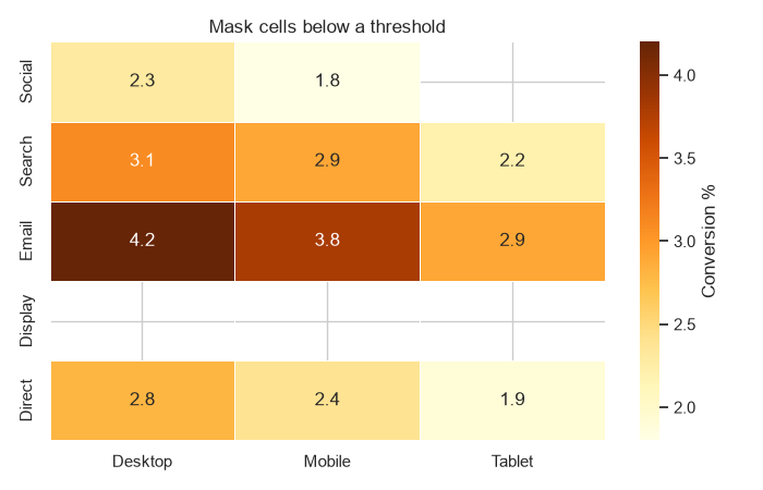
Here every channel-device combination with a conversion rate under 1.5% is blank, so the eye lands on the rows that clear the bar.
Mask missing data
Missing combinations should not be drawn as zeros. Build a boolean mask from the NaNs and pass it to mask so those cells stay empty.
conv_nan = conv.copy()
conv_nan.loc["Display", "Tablet"] = np.nan

sns.heatmap(
    conv_nan,
    mask=conv_nan.isna(),
    annot=True,
    fmt=".1f",
    cmap="YlOrBr",
)
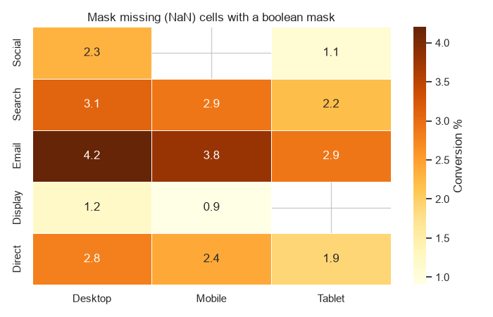
conv_nan.isna() is True exactly where the data is missing, so those cells render blank instead of implying a value of zero.
Practical Tips
- Use
annot=Trueon small matrices; for large ones, turn annotations off and let the colorbar carry the values. - Use
fmtfor plain numbers and a DataFrame of strings for anything richer like percentages or currency. - Style the text with
annot_kws, and pick a text color that matches your colormap's darker end. - Build threshold masks with a comparison like
mask = data < valueto hide unimportant cells. - Use
data.isna()as the mask when a missing combination genuinely means "no data", not zero.