
Long category names on the x-axis overlap and become unreadable, and the problem multiplies when there are several facets. This post shows the couple of lines it takes to rotate those labels on a FacetGrid (including catplot) and on a pairplot.
Quick Example
Call set_xticklabels() on the grid and pass rotation. It applies to every facet axis at once.
import seaborn as sns

g = sns.catplot(data=df, x="department", y="score", col="quarter", kind="box")
g.set_xticklabels(rotation=45)
This rotates the x-axis labels on all three facet axes. Add ha="right" to align them so they do not look randomly slanted.
Why labels need rotating
Seaborn defaults keep tick labels horizontal. That is fine for short names, but a category like "Customer Success" or "Product Engineering" is too wide, and across multiple facets the labels butt into each other and the axis titles.
g = sns.catplot(data=df, x="department", y="score", col="quarter", kind="box")
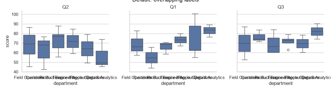
Rotate labels on a FacetGrid
FacetGrid, which powers catplot, relplot, and lmplot, has a set_xticklabels() method that rotates the tick labels on every subplot in one call.
g = sns.catplot(data=df, x="department", y="score", col="quarter", kind="box")
g.set_xticklabels(rotation=45)
for label in g.axes.flat[0].get_xticklabels():
    label.set_ha("right")
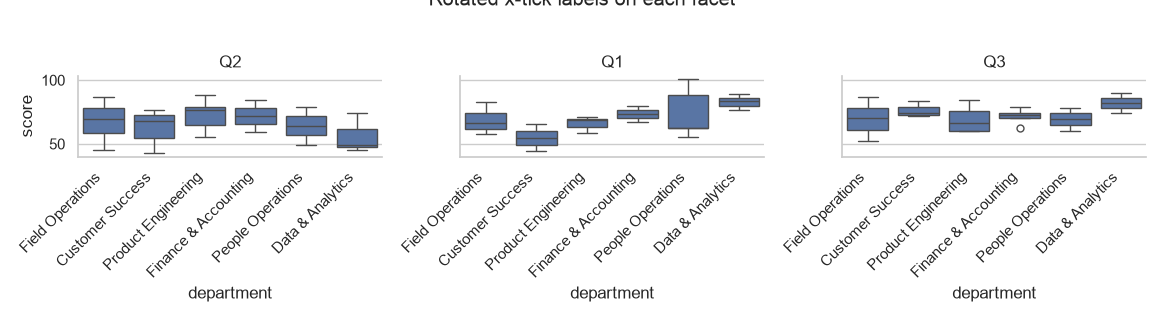
The ha="right" (horizontal alignment) step cants the labels the natural way: each text hangs from its tick. Compare this to the default image above.
The manual loop alternative
When you want more control, or when you are building a grid by hand, loop over the axes and use tick_params. This sets rotation on every axis individually and works anywhere seaborn draws a categorical axis.
for ax in g.axes.flat:
    ax.tick_params(axis="x", rotation=45)
Matplotlib.pyplot.setp is another way to target the tick label text objects directly:
import matplotlib.pyplot as plt

for ax in g.axes.flat:
    plt.setp(ax.get_xticklabels(), rotation=45, ha="right")
Rotate labels on a pairplot
A pairplot returns a PairGrid, which also exposes .axes.flat. Loop over it to rotate the numeric tick labels on every small axis.
g = sns.pairplot(df, hue="program")

for ax in g.axes.flat:
    ax.tick_params(axis="both", rotation=30)
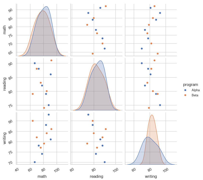
Using axis="both" rotates both the x and y ticks. You can also rotate only the diagonal labels or only the legend text by targeting those objects instead.
Practical Tips
- Use
g.set_xticklabels(rotation=45)as the quick fix for acatplotorrelplot. - Add
ha="right"so rotated labels line up under their ticks instead of drifting. - Loop over
g.axes.flatwhen you use a manualFacetGridor apairplot(PairGrid). - Prefer
tick_paramsfor clean control over only the x- or y-axis. - Rotate just enough (30-45 degrees) to fix overlap; overly steep angles are harder to read.