
A bivariate distribution shows how two variables behave together. Seaborn's jointplot() puts the relationship in the center and the distribution of each variable on the margins, so you get three views of the data in one figure.
Quick Example
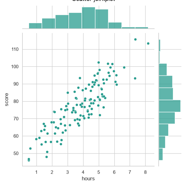
Pass a dataframe and two column names to sns.jointplot(). The default layout is a scatter plot in the center with a histogram of each variable along the sides and top.
import seaborn as sns

g = sns.jointplot(data=df, x="hours", y="score", kind="scatter")
Set kind to change how the center displays the relationship. "scatter" is the default, with "hex", "kde", "reg", and "resid" available.
The jointplot layout
The figure has three parts: the main axes in the middle, a histogram across the top for the x variable, and a histogram up the right side for the y variable. That small addition is the whole point, since it shows the overall shape of each variable alongside how the two relate.
g = sns.jointplot(data=df, x="hours", y="score", kind="scatter",
                  color="#2a9d8f", height=6)
Choose a kind
The kind argument controls the center panel.
# Scatter with a regression line.
sns.jointplot(data=df, x="hours", y="score", kind="reg")

# Hex bins, fast and clean for dense data.
sns.jointplot(data=df, x="hours", y="score", kind="hex")
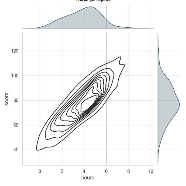
KDE contours are a strong choice when you want smoothed density rather than individual points, and a continuous color shows the peaks clearly.
sns.jointplot(
    data=df, x="hours", y="score", kind="kde",
    marginal_kws=dict(color="#264653", fill=True),
)
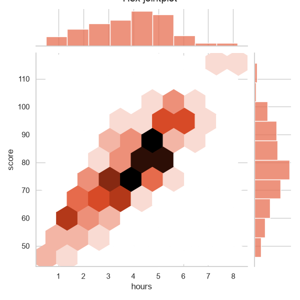
For dense scatter, kind="hex" bins the points into hexagons colored by count, which avoids the mess of thousands of overlapping dots and speeds up rendering.
Split by a hue
jointplot accepts hue to color points by a group, and it draws the marginal histograms for each group so you can compare their shapes.
sns.jointplot(
    data=df, x="hours", y="score", hue="program",
    palette=["#6366f1", "#f59e0b", "#10b981"],
)
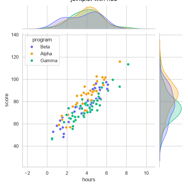
When the groups have different sample sizes, set marginal_kws=dict(common_norm=False) so each histogram is normalized on its own group instead of the combined total.
Control the margins and layout
marginal_kws customizes the marginal plots, and layout options size the whole figure.
g = sns.jointplot(
    data=df, x="hours", y="score", kind="scatter",
    color="#2a9d8f",
    height=6,          # height in inches
    ratio=5,           # center-to-margin size ratio
    space=0.2,         # gap between center and margins
    marginal_kws=dict(hist_kws=dict(alpha=0.6)),
)
height sets the figure height and width on a square grid. ratio and space trade space between the center plot and the margins.
Style the points
Like most Seaborn functions, jointplot forwards plotting keywords through matching arguments.
g = sns.jointplot(data=df, x="hours", y="score", kind="scatter",
                  color="#1f77b4", alpha=0.6, s=20,
                  marginal_kws=dict(rwidth=0.85))
Use alpha and s to stop the center dots from piling into a blob, and marginal_kws to adjust the histograms, such as rwidth to space the bars.
Practical Tips
- Use
kind="scatter"for small-to-medium data andkind="hex"for dense data. - Choose
kind="kde"for smoothed density or when exact point positions do not matter. - Pass
hueto compare groups, and setcommon_norm=Falseinmarginal_kwsfor unequal group sizes. - Tune
height,ratio, andspaceto balance the center and the margins. - Use
alphaandsinscatter_kws/jointplotkwargs to keep the center readable.