
A ridge plot (also called a joyplot, after the Joy Division album cover it resembles) stacks a distribution per category into overlapping ridges instead of side-by-side subplots. It's a good fit when you have several groups and want to compare the shape of each group's distribution at a glance, not just its mean. Seaborn doesn't have a one-line ridgeplot() function, but it builds cleanly from a FacetGrid of overlapping KDE curves.
Quick Example
Build one KDE per category on a FacetGrid, then pull the rows on top of each other with negative hspace.
import matplotlib.pyplot as plt
import seaborn as sns

sns.set_theme(style="white", rc={"axes.facecolor": (0, 0, 0, 0)})
palette = sns.cubehelix_palette(len(order), rot=-0.25, light=0.7)

g = sns.FacetGrid(df, row="department", hue="department", row_order=order,
                   hue_order=order, aspect=6, height=1.0, palette=palette)
g.map(sns.kdeplot, "commute_minutes", fill=True, alpha=0.9, linewidth=1.2)
g.map(sns.kdeplot, "commute_minutes", color="w", linewidth=2)
g.refline(y=0, linewidth=1.5, linestyle="-", color=None, clip_on=False)
g.figure.subplots_adjust(hspace=-0.5)
g.set_titles("")
g.set(yticks=[], ylabel="")
g.despine(bottom=True, left=True)
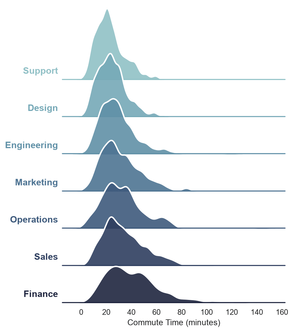
Each row is its own tiny subplot with its own y-axis; the negative hspace is what pulls those rows into each other so the taller ridges spill up into the row above.
How the overlap works
row="department" gives every category its own facet, stacked vertically in the order you specify with row_order. Normally subplots_adjust(hspace=...) only takes positive values to add space between subplots; passing a negative value pulls rows past zero spacing and into overlap. The two kdeplot calls draw the same curve twice: once filled with color, once as a plain white outline on top, which is what keeps each ridge readable where it crosses the ridge behind it.
g.figure.subplots_adjust(hspace=0.3)    # normal spacing, no overlap
g.figure.subplots_adjust(hspace=-0.7)   # heavy overlap
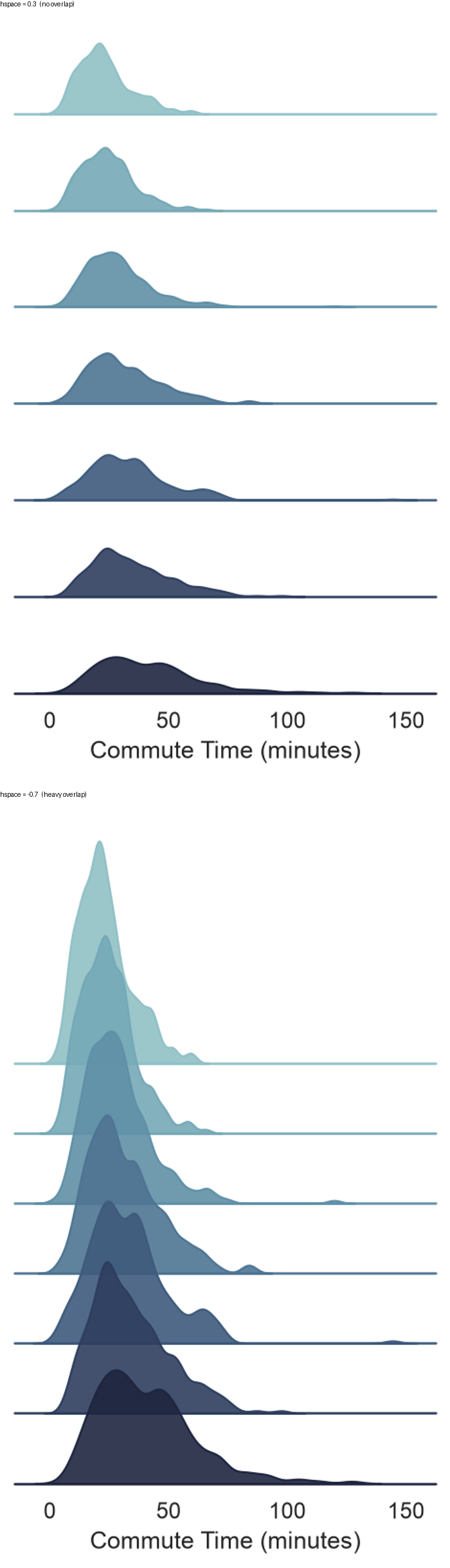
There's no single right amount of overlap. Something around -0.4 to -0.6 is a common starting point: enough for the ridges to read as one continuous shape without one distribution completely burying the row behind it.
The transparent facecolor gotcha
Overlap only looks right if each facet's background is transparent. Left at the default opaque white, every row's axes background is a solid rectangle that clips off whatever ridge is poking up from the row beneath it.
sns.set_theme(style="white", rc={"axes.facecolor": (0, 0, 0, 0)})
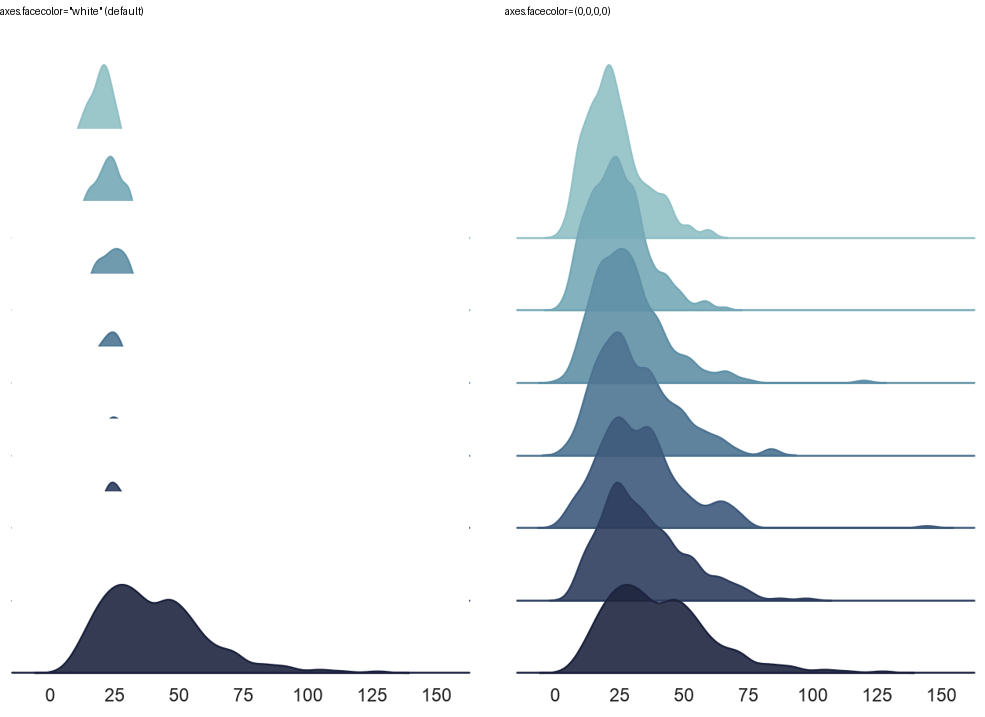
Set this before creating the FacetGrid, since it's a global rc setting rather than a per-plot argument. It's the single most common reason a ridge plot comes out looking like a row of amputated triangles instead of overlapping curves.
Color palettes for ridge plots
Any Seaborn palette works with hue, but sequential palettes read especially well on a ridge plot since the color gradient reinforces the vertical order of the categories.
palette = sns.color_palette("rocket", len(order))
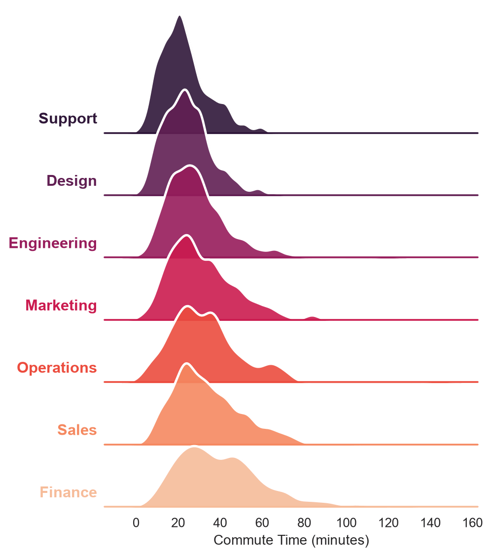
Sort row_order by each group's mean, minimum, or another meaningful statistic (df.groupby("department")["commute_minutes"].mean().sort_values().index) rather than leaving it alphabetical; a sequential palette paired with a meaningful sort is what makes the color progression actually mean something instead of just looking nice.
Practical Tips
- Set
rc={"axes.facecolor": (0, 0, 0, 0)}insns.set_theme()before building theFacetGrid, or every row's background will clip the ridge above it. - Sort
row_orderby a real statistic (mean, median) rather than leaving it alphabetical, especially when using a sequential palette. - Start around
hspace=-0.5and adjust from there; too little overlap looks like a plain small-multiples grid, too much buries the shorter distributions. - Drawing the KDE twice, once filled and once as a white outline on top, keeps overlapping ridges visually separable; skip the white outline pass for a softer, more blended look instead.
bw_adjustonkdeplotsmooths or sharpens each ridge's curve; lower it if the distributions look artificially smooth, raise it if they look noisy.