
A grouped bar chart splits each category into a cluster of smaller bars, one per subgroup, so two variables can sit side by side instead of stacking or averaging together. Seaborn builds this automatically from a hue column, no manual bar offsets required.
Quick Example
Pass one column to x and a second to hue, and barplot() clusters a bar per hue value within each x category.
import seaborn as sns

fig, ax = plt.subplots(figsize=(9, 5))
sns.barplot(data=df, x="quarter", y="revenue", hue="region", ax=ax)
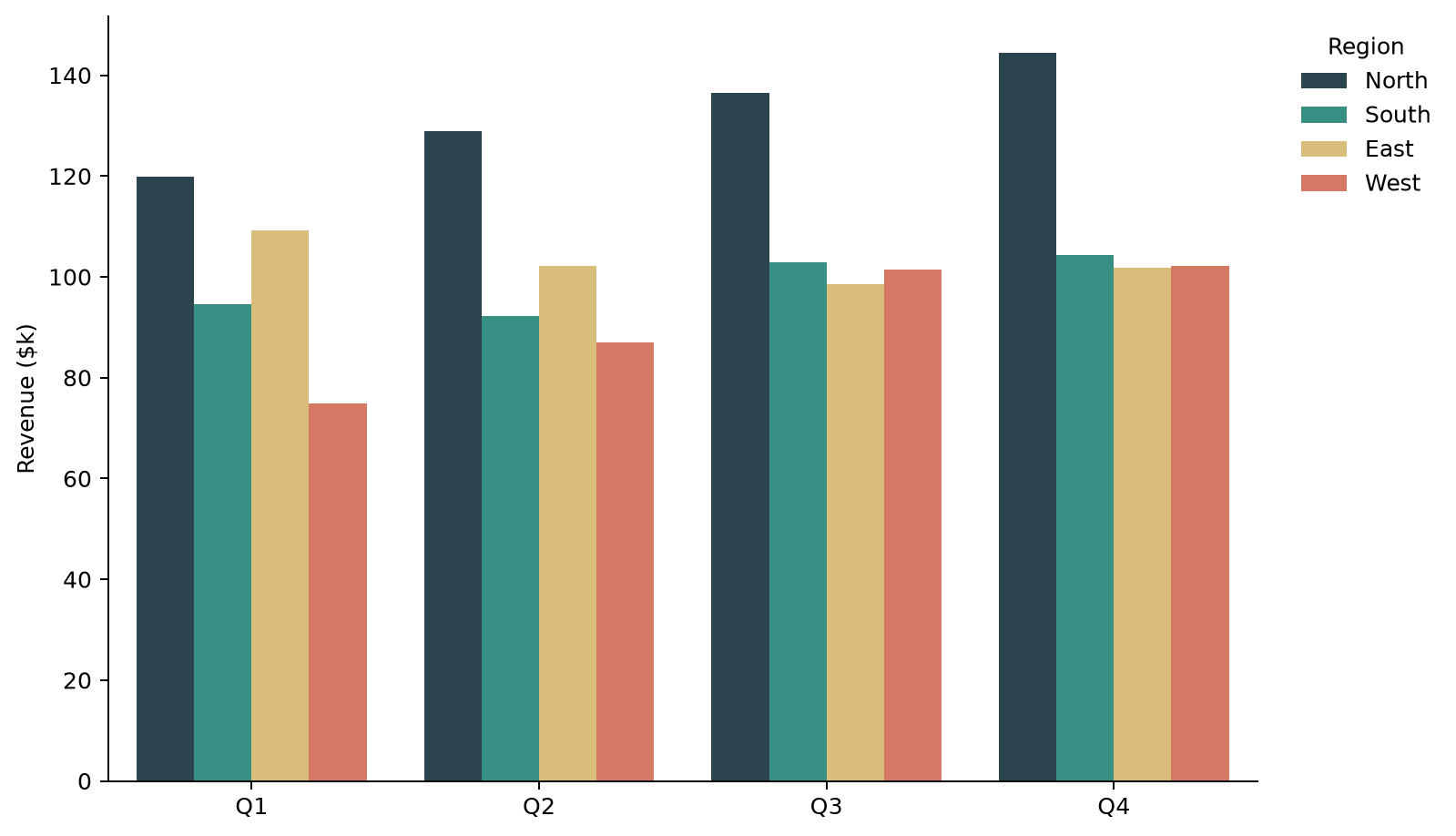
Seaborn handles the bar width and spacing on its own. This is the whole difference from a plain barplot(): adding hue is what turns single bars into grouped clusters.
How grouping works
Internally, Seaborn dodges the bars, meaning it narrows each bar and nudges it sideways so every hue value gets its own slot within the x category instead of overlapping. This is the same idea as manually offsetting bars in matplotlib with bar(), but Seaborn works out the positions and widths for you based on how many hue levels there are.
Each quarter above holds four bars, one per region, and the color mapping in the legend tells you which bar is which without needing to label every bar directly.
Control the order of categories and groups
By default, x categories and hue groups both appear in the order pandas encounters them, alphabetical for strings. order and hue_order set an explicit order for each independently.
region_order = ["West", "North", "East", "South"]

fig, ax = plt.subplots(figsize=(9, 5))
sns.barplot(data=df, x="quarter", y="revenue", hue="region",
            hue_order=region_order, ax=ax)
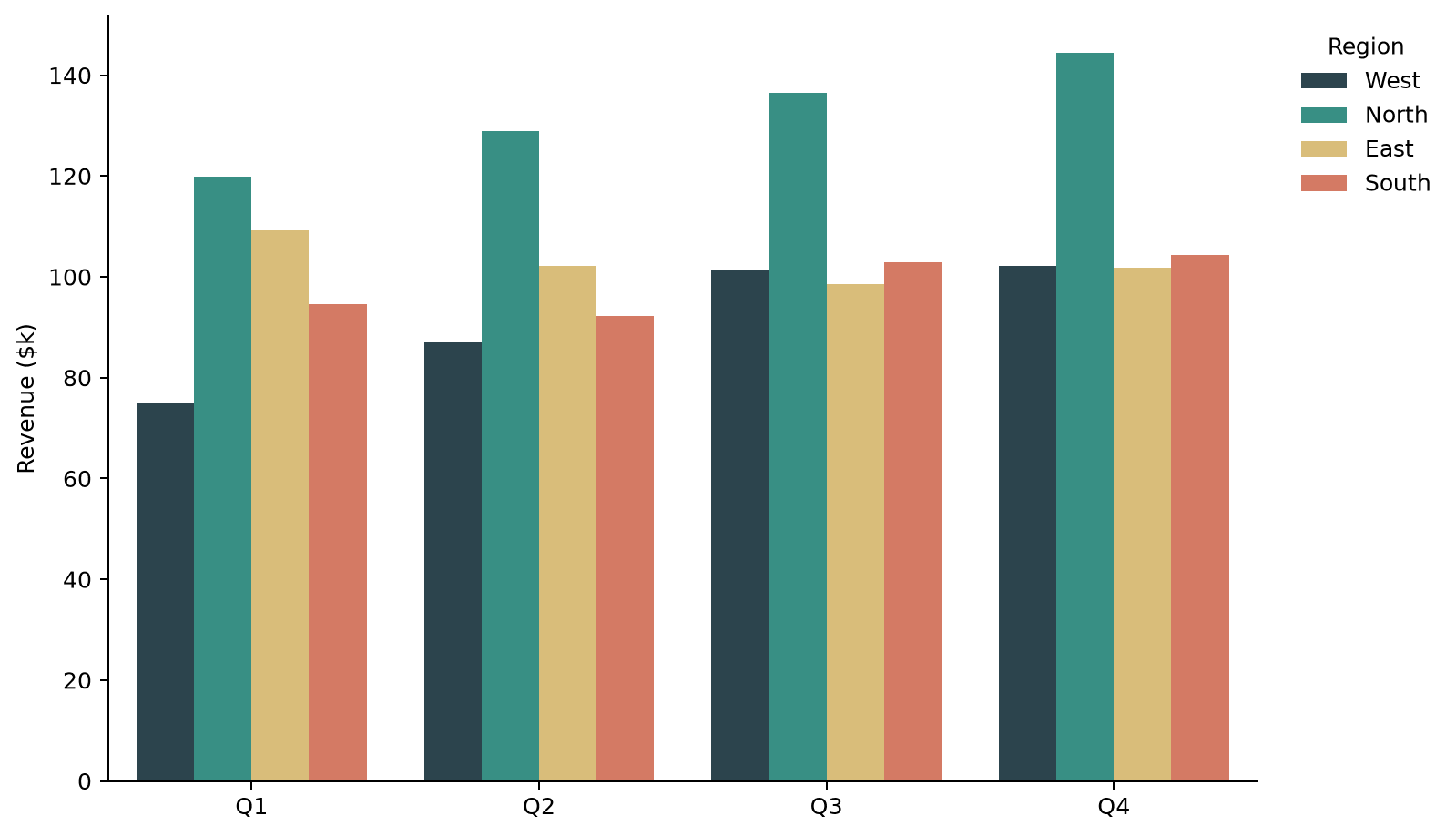
order reorders the x-axis categories the same way; use it when the categories are not something pandas would sort correctly on its own, like month names or a custom priority ranking.
Adjust spacing between bars
Recent Seaborn versions expose a gap argument that controls the space between bars within the same group, given as a fraction of the bar width.
sns.barplot(data=df, x="quarter", y="revenue", hue="region", gap=0.2, ax=ax)
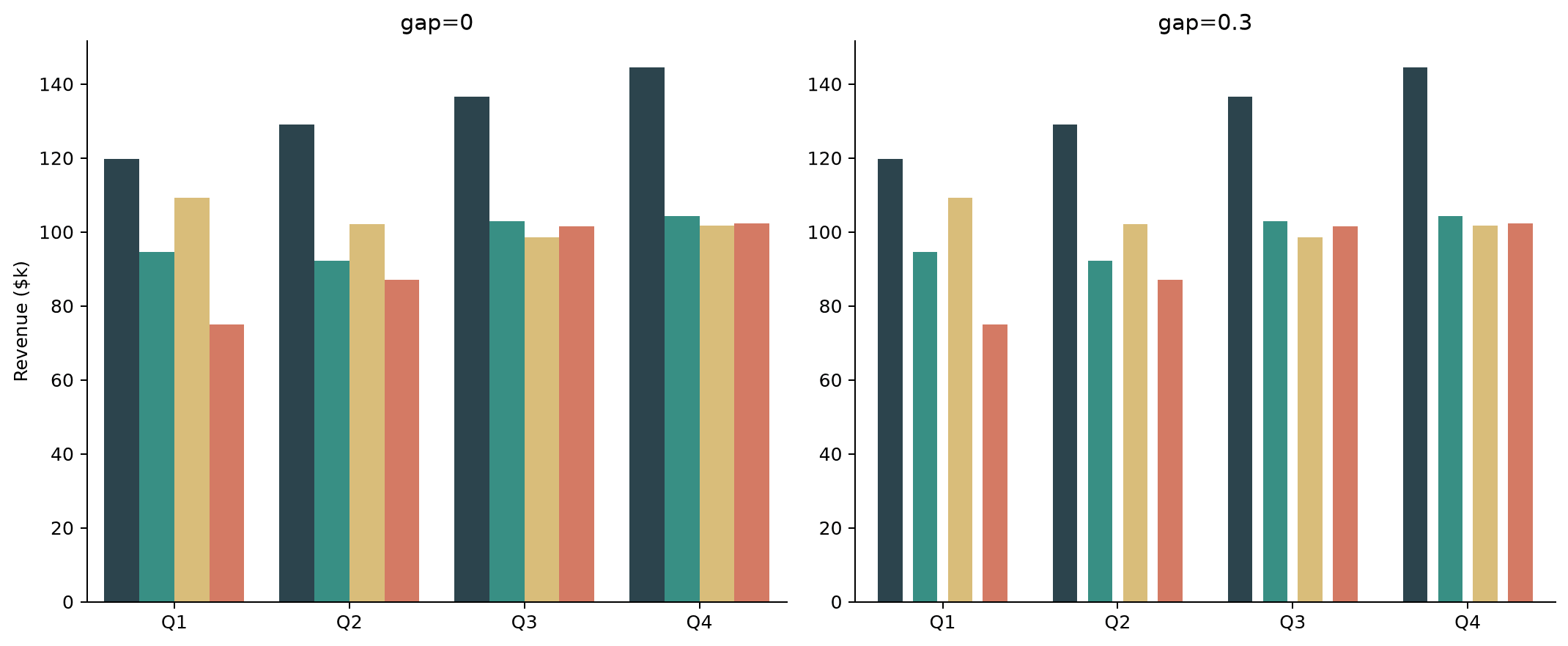
gap=0 (the effective default) packs bars edge to edge within a group; increasing it toward 0.3 or higher separates them and makes each group read more clearly as a distinct cluster, at the cost of making the individual bars a bit narrower.
Horizontal grouped bar charts
Swap what goes on x and y and add orient="h" to lay the same grouped chart out horizontally, which tends to fit long category labels better than rotating text on a vertical axis.
fig, ax = plt.subplots(figsize=(9, 6))
sns.barplot(data=df, x="revenue", y="quarter", hue="region",
            orient="h", ax=ax)
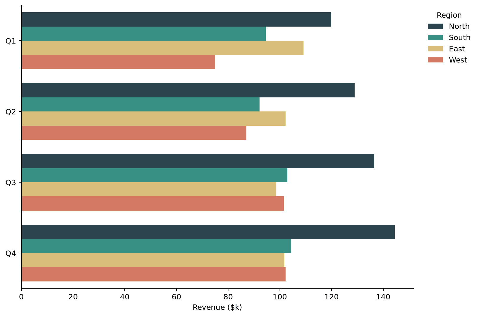
The grouping logic stays the same, just rotated: each y category holds one dodged cluster of bars instead of each x category.
Adding value labels
Grouped bars pull one thing along for the ride: ax.containers now holds one container per hue group instead of just one. Loop over all of them to label every bar.
for container in ax.containers:
    ax.bar_label(container, fmt=lambda v: f"${v:,.0f}k")
The bar label post covers formatting and positioning those labels in more depth.
Practical Tips
- Adding
hueis the only change needed to turn a regularbarplot()into a grouped one; Seaborn computes the dodge automatically. - Set
orderandhue_orderexplicitly whenever alphabetical or first-seen ordering is not the order you actually want, such as month names or a fixed priority. - Use
gapto loosen up crowded groups; a small gap (0.1–0.2) is usually enough to visually separate clusters without shrinking bars too much. - Switch to
orient="h"withx/yswapped when category labels are long enough to crowd a vertical axis. - Loop over
ax.containersto label every group's bars, not justax.containers[0], oncehueis involved.