
TL;DR
A Gantt chart shows tasks as horizontal bars on a timeline. Each bar runs from when a task starts to when it finishes, so you can see the sequence and overlap of a whole project at a glance. Plotly's px.timeline() builds one from a dataframe with Start and Finish date columns.
import pandas as pd
import plotly.express as px

df = pd.DataFrame({
    "Task":   ["Design", "Development", "Launch", "Support"],
    "Start":  pd.to_datetime(["2026-03-02", "2026-03-23", "2026-06-22", "2026-07-06"]),
    "Finish": pd.to_datetime(["2026-04-24", "2026-05-29", "2026-06-30", "2026-08-14"]),
})

fig = px.timeline(df, x_start="Start", x_end="Finish", y="Task")
fig.update_yaxes(autorange="reversed")
fig.show()
Each row becomes one horizontal bar. Hover a bar to see the task name and its date range, and use the mode bar to zoom and pan along the timeline.
What a Gantt chart is for
A Gantt chart answers "what runs when" for a set of tasks. Use it when you need to show:
- the start and end dates of each task
- which tasks run in parallel
- the critical path through a schedule
- how long the whole project takes
It is a project-planning staple, but the same horizontal-timeline layout works for release plans, campaign calendars, and onboarding tracks.
Build it with px.timeline
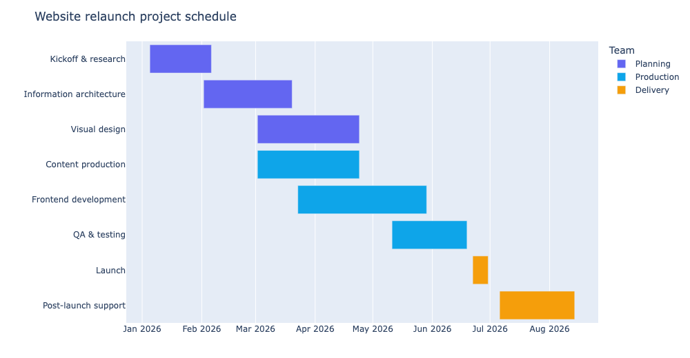
px.timeline() needs an x_start, an x_end, and a y category. Feed it the full schedule:
import pandas as pd
import plotly.express as px

df = pd.DataFrame({
    "Task": [
        "Kickoff & research",
        "Information architecture",
        "Visual design",
        "Content production",
        "Frontend development",
        "QA & testing",
        "Launch",
        "Post-launch support",
    ],
    "Team": [
        "Planning", "Planning", "Planning",
        "Production", "Production", "Production",
        "Delivery", "Delivery",
    ],
    "Start": pd.to_datetime([
        "2026-01-05", "2026-02-02", "2026-03-02", "2026-03-02",
        "2026-03-23", "2026-05-11", "2026-06-22", "2026-07-06",
    ]),
    "Finish": pd.to_datetime([
        "2026-02-06", "2026-03-20", "2026-04-24", "2026-04-24",
        "2026-05-29", "2026-06-19", "2026-06-30", "2026-08-14",
    ]),
})

fig = px.timeline(
    df,
    x_start="Start",
    x_end="Finish",
    y="Task",
    color="Team",
    color_discrete_sequence=["#6366f1", "#0ea5e9", "#f59e0b"],
)
fig.update_yaxes(autorange="reversed")
fig.show()
Make sure Start and Finish are datetime values. Passing them in pd.to_datetime(...) keeps Plotly from treating them as plain categories.
Order the tasks
By default px.timeline() stacks bars top to bottom. fig.update_yaxes(autorange="reversed") flips the axis so the first task appears at the top, matching how you normally read a schedule. It is a one-liner but easy to forget.
Color by team or phase
Pass color to shade bars by whoever owns or which phase defines them. In the example, planning tasks are indigo, production is sky blue, and delivery is amber. That turns a bland schedule into something you can scan for who is responsible where.
fig = px.timeline(
    df,
    x_start="Start",
    x_end="Finish",
    y="Task",
    color="Team",
)
Drop color if you do not need the grouping and want a single color for every bar.
Interact with it
The embedded chart above is a real Plotly figure, so readers get more than a static image:
- hover a bar to see the task and its exact date range
- zoom in on a section of the timeline with the box or lasso tools
- pan left and right to follow the schedule
- the legend lets you toggle teams on and off
Zooming into a busy stretch of a Gantt is where the interactivity really earns its keep.
Styling tweaks
A few layout options tidy up the default output:
fig.update_layout(
    title="Website relaunch project schedule",
    xaxis_title="",
    yaxis_title="",
    width=1000,
    height=520,
    margin=dict(t=60, l=10, r=10, b=10),
    legend_title_text="Team",
)
px.timeline() draws bars from x_start to x_end already, so you rarely need to touch the axis ranges by hand. Clearing the empty axis titles and sizing the figure avoids a cluttered look.
A few practical tips
- Keep
StartandFinishas real dates so the bar lengths are accurate. - Use
autorange="reversed"to keep the header task on top. - Group bars by color when a project has several owners or phases.
- Do not overload the chart with dozens of tasks. A Gantt reads best when every bar is tall enough to hover and label.
- For due-date checklists on a calendar rather than a project schedule, Plotly also has built-in calendar annotations if you want to go that direction.