
TL;DR
A candlestick chart shows the open, high, low, and close (OHLC) price for each period. Each candle's body runs from open to close, and the wicks mark the high and low. A filled green candle means the close was above the open (an up day); a red candle means the close was below the open. In Plotly, go.Candlestick() draws them from four price arrays.
import plotly.graph_objects as go

fig = go.Figure(
    data=go.Candlestick(
        x=["2026-05-04", "2026-05-05", "2026-05-06"],
        open=[100.0, 100.0, 100.0],
        high=[100.82, 100.93, 100.88],
        low=[99.61, 99.99, 99.6],
        close=[100.0, 100.0, 100.36],
    )
)
fig.show()
Give go.Candlestick() matching open, high, low, and close lists and it handles the rest. Hover any candle to read its full OHLC, and use the mode bar to zoom and pan across the price history.
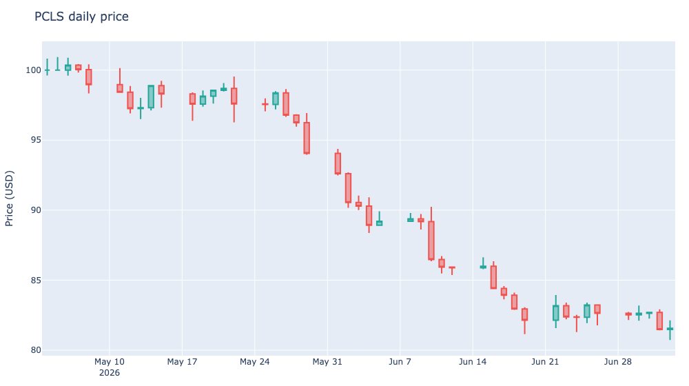
What a candlestick chart is for
Candlesticks are the standard way traders and analysts read price action. Each candle packs four numbers into one shape:
- the body spans from open to close
- the upper wick reaches to the high
- the lower wick reaches to the low
- the body color tells you whether the close was above (up) or below (down) the open
That single shape communicates a lot: a tall body means a strong move, long wicks mean the price swung and reversed, and a string of green or red bodies reveals momentum. There is no plotly.express version of a candlestick, so you use plotly.graph_objects directly.
Color the up and down candles
Plotly colors the candles for you, but you should set the palette so the direction is obvious. By default, up days are one color and down days are another.
import plotly.graph_objects as go

fig = go.Figure(
    data=go.Candlestick(
        x=dates,
        open=open_prices,
        high=high_prices,
        low=low_prices,
        close=close_prices,
        increasing_line_color="#26a69a",
        decreasing_line_color="#ef5350",
        name="PCLS",
    )
)
increasing_line_color controls up days and decreasing_line_color controls down days. The teal green and red pair above matches the default Plotly financial theme.
Turn off the range slider
Candlesticks come with a range slider under the chart by default. It is handy for scrubbing, but it eats vertical space. On a blog post you usually want it off:
fig.update_layout(
    title="PCLS daily price",
    xaxis_rangeslider_visible=False,
    yaxis_title="Price (USD)",
)
Set xaxis_rangeslider_visible=False to hide it and give the candles the full height.
Add a moving average
Traders often overlay a moving average to smooth out the noise. Use go.Scatter on the same figure:
import pandas as pd

ma = pd.Series(close_prices).rolling(5).mean()

fig.add_trace(
    go.Scatter(
        x=dates,
        y=ma,
        mode="lines",
        line=dict(color="#f58518", width=2),
        name="5-day MA",
    )
)
Adding the trace keeps the candlesticks and the average in one interactive figure, and the legend lets readers toggle the line on and off.
Interact with it
The embedded chart above is a live Plotly figure, not an image:
- hover a candle to read its open, high, low, and close
- use the box or lasso zoom to focus on a price range
- pan along the axis to follow the series
- the mode bar lets you reset the view or save the figure
Cross-hair zoom is the real payoff. Narrowing in on a few days of candles is exactly what you cannot do with a static screenshot.
A few practical tips
- Keep the four arrays aligned. If the lists are different lengths, Plotly will drop the mismatch and the chart will silently look wrong.
- Use increasing/decreasing colors that read clearly against your plot background.
- Hide the range slider unless readers actually need to scrub a long history.
- Candlesticks are for time series OHLC data. For a simple line of a single value over time, a regular
go.Scatteris lighter. - Consider a moving average overlay when the raw candles are too noisy to read by eye.