
TL;DR
A sunburst chart shows hierarchical data as concentric rings. Each ring is one level of the hierarchy, and the size of each arc is proportional to its value. With Plotly, px.sunburst() builds one from a tidy dataframe in a few lines.
import pandas as pd
import plotly.express as px

df = pd.DataFrame({
    "Category": ["Electronics", "Electronics", "Apparel", "Apparel", "Books"],
    "Product":  ["Laptops", "Phones", "Tops", "Bottoms", "Fiction"],
    "Sales":    [250, 210, 151, 95, 83],
})

fig = px.sunburst(
    df,
    path=["Category", "Product"],
    values="Sales",
    branchvalues="total",
)
fig.show()
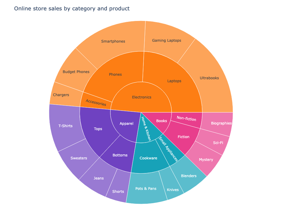
The inner ring is the top level (Category), and the outer ring splits each category into products. Hover over any slice to see its value, and click a slice to zoom into it. Double-click to zoom back out.
What a sunburst chart is for
Sunburst charts shine when you have a hierarchy with two or more levels and you want to see the proportions at every level at once. A pie chart only compares one level. A sunburst stacks the levels so you can trace how a top-level slice splits into its parts.
Common uses:
- product category, subcategory, and item breakdowns
- website or campaign traffic by channel and landing page
- segment, region, and territory rollups
- any tree where the size of each node matters
The tradeoff: sunbursts get hard to read past three or four levels. Keep the tree shallow and the labels short.
Build it with plotly.express
px.sunburst() takes a tidy dataframe. Pass the hierarchy columns to path in order from outermost to innermost, and give values a numeric column.
import pandas as pd
import plotly.express as px

df = pd.DataFrame({
    "Category":    ["Electronics", "Electronics", "Electronics", "Electronics",
                    "Electronics", "Apparel", "Apparel", "Apparel", "Apparel",
                    "Home & Kitchen", "Home & Kitchen", "Home & Kitchen",
                    "Books", "Books", "Books"],
    "Subcategory": ["Laptops", "Laptops", "Phones", "Phones", "Accessories",
                    "Tops", "Tops", "Bottoms", "Bottoms",
                    "Cookware", "Cookware", "Small Appliances",
                    "Fiction", "Fiction", "Non-fiction"],
    "Product":     ["Ultrabooks", "Gaming Laptops", "Smartphones", "Budget Phones",
                    "Chargers", "T-Shirts", "Sweaters", "Jeans", "Shorts",
                    "Pots & Pans", "Knives", "Blenders",
                    "Mystery", "Sci-Fi", "Biographies"],
    "Sales":       [154, 96, 138, 72, 41, 88, 63, 57, 38, 75, 32, 51, 47, 36, 44],
})

fig = px.sunburst(
    df,
    path=["Category", "Subcategory", "Product"],
    values="Sales",
    branchvalues="total",
)
fig.show()
That gives the three-ring chart shown at the top of this post.
Understanding branchvalues
branchvalues controls how the arc sizes are computed, and it tripped me up the first time.
branchvalues="total"(the default inpx.sunburst) treats each node's value as the total of everything beneath it. Parent arcs fill in the gaps around their children, so the whole chart is one contiguous circle.branchvalues="remainder"treats only the leaf values as absolute. Each parent arc is sized exactly by its value, which can leave holes or overlap.
For a tidy hierarchy where parents are the sum of their children, keep the default "total".
Color by a level
Pass color to assign colors per group. Here I color each top-level category and let its children inherit the same color, which makes the four main branches easy to scan.
fig = px.sunburst(
    df,
    path=["Category", "Subcategory", "Product"],
    values="Sales",
    color="Category",
    color_discrete_sequence=["#6f42c1", "#e83e8c", "#fd7e14", "#17a2b8"],
    branchvalues="total",
)
You can also drop color and let Plotly cycle its default palette.
Interact with it
Sunbursts from Plotly are interactive out of the box:
- hover over a slice for its value
- click a slice to zoom into that branch
- double-click to zoom back out
- the mode bar lets you save the chart or toggle zoom types
These interactions are why sunbursts beat static nested treemaps or pie charts for exploratory work. On the blog, the chart is embedded directly so readers can click through it, not just look at a picture.
Styling tweaks
A few layout options make a big difference:
fig.update_layout(
    title="Online store sales by category and product",
    width=950,
    height=700,
    margin=dict(t=70, l=10, r=10, b=10),
)
fig.update_traces(
    textinfo="label+percent parent",
    insidetextorientation="radial",
    hovertemplate="<b>%{label}</b><br>Sales: $%{value}k<extra></extra>",
)
textinfocontrols what the labels show."label+percent parent"is a good balance;"none"cleans up crowded inner rings.insidetextorientation="radial"keeps text running along the slice instead of horizontal.hovertemplateformats the tooltip the same way you see in the other Plotly posts on this site.
A few practical tips
- Keep the hierarchy to three levels or fewer. Deep trees turn into thin, unreadable slivers.
- Make sure parent values are the real sums of their children, or the proportions will look wrong.
- If a slice is too small to label, let
textinfohide it rather than cramming text in. - Sunbursts are great for a top-down part-to-whole story. If you need a left-to-right flow instead, a Sankey diagram is the better fit.