TL;DR
A parallel coordinates plot draws one vertical axis per variable and connects every row with a line across those axes. It is the quickest way to compare many numeric dimensions at once and spot clusters or correlations. Plotly's px.parallel_coordinates() builds one from a dataframe in a few lines.
import pandas as pd
import plotly.express as px

df = pd.read_csv("cars.csv")  # columns: mpg, horsepower, weight, acceleration, ...

fig = px.parallel_coordinates(
    df,
    dimensions=["mpg", "horsepower", "weight", "acceleration"],
    color="mpg",
)
fig.show()
Each vertical line is a variable, and each polyline is one row of data. Drag an axis to reorder it, and brush (select a range on an axis) to highlight only the rows that pass through it.
What a parallel coordinates plot is for
Parallel coordinates shine when your data has several numeric columns and you want to compare them without a scatter plot for every pair. Each dimension gets an axis, and the lines between them reveal correlation and grouping:
- parallel, slanted lines between two axes indicate a correlation
- crossings imply a negative relationship
- groups of lines that stay together across all axes are clusters
They are a staple for high-dimensional data: car specs, sensor readings, model performance metrics, and survey results all benefit.
Build it with px.parallel_coordinates
px.parallel_coordinates() takes a dataframe and a dimensions list. Column order in that list is the order of the axes, so put related dimensions next to each other.
import pandas as pd
import plotly.express as px

df = pd.DataFrame({
    "mpg":            [18, 15, 35, 33, 35, 34],
    "cylinders":      [8, 8, 4, 4, 4, 4],
    "displacement":   [307, 350, 75, 97, 85, 85],
    "horsepower":     [130, 165, 52, 78, 65, 58],
    "weight":         [3504, 3693, 1610, 2135, 2020, 2110],
    "acceleration":   [12.0, 11.5, 18.6, 18.0, 19.9, 20.5],
    "origin":         ["USA", "USA", "Japan", "Europe", "Japan", "Europe"],
})

fig = px.parallel_coordinates(
    df,
    dimensions=["mpg", "cylinders", "displacement", "horsepower", "weight", "acceleration"],
    color="mpg",
)
fig.show()
If you do not pass dimensions, Plotly uses every numeric column automatically.
Color by a category
px.parallel_coordinates() needs a numeric color, so to color by a category like origin you map it to numbers first.
df["origin_num"] = df["origin"].map({"USA": 0.0, "Europe": 0.5, "Japan": 1.0})

fig = px.parallel_coordinates(
    df,
    dimensions=[...],
    color="origin_num",
    color_continuous_scale=[
        [0.0, "#1f77b4"],
        [0.5, "#2ca02c"],
        [1.0, "#d62728"],
    ],
)
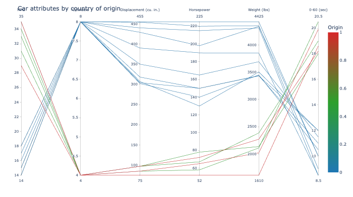
Color is what makes the grouping visible. In the example above, the American muscle cars (blue) cluster at low MPG and high horsepower, while the Asian and European compacts (red and green) sit at the opposite end.
Reorder and brush
The whole point of the interactive version is that the axes are not fixed:
- drag any axis horizontally to reorder the dimensions
- brush on an axis to select a range; Plotly dims every line that does not pass through it
- drag to reposition an axis while brushing to isolate a subset
This lets you flip axes around and narrow in on a group faster than any static chart.
Style the axes with labels and ranges
Giving each dimension a clear label and an explicit range keeps the chart readable:
fig.update_layout(
    title="Car attributes by country of origin",
    width=1000,
    height=560,
)
You can also pass labels to px.parallel_coordinates to rename columns, and each dimension's range is inferred from the data unless you pin it. Wide units like horsepower and weight benefit from keeping their own scales.
A few practical tips
- Order dimensions so correlated ones sit adjacent, which makes the connections easy to follow.
- Log-scale a dimension that spans orders of magnitude so the line does not flatten against one end.
- Keep the number of rows reasonable. Hundreds of overlapping lines turn into an unreadable tangle.
- Use color to encode a grouping or a key metric; it anchors the eye.
- For pairs of variables only, a regular scatter plot or scatter matrix is usually clearer than parallel coordinates.