
TL;DR
Use tickformat for percentage and currency axis labels, and tickprefix/ticksuffix when you need a custom unit or symbol.
import plotly.graph_objects as go

fig = go.Figure(data=[go.Bar(x=['A', 'B', 'C'], y=[0.25, 0.5, 0.75])])
fig.update_layout(yaxis_tickformat='.0%')
fig.show()
Percentage formatting with tickformat
For percentage data, use a format string like .0% or .1% on the axis.
import plotly.graph_objects as go

fig = go.Figure(data=[go.Bar(x=['A', 'B', 'C'], y=[0.23, 0.55, 0.78])])
fig.update_layout(
    yaxis=dict(
        title='Conversion rate',
        tickformat='.0%'
    )
)
fig.show()
tickformat='.0%' multiplies values by 100 and adds a percent sign. Use .1% when you want one decimal place.
Currency formatting with tickformat
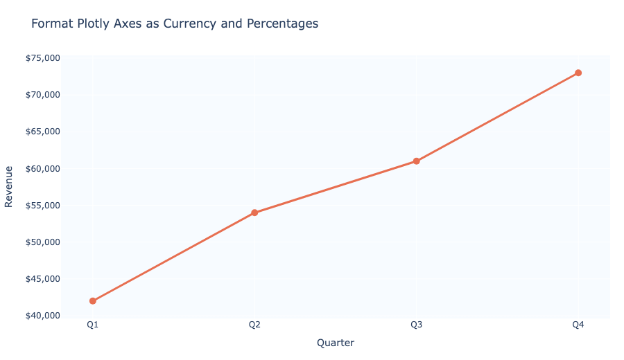
To format an axis as USD, use tickformat='$,.2f'. The comma adds thousands separators and .2f keeps two decimals.
import plotly.graph_objects as go

fig = go.Figure(data=[go.Bar(x=['Q1', 'Q2', 'Q3'], y=[42000, 54000, 61000])])
fig.update_layout(
    yaxis=dict(
        title='Revenue',
        tickformat='$,.2f'
    )
)
fig.show()
Use tickprefix or ticksuffix for custom units
If your values are already scaled, add a symbol without changing the numbers.
import plotly.graph_objects as go

fig = go.Figure(data=[go.Bar(x=['A', 'B', 'C'], y=[25, 50, 75])])
fig.update_layout(
    yaxis=dict(
        title='Completion',
        tickprefix='',
        ticksuffix='%'
    )
)
fig.show()
Format currencies for other locales
For euros or pounds, you can use tickprefix and a format that keeps the numeric pattern.
import plotly.graph_objects as go

fig = go.Figure(data=[go.Bar(x=['A', 'B', 'C'], y=[42000, 54000, 61000])])
fig.update_layout(
    yaxis=dict(
        title='Revenue',
        tickprefix='€',
        tickformat=',.0f'
    )
)
fig.show()
Show values in hover labels too
Plotly hover labels use the same formatting strings when you update the axis and trace layout.
import plotly.graph_objects as go

fig = go.Figure(data=[
    go.Bar(
        x=['Q1', 'Q2', 'Q3'],
        y=[42000, 54000, 61000],
        hovertemplate='$%{y:,.2f}<extra></extra>'
    )
])
fig.update_layout(
    yaxis=dict(title='Revenue', tickformat='$,.2f')
)
fig.show()
Summary
- Use
tickformat='.0%'or.1%for percentage axis labels. - Use
tickformat='$,.2f'for US Dollar currency formatting. - Use
tickprefix/ticksuffixwhen the axis values should not be rescaled. - Add
hovertemplatefor matching hover label formatting.