
TL;DR
Plotly has two no-frills ways to draw maps without any API key: px.scatter_geo() for points on a world map and px.choropleth() for regions shaded by a value. Both use Plotly's built-in geo projections, so there is no Mapbox token to set up.
import pandas as pd
import plotly.express as px

df = pd.DataFrame({
    "name": ["Tohoku 2011", "Sumatra 2004", "Chile 2010"],
    "lat":  [38.32, 3.30, -36.12],
    "lon":  [142.37, 95.98, -72.90],
    "mag":  [9.1, 9.1, 8.8],
})

fig = px.scatter_geo(
    df,
    lat="lat",
    lon="lon",
    size="mag",
    hover_name="name",
    projection="natural earth",
)
fig.show()
Give each row a lat and lon, pass them to px.scatter_geo(), and every point lands on the map. Hover to inspect a point, and use the mode bar to zoom and pan around the globe.
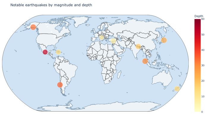
Scatter geo for point locations
px.scatter_geo() is the go-to when your data is a set of coordinates. Earthquakes, store locations, flights, sensors, and ports all map naturally to this trace. The marker size and color can carry extra dimensions, as the example does with magnitude and depth.
import pandas as pd
import plotly.express as px

quakes = pd.DataFrame({
    "Name":  ["Tohoku 2011", "Sumatra 2004", "Chile 2010", "Alaska 1964",
              "Haiti 2010", "Nepal 2015", "Mexico 2017"],
    "Lat":   [38.32, 3.30, -36.12, 61.02, 18.44, 27.86, 18.55],
    "Lon":   [142.37, 95.98, -72.90, -147.65, -72.57, 85.89, -98.49],
    "Mag":   [9.1, 9.1, 8.8, 9.2, 7.0, 7.8, 7.1],
    "Depth": [24, 30, 35, 33, 13, 18, 51],
})

fig = px.scatter_geo(
    quakes,
    lat="Lat",
    lon="Lon",
    size="Mag",
    color="Depth",
    hover_name="Name",
    projection="natural earth",
    color_continuous_scale="YlOrRd",
)
fig.show()
sizescales the dots by a numeric column.colorshades them by another column and adds a colorbar.projectionswaps the map shape;"natural earth"and"equirectangular"are safe defaults.
Choropleth for shaded regions
When you want to color whole countries or regions by a value, use px.choropleth(). It needs a locations column and a locationmode. Use ISO-3 country codes for the most reliable results.
import pandas as pd
import plotly.express as px

gdp = pd.DataFrame({
    "code": ["USA", "CHN", "JPN", "DEU", "BRA", "IND", "AUS", "NGA"],
    "internet": [311, 1050, 118, 73, 160, 830, 25, 100],
})

fig = px.choropleth(
    gdp,
    locations="code",
    locationmode="ISO-3",
    color="internet",
    color_continuous_scale="Blues",
)
fig.show()
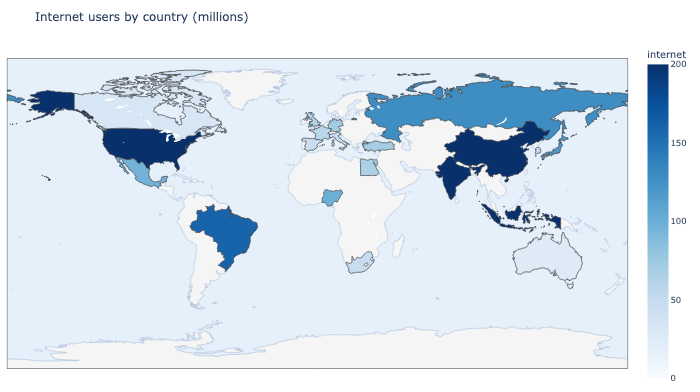
locationmode="ISO-3" matches the three-letter country abbreviations against Plotly's bundled world regions. The older "country names" mode still works but is deprecated, so prefer ISO-3 codes to keep your charts future-proof.
What about Mapbox?
If you want street-level tiles, you can drop both of these and use px.scatter_mapbox() or px.choropleth_mapbox() instead. The catch is that Mapbox tiles need a free access token, and the same token has to be supplied both to plot and to export a static image. The scatter_geo and choropleth traces in this post need no token and are enough for country and continent-level maps.
Interact with it
Both embedded charts above are live figures:
- hover a point or region to read its values
- zoom, pan, and rotate the globe with the mode bar
- toggle between a flat world view and a spherical projection
The latitude, longitude, and value columns all stay in the tooltip, so readers can inspect the data without leaving the page.
Styling tweaks
A few options control the look of the base map:
fig.update_layout(
    geo=dict(
        showland=True,
        landcolor="#eef3f7",
        showocean=True,
        oceancolor="#cfe3f5",
        coastlinecolor="#8ab4d8",
        showcountries=True,
    )
)
Light land and ocean colors keep the focus on your markers or regions. showcountries draws borders, and showcoastlines (on by default) adds the coastline outline. Keep the palette subtle so the data stays the hero.
A few practical tips
- Always check your coordinates: latitude is north/south, longitude is east/west, and mixing them puts points in the wrong ocean.
- Use ISO-3 codes for
choroplethand keep the map region broad enough that the shapes render cleanly. - Use
scatter_geofor individual points andchoroplethfor aggregated regions, not the other way around. - For campus, city, or street-level detail, switch to Mapbox traces and supply a token.
- Resize with
widthandheight; a cramped map hides the very detail you are trying to show.