Data
To get started, let's import plotly and create some fake data to work with.
# Plotly express is the simpler Plotly API that we'll start with.
import plotly.express as px
# Plotly graph objects are more powerful/flexible, but also a bit more complex and verbose.
import plotly.graph_objects as go
import pandas as pd

# Sample data for the pie charts.
data = {
    'category': ['A', 'B', 'C', 'D', 'E'],
    'value': [40, 60, 30, 50, 20]
}
df = pd.DataFrame(data)
df.head()
We'll just use some very simple "categorical" data, with five categories - A, B, C, D, E - with quantities associated with each. Note, plotly can handle data with multiple rows per category just fine, but we'll start simple here.
| category | value | |
|---|---|---|
| 0 | A | 40 |
| 1 | B | 60 |
| 2 | C | 30 |
| 3 | D | 50 |
| 4 | E | 20 |
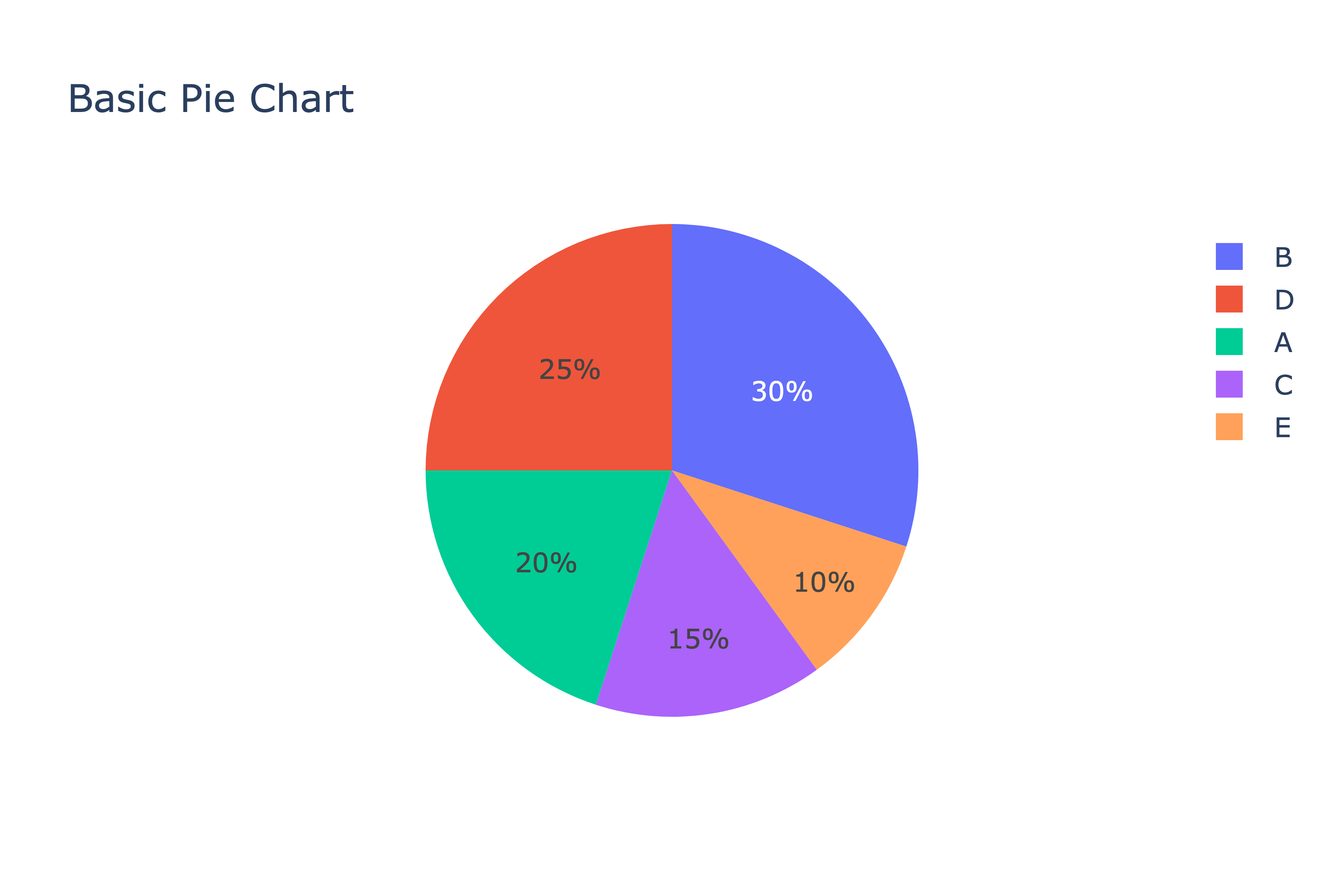
Pie Charts & Donut Charts using Plotly Express
Now that we have our data, we'll create our first pie chart using Plotly's express library which canonically gets
imported ass px. We simply set the values vs names (categories) and we're set.
fig = px.pie(df, values='value', names='category', title='Basic Pie Chart')
fig.show()
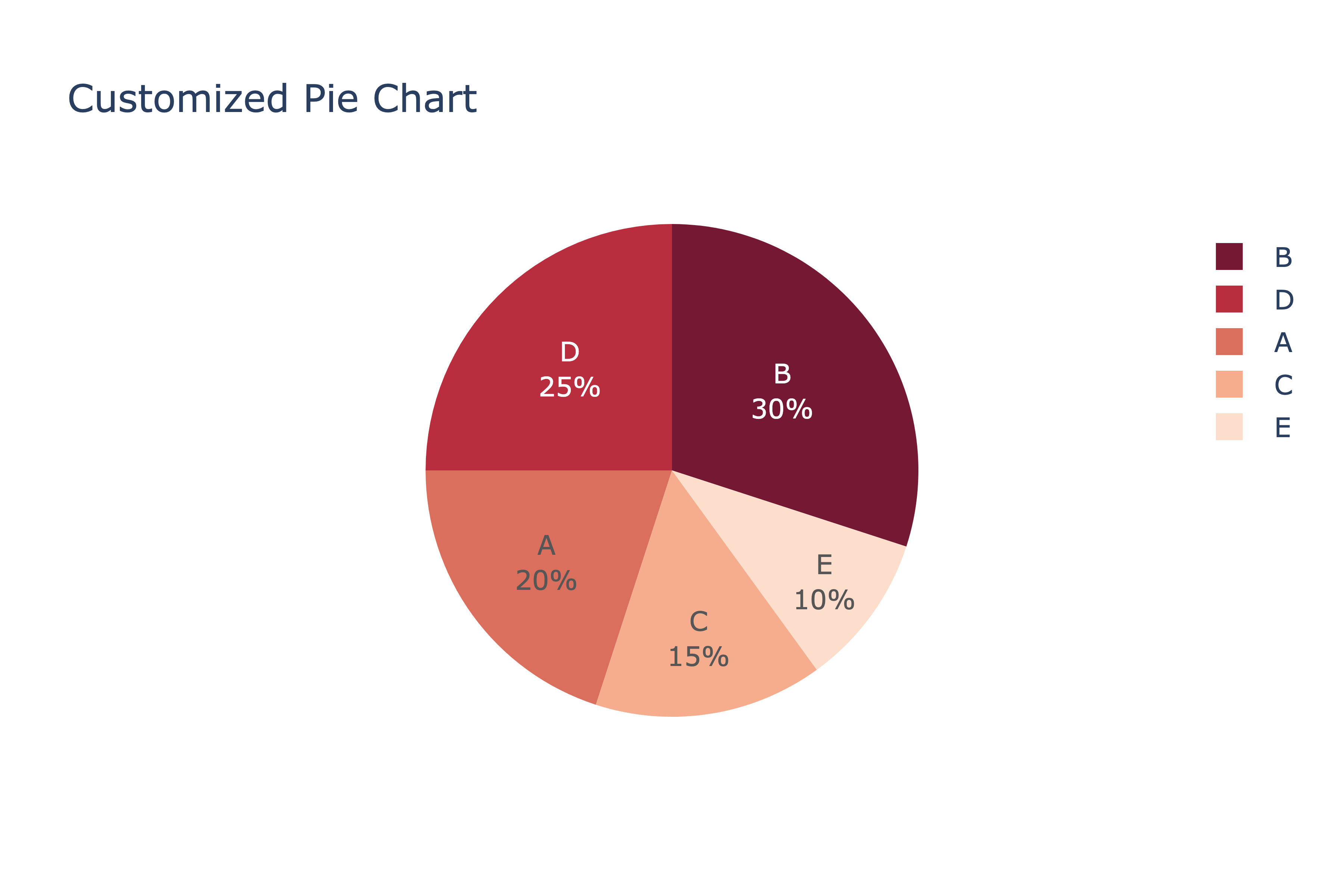
Customized Pie Chart
Now let's customize it a bit. We'll use the same code as above, but add a color_discrete_sequence to set a color
palette, and also add a touch of transparency using opacity.
Lastly, via the Figure's update_traces call, we'll set the text annotation position and tell it to use both the
label and percent of total when annotating.
fig = px.pie(
    df, values='value',
    names='category',
    title='Customized Pie Chart',
    # Explicitly set the color sequence.
    color_discrete_sequence=px.colors.sequential.RdBu,
    # Add a small bit of transparency.
    opacity=0.9,
)
fig.update_traces(textposition='inside', textinfo='label+percent')
fig.show()
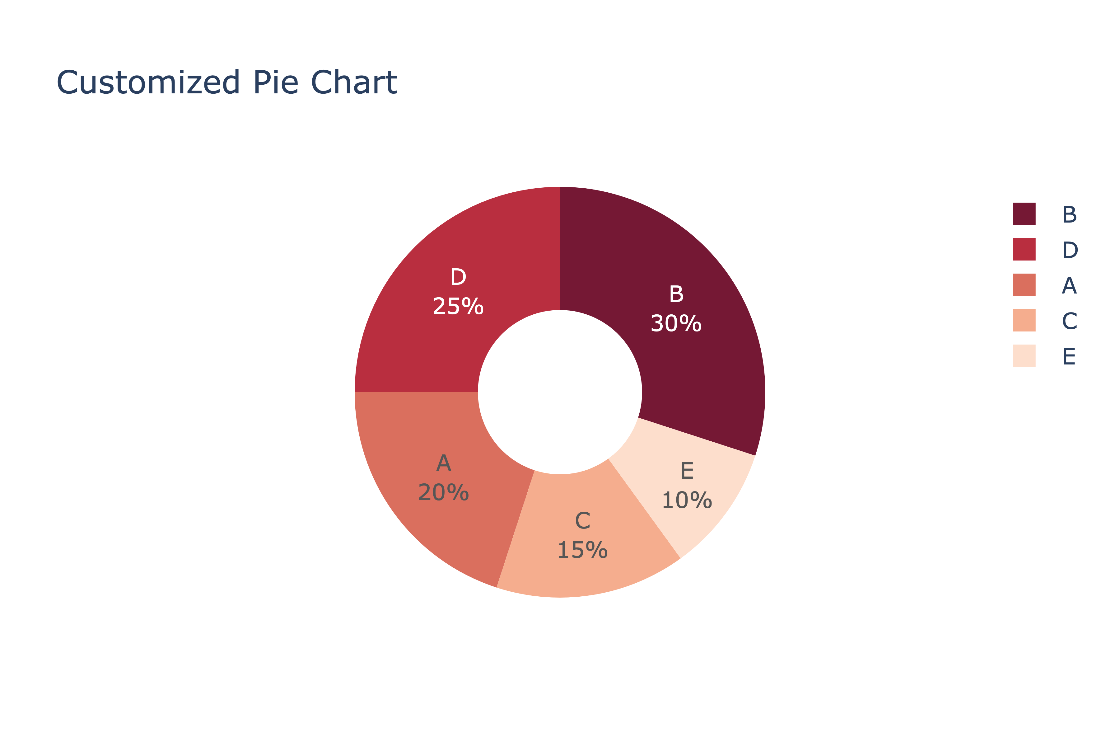
Donut Charts
Donut charts are just pie charts with a hole in the center, so they're constructed identically to pie charts, just with
an additional argument - hole - which will create the donut hole based on the value given (between 0 and 1).
fig = px.pie(
    df, values='value',
    names='category',
    title='Customized Pie Chart',
    # Explicitly set the color sequence.
    color_discrete_sequence=px.colors.sequential.RdBu,
    # Add a small bit of transparency.
    opacity=0.9,
    # Make the pie chart into a donut chart.
    hole=0.4
)
fig.update_traces(textposition='inside', textinfo='label+percent')
fig.show()
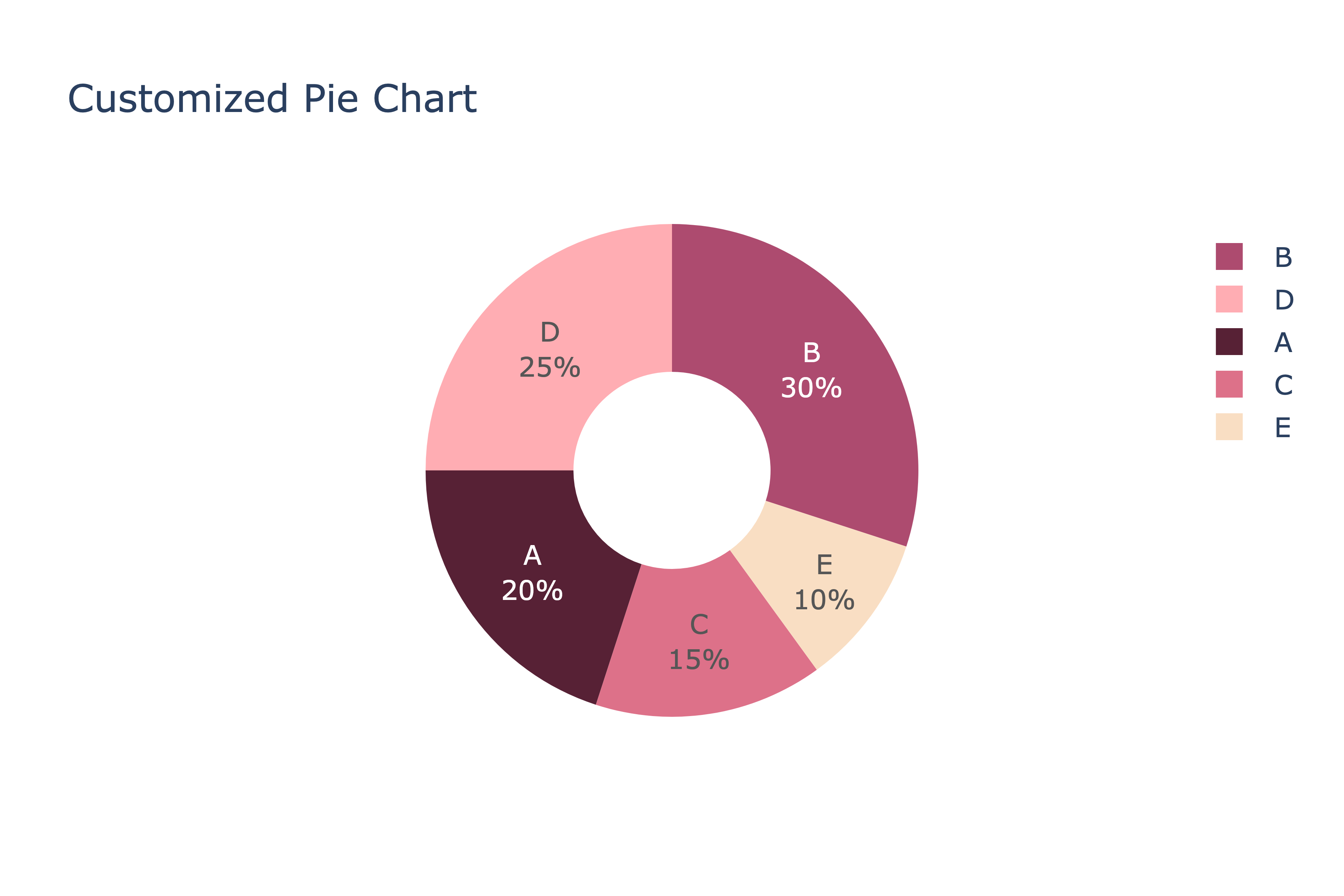
Setting Custom Colors
Sometimes you might want to explicitly set the color for each category or name. To do that, use color_discrete_map,
which expects a python dictionary, mapping each value to its color. Note, you also need to set the color argument to
'category' in this case, the same value given to names.
fig = px.pie(
    df, values='value', names='category', title='Customized Pie Chart',
    color='category',
    color_discrete_map={
        'A': '#450920',
        'B': '#a53860',
        'C': '#da627d',
        'D': '#ffa5ab',
        'E': '#f9dbbd'
    },
    opacity=0.9,
    hole=0.4
)
fig.update_traces(textposition='inside', textinfo='label+percent') fig.show()
Setting a Specific Order
It's also often useful to explicitly set the order the slices of the pie go in. By default, plotly will plot them in descending order by their value, counter-clockwise. With the Plotly express API, you currently can't change the direction from counter-clockwise to clockwise, so just take that into account when setting the order.
fig = px.pie(
    df, values='value', names='category', title='Customized Pie Chart',
    color='category',
    color_discrete_map={
        'A': '#450920',
        'B': '#a53860',
        'C': '#da627d',
        'D': '#ffa5ab',
        'E': '#f9dbbd'
    },
    # Set the counter-clockwise order we want the category to be in.
    category_orders={'category': ['A', 'B', 'C', 'D', 'E']},
    opacity=0.9,
    hole=0.4
)
fig.update_traces(textposition='inside', textinfo='label+percent')
fig.show()
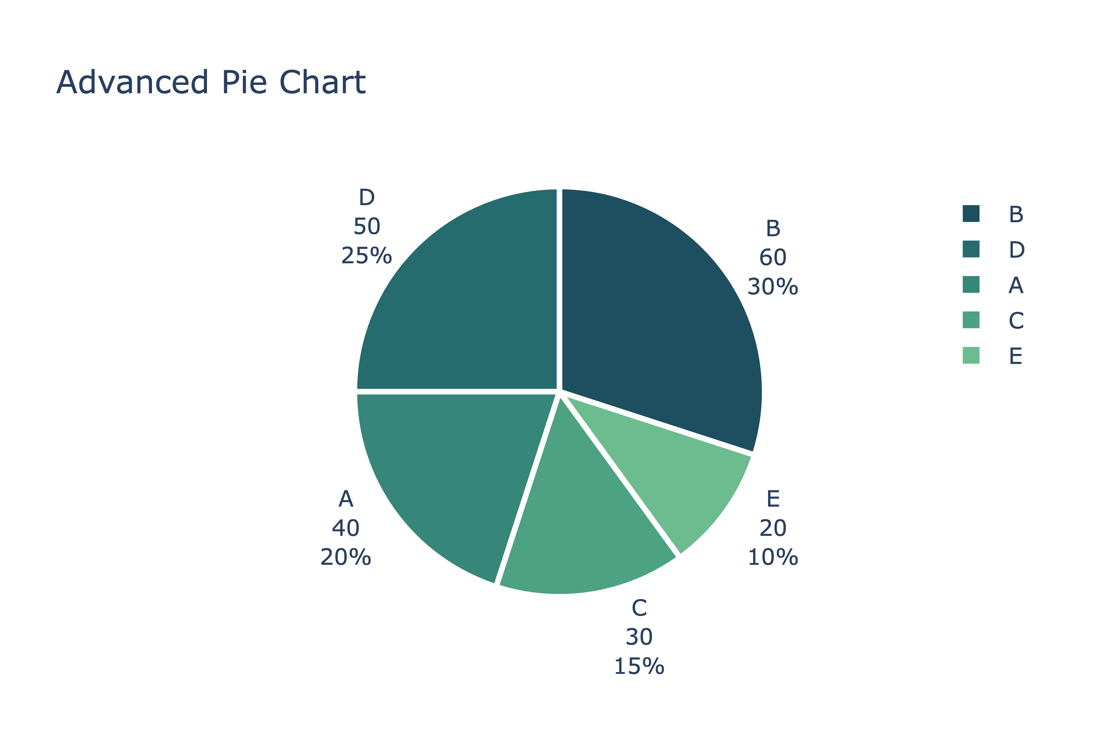
Further Pie Chart Customizations
For our last Plotly express example, we'll show a few other customizations. First, we'll add the category to the hover info (although this could easily be some other column if we had more interesting data). Second, we'll change the actual text annotation to be outside the pie slices, and show not only the label and percent, but the value as well. Third, we'll add a white border to stylize the slices a bit.
fig = px.pie(
    df, values='value', names='category', title='Advanced Pie Chart',
    color_discrete_sequence=px.colors.sequential.Blugrn_r,
    hover_name="category", # Add category to hover text (somewhat duplicative)
)
fig.update_traces(
    textposition='outside', textinfo='label+percent+value',
    marker=dict(line=dict(color='#fff', width=3)) # Add border to slices
)
fig.show()
Plotly Graph Objects Pie Charts
As mentioned, Plotly has two APIs you can usually use when creating charts - plotly.express and plotly.graph_objects.
We'll now demonstrate the same simple pie chart using the graph objects way.
import plotly.graph_objects as go

fig = go.Figure(data=[go.Pie(labels=df['category'], values=df['value'])])
fig.update_layout(title_text='Simple Pie Chart (graph_objects)')
fig.show()
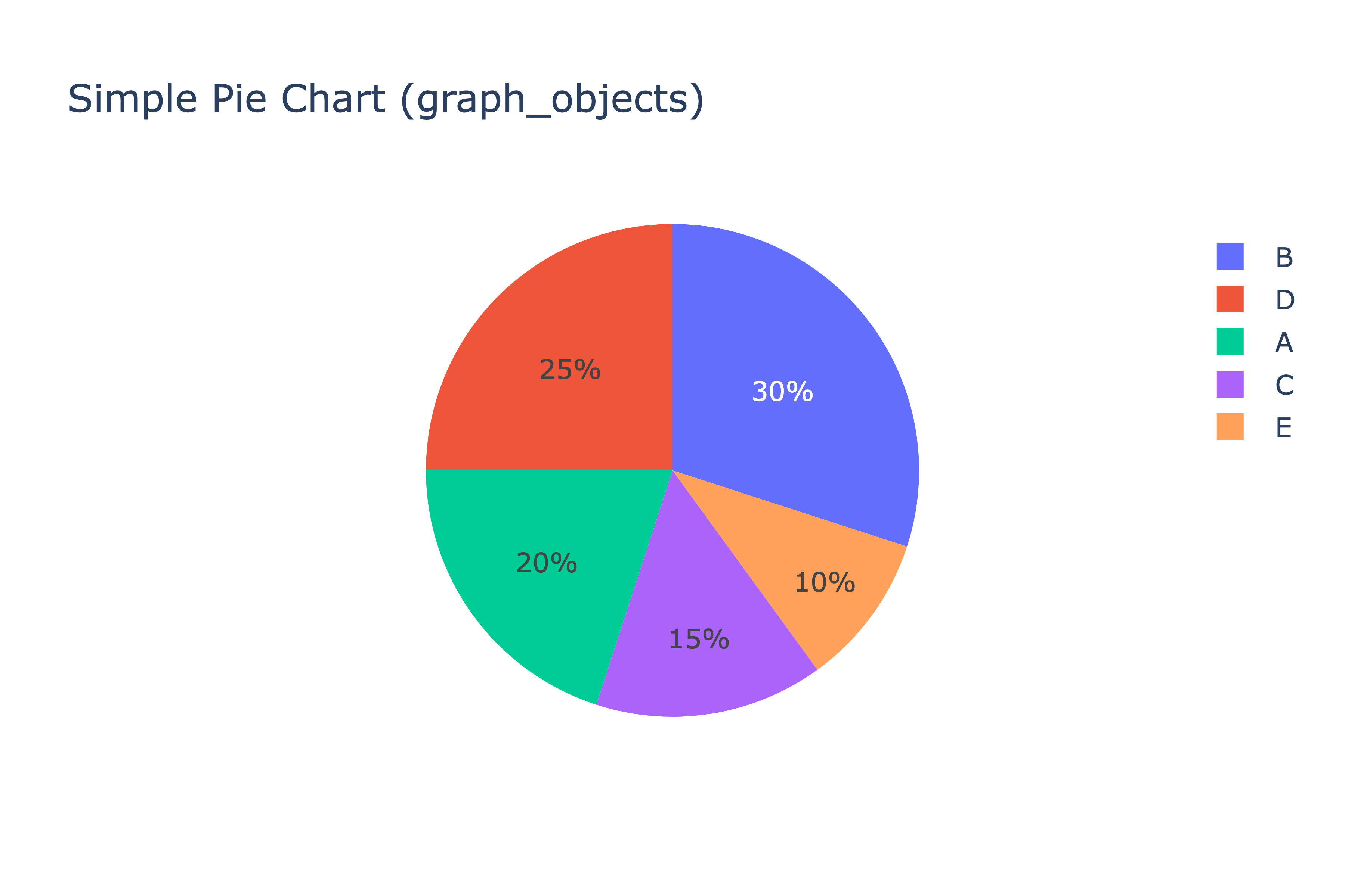
Pretty simple, and we get the same result as in the first example of this post.
Lastly, we'll show a more complex example, setting the color explicitly, changing the order of the slices, and using
the pull attribute to "pull" a slice out of the pie. This is great if you want to highlight a particular category.
colors = ['#FF9900', '#FFFF66', '#CC0066', '#66CC99', '#66B2FF']
fig = go.Figure(data=[
    go.Pie(
        labels=df['category'], values=df['value'], textinfo='label+percent',
        marker=dict(colors=colors),
        pull=[0, 0, 0.2, 0, 0],
        sort=False, # Just use the order the data is in
        direction='clockwise' # Change the order from counter-clockwise to clockwise
    )
])

fig.update_layout(title_text='Customized Pie Chart')
fig.show()
That's it for now. Plotly has some great documentation on pie charts if you'd like to explore further.