
Sankey diagrams are one of the best ways to show how a quantity moves from one stage to another. They are especially useful when you want to show flows such as website traffic, budget allocations, energy usage, or customer journeys.
The nice thing about a Sankey diagram is that it makes the big picture obvious at a glance. A wide band tells you the flow is large, while a thin band suggests a smaller part of the overall movement.
In this post, we'll build a few simple Sankey charts with Plotly and cover the most important pieces you need to know.
A Simple Example
To create Sankey diagrams in Plotly, we usually use plotly.graph_objects rather than plotly.express. The main idea
is to define a list of node labels and then connect those nodes with links that have their own values.
Let's build a simple example that follows visitors through a signup funnel:
- Visitors either sign up or drop off
- Signups either become a paid plan or a free trial
- Each of those groups may then be retained or canceled
import plotly.graph_objects as go

labels = [
    "Visitors",
    "Signed Up",
    "Paid Plan",
    "Free Trial",
    "Dropped Off",
    "Retained",
    "Canceled"
]

source = [0, 0, 1, 1, 2, 2, 3, 3]
target = [1, 4, 2, 3, 5, 6, 5, 6]
value = [600, 400, 350, 250, 220, 130, 120, 130]

x = [0.02, 0.35, 0.66, 0.66, 0.35, 0.92, 0.92]
y = [0.50, 0.35, 0.20, 0.55, 0.72, 0.20, 0.55]

fig = go.Figure(
    go.Sankey(
        arrangement="fixed",
        node=dict(
            pad=20,
            thickness=20,
            line=dict(color="rgba(0,0,0,0.5)", width=0.8),
            label=labels,
            x=x,
            y=y,
            color=[
                "#4C78A8",
                "#F58518",
                "#54A24B",
                "#EECA3B",
                "#B279A2",
                "#72B7B2",
                "#E45756"
            ]
        ),
        link=dict(
            source=source,
            target=target,
            value=value,
            color=[
                "rgba(76, 120, 168, 0.45)",
                "rgba(0, 0, 0, 0.15)",
                "rgba(245, 133, 24, 0.45)",
                "rgba(245, 133, 24, 0.25)",
                "rgba(84, 162, 75, 0.45)",
                "rgba(84, 162, 75, 0.25)",
                "rgba(238, 202, 59, 0.45)",
                "rgba(238, 202, 59, 0.25)"
            ]
        )
    )
)

fig.update_layout(
    title_text="How visitors move through a simple signup funnel",
    font_size=14,
    width=1000,
    height=700
)

fig.show()
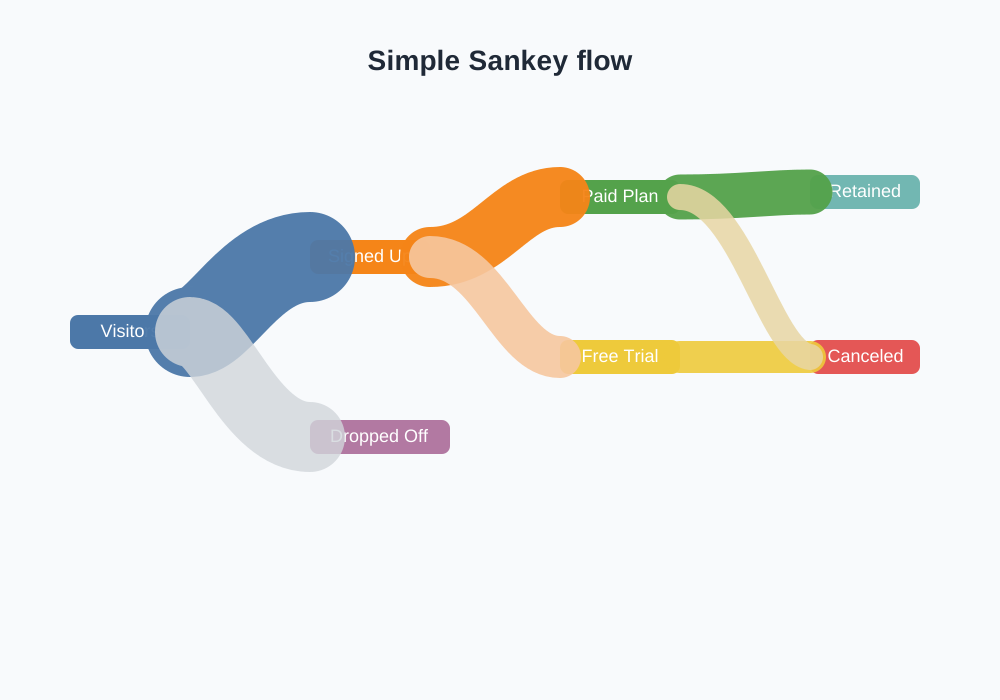
A few details are worth pointing out here:
- each node is defined by its label in the
labelslist - each link uses a
sourceandtargetindex from that list - the
valuedetermines how wide the flow should be
In other words, the Sankey chart is really a network of nodes and weighted links. That makes it a good fit for flows where the size of the movement matters.
Styling the Diagram
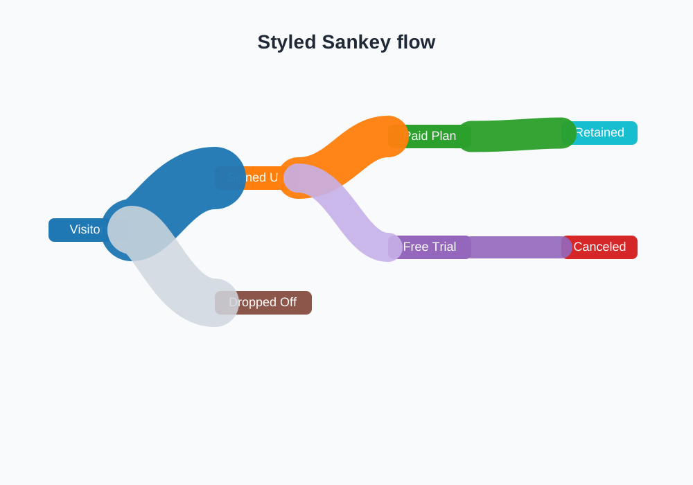
The default Plotly layout is already readable, but a few small tweaks can make the chart easier to understand.
Here are a few helpful ideas:
- keep node labels short so the plot does not feel crowded
- use consistent colors for the same kind of stage, such as all "retention" nodes in green
- make the most important flow a bit more prominent with a stronger color
- use
arrangement="snap"orarrangement="fixed"depending on whether you want Plotly to optimize the layout automatically
A more polished version might look like this:
fig = go.Figure(
    go.Sankey(
        arrangement="fixed",
        node=dict(
            pad=18,
            thickness=22,
            line=dict(color="rgba(0,0,0,0.4)", width=0.8),
            label=labels,
            x=x,
            y=y,
            color=["#1f77b4", "#ff7f0e", "#2ca02c", "#9467bd", "#8c564b", "#17becf", "#d62728"]
        ),
        link=dict(
            source=source,
            target=target,
            value=value,
            color=[
                "rgba(31, 119, 180, 0.5)",
                "rgba(0, 0, 0, 0.12)",
                "rgba(255, 127, 14, 0.5)",
                "rgba(255, 127, 14, 0.25)",
                "rgba(44, 160, 44, 0.5)",
                "rgba(44, 160, 44, 0.25)",
                "rgba(217, 83, 25, 0.5)",
                "rgba(217, 83, 25, 0.25)"
            ]
        )
    )
)

fig.update_layout(
    title_text="A cleaner version of the same flow",
    font_size=15,
    width=1000,
    height=700
)

fig.show()
A Few Practical Tips
Sankey charts are simple once you get the structure right, but there are a few rules worth keeping in mind.
First, the flow values should make sense. A node that sends out more than it receives could make the chart visually confusing, even if Plotly will still draw it. In practice, it usually works best when the incoming flow and the outgoing flow are logically consistent.
Second, do not overload the chart. One of the most common mistakes is trying to show too many stages at once. A simple flow with three or four steps is often easier to read than a very dense network.
Third, use the layout to guide attention. If one branch is particularly important, emphasize it with a brighter color or by placing it in a more central position in the diagram.
That is really the main idea behind creating Sankey diagrams in Plotly: define the nodes, define the flows, and then use color and layout choices to make the story easy to follow.
If you want to explore more, try swapping in your own numbers and labels. A Sankey chart becomes much more interesting when it reflects a real process you care about, whether that is a marketing funnel, a budget breakdown, or a data pipeline.