
TL;DR
A treemap shows hierarchical data as nested rectangles. The area of each rectangle is proportional to its value, so you can see the ratio of every branch at a glance. In Plotly, px.treemap() builds one from a dataframe, and passing a top-level column to color colors each whole branch with its own color.
import pandas as pd
import plotly.express as px

df = pd.DataFrame({
    "Division": ["Engineering", "Sales", "Engineering", "Marketing"],
    "Team":     ["Platform", "Enterprise", "Data", "Brand"],
    "Budget":   [245, 135, 95, 125],
})

fig = px.treemap(
    df,
    path=["Division", "Team"],
    values="Budget",
    color="Division",
)
fig.show()
The color="Division" is the key line. It maps each top-level division to a color and makes every nested rectangle inside that division inherit the same color. Hover a rectangle to see its value, and click one to zoom into that branch.
What a treemap is for
Treemaps use area to encode value. That makes them useful when you want to compare the size of many categories and still see how they split into subcategories. Common uses:
- budget allocation by department, team, and expense
- file or storage usage by folder and file type
- portfolio weight by sector and holding
- sales by region, country, and product line
Unlike a sunburst, a treemap lays everything out as rectangles, so it uses the full plot area and can hold more labels. The tradeoff is that the visual focus shifts from proportions of a circle to area comparisons.
Build it with plotly.express
px.treemap() mirrors px.sunburst() almost exactly. Pass the hierarchy columns to path, give values a numeric column, and set branchvalues.
import pandas as pd
import plotly.express as px

df = pd.DataFrame({
    "Division": [
        "Engineering", "Engineering", "Engineering", "Engineering",
        "Engineering", "Engineering", "Marketing", "Marketing",
        "Marketing", "Marketing", "Sales", "Sales", "Sales",
        "Operations", "Operations", "Operations",
    ],
    "Team": [
        "Platform", "Platform", "Product", "Product", "Data", "Data",
        "Brand", "Brand", "Digital", "Digital",
        "Enterprise", "Enterprise", "SMB",
        "Facilities", "Facilities", "Support",
    ],
    "Cost item": [
        "Infrastructure", "Tooling", "Design", "Research", "Storage", "Analytics",
        "Campaigns", "Market Research", "Paid Ads", "SEO",
        "Enterprise Team", "Onboarding", "SMB Team",
        "Rent", "Utilities", "Support Staffing",
    ],
    "Budget": [
        180, 65, 90, 70, 55, 40, 95, 30,
        120, 45, 110, 25, 60, 85, 20, 70,
    ],
})

fig = px.treemap(
    df,
    path=["Division", "Team", "Cost item"],
    values="Budget",
    branchvalues="total",
)
fig.show()
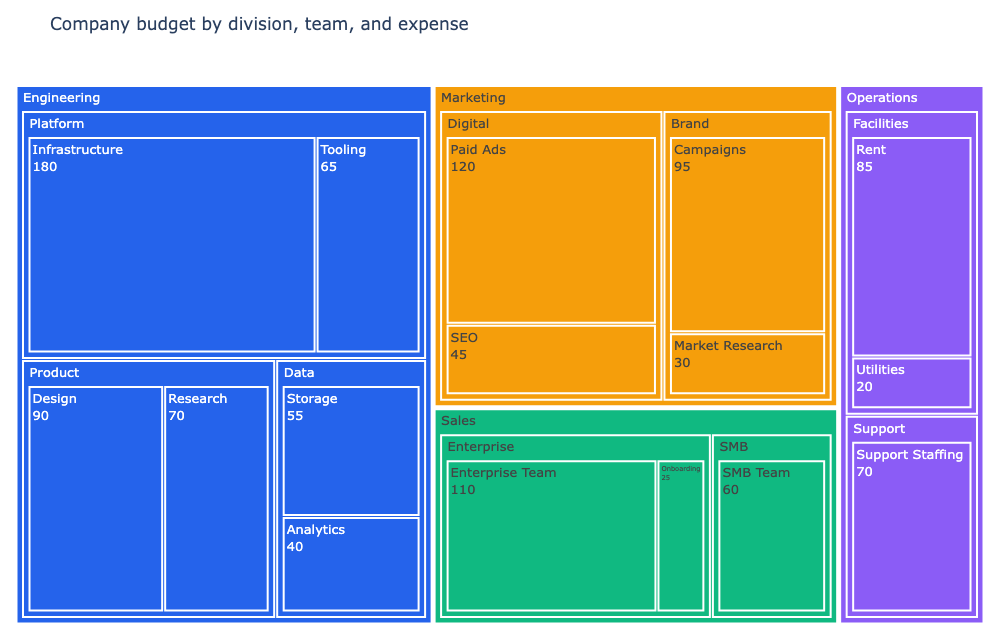
That builds the three-level treemap shown in the interactive example at the top.
Color by a level of the hierarchy
The default treemap gives every rectangle its own color, which can look noisy on a multi-level chart. To keep it readable, color by one level so each branch reads as a single unit.
fig = px.treemap(
    df,
    path=["Division", "Team", "Cost item"],
    values="Budget",
    color="Division",
    color_discrete_map={
        "Engineering": "#2563eb",
        "Marketing": "#f59e0b",
        "Sales": "#10b981",
        "Operations": "#8b5cf6",
    },
    branchvalues="total",
)
Because every row carries the Division value, each team and cost item inherits the color of its division. The whole Engineering block is blue, the whole Marketing block is amber, and so on. That is what people usually mean by hierarchical colors: color is assigned at one level and flows down the tree.
To color only the top level and leave the rest neutral, keep the same color argument but skip the map and let Plotly assign colors to the divisions automatically.
Lay a continuous colorscale over the values
Another common approach is to map a continuous colorscale to the numeric values instead of to a category. This keeps one spectrum across the whole chart and highlights which rectangles are the biggest.
fig = px.treemap(
    df,
    path=["Division", "Team", "Cost item"],
    values="Budget",
    color="Budget",
    color_continuous_scale="Blues",
    range_color=[0, 180],
    branchvalues="total",
)
With color="Budget", rectangles are shaded from light to dark blue by value. Add range_color to pin the ends of the scale so the comparison stays stable.
Interact with it
Like the other Plotly charts on this site, the treemap above is live, not a screenshot:
- hover a rectangle to read its value and percentage
- click a rectangle to zoom into that branch
- double-click to zoom back out to the full tree
- the mode bar lets you adjust the zoom or save the figure
textinfo controls what appears in each rectangle. "label+value" is a good default; on a crowded tree, dropping the value or using "label+percent parent" keeps things legible.
Styling tweaks
Two small touches make a treemap much easier to scan:
fig.update_traces(
    textinfo="label+value",
    textfont_size=13,
    marker=dict(line=dict(color="#ffffff", width=2)),
)
fig.update_layout(
    title="Company budget by division, team, and expense",
    width=1000,
    height=640,
    margin=dict(t=60, l=10, r=10, b=10),
)
- the white
marker.lineadds padding between rectangles so adjacent branches do not blur together textfont_sizekeeps small rectangles readable, though Plotly will hide labels that do not fitbranchvalues="total"makes every parent rectangle fill out to the sum of its children
A few practical tips
- Three levels is usually the sweet spot. Deeper trees make the innermost rectangles too small to label.
- Use hierarchical colors when the story is "which branch is big". They group the tree at a glance.
- Use a continuous colorscale when the story is "which values are high or low" across all branches.
- Keep labels short. Long expense names overflow tiny rectangles fast.
- If you need to compare proportions of a whole as nested rings instead of rectangles, a sunburst is the better fit.