Some background
Altair is a relative newcomer to the Python visualization space, but it's already quite popular and is actively being developed and improved. It was created by Jake Vanderplas in collaboration with the University of Washington's Interactive Data Lab and is actively maintained on Github.
Altair is a Python API wrapper around the very cool Vega-Lite project (which is itself a wrapper around Vega, which is kind of a wrapper around D3...but I digress).
Altair's philosophy
Altair is a so-called "declarative statistical visualization library" for Python. It has a pretty simple structure and philosophy:
- Surface a simple (meaning not ALL the bells and whistles), declarative (meaning you give it the "what", not the "how") Python API
- Use the API to output JSON that follows the Vega-Lite spec
- Render that JSON using existing visualization tools
A quick word on data
Altair, like many other plotting libraries, works best if your data is in a Pandas DataFrame, in "tidy" (AKA "long") format. It does not necessarily need to be pre-aggregated. If your data is in "wide" format, you can use the melt() method to convert to tidy data.
Our first plot
Okay, enough background, let's create a chart already.
import altair as alt

# Load sample data from Vega's dataset library.
from vega_datasets import data
df = data.iris()

# Look at a bit of the data.
df.head()
| petalLength | petalWidth | sepalLength | sepalWidth | species | |
|---|---|---|---|---|---|
| 0 | 1.4 | 0.2 | 5.1 | 3.5 | setosa |
| 1 | 1.4 | 0.2 | 4.9 | 3.0 | setosa |
| 2 | 1.3 | 0.2 | 4.7 | 3.2 | setosa |
| 3 | 1.5 | 0.2 | 4.6 | 3.1 | setosa |
| 4 | 1.4 | 0.2 | 5.0 | 3.6 | setosa |
Now let's plot each flower's petal width versus its height.
# Plot with Altair. See below for an explanation.
alt.Chart(df).mark_point().encode(
    x='petalLength',
    y='petalWidth',
    color='species',
)
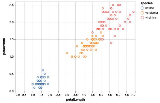
Voila! Let's take a step back though and do it step by step.
The first step creates an Altair chart object using the Chart class. You instantiate this with your data, here called df.
# Create a chart object, initialized with our data.
chart = alt.Chart(df)
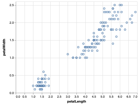
The next step is to tell Altair what type of chart you'd like it to render. Altair calls these "marks"; if you're familiar with ggplot's "geom" vocabulary, this is very similar. Below we call the chart method mark_point() to create our scatter plot. You can browse Altair's documentation for a list of all mark options.
# Note that this outputs just a single point. We haven't told Altair how to
# actually plot our data just yet.
chart.mark_point()
Now we want to tell Altair how to map our data to the mark we've chosen. We do this using the encode() method, and x and y arguments.
# We now tell Altair what we'd like to plot using the `encode()` method and the
# `x` and `y` arguments.
chart.mark_point().encode(
    x='petalLength',
    y='petalWidth'
)
Easy and straightforward right? To make our plot slightly more interesting, let's see if there's a relationship between the species of the flower and the petal size. We do that by mapping that variable to another dimension, in this case, color.
# Lastly, let's add another dimension to the chart - the species of the flower.
# We include that dimension via the `color` argument in `encode()`.
chart.mark_point().encode(
    x='petalLength',
    y='petalWidth',
    color='species'
)
And we're back to where we started. Simple, declarative plotting for Python and readily available to use in JupyterLab and Google's Colab Notebooks.
Here's a Colab Notebook with the code and output.