Bar charts are ubiquitous in the data visualization world. They may not be the sexiest of choices when plotting data, but their simplicity allows data to be presented in a straightforward way that's usually easy to understand for the intended audience.
That being said, there is a big difference (at least, in my humble opinion) between a good and bad bar chart. One of the more important pillars of making a bar chart a great bar chart is to make it visually "smart". That means a few main things:
- Make the base plot itself high quality and visually appealing
- Remove redundancies and elements that are not mandatory from an information perspective
- Add annotations to give the chart "at a glance" understandability
What does all that mean? Easiest to walk through it with an example.
The default Matplotlib bar chart
Let's first get some data. For this example, we'll use the popular cars dataset available in several sample data repositories.
# Load Matplotlib and data wrangling libraries.
import matplotlib.pyplot as plt
import numpy as np
import pandas as pd

# Load cars dataset from Vega's dataset library.
from vega_datasets import data
df = data.cars()
df.head()
| Acceleration | Cylinders | Displacement | Horsepower | Miles_per_Gallon | Name | Origin | Weight_in_lbs | Year | |
|---|---|---|---|---|---|---|---|---|---|
| 0 | 12.0 | 8 | 307.0 | 130.0 | 18.0 | chevrolet chevelle malibu | USA | 3504 | 1970-01-01 |
| 1 | 11.5 | 8 | 350.0 | 165.0 | 15.0 | buick skylark 320 | USA | 3693 | 1970-01-01 |
| 2 | 11.0 | 8 | 318.0 | 150.0 | 18.0 | plymouth satellite | USA | 3436 | 1970-01-01 |
| 3 | 12.0 | 8 | 304.0 | 150.0 | 16.0 | amc rebel sst | USA | 3433 | 1970-01-01 |
| 4 | 10.5 | 8 | 302.0 | 140.0 | 17.0 | ford torino | USA | 3449 | 1970-01-01 |
Let's look at the average miles per gallon of cars over the years. To do that, we'll need to use pandas to group and aggregate.
mpg = df[['Miles_per_Gallon', 'Year']].groupby('Year').mean()
mpg.head()
| Year | Miles_per_Gallon |
|---|---|
| 1970-01-01 | 17.689655 |
| 1971-01-01 | 21.250000 |
| 1972-01-01 | 18.714286 |
| 1973-01-01 | 17.100000 |
| 1974-01-01 | 22.703704 |
Let's create our first bar chart.
plt.bar(
    x=np.arange(mpg.size),
    height=mpg['Miles_per_Gallon']
)
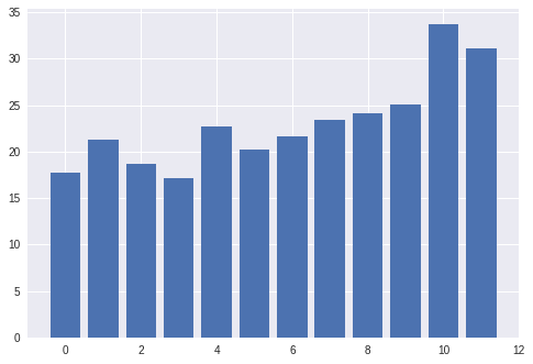
Interesting. We're using Google's Colaboratory (aka "Colab") to create our visualizations. Colab applies some default styles to Maplotlib using the Seaborn visualization library, hence the gray ggplot2-esque background instead of the Matplotlib defaults.
As a first step, let's remove those Seaborn styles to get back to base Matplotlib and re-plot.
# Colab sets some Seaborn styles by default; let's revert to the default
# Matplotlib styles and plot again.
plt.rcdefaults()

plt.bar(
    x=np.arange(mpg.size),
    height=mpg['Miles_per_Gallon']
)
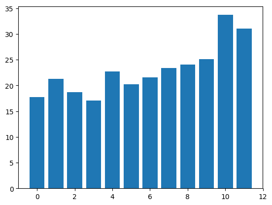
I actually prefer this to Colab's default. Nice and clean and a better blank canvas from which to start.
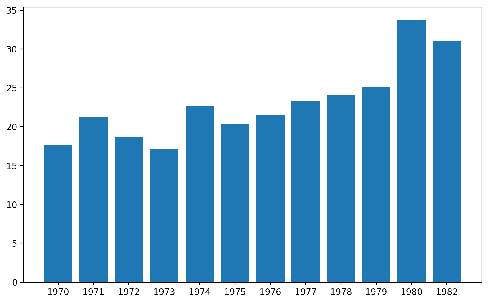
Now we need to fix the x-axis to actually be labeled with the year and we're good to go.
plt.bar(
    x=np.arange(mpg.size),
    height=mpg['Miles_per_Gallon'],
    tick_label=mpg.index.strftime('%Y')
)

Not bad! It's a pretty nice default chart honestly. But we can make it significantly better with just a few more tweaks.
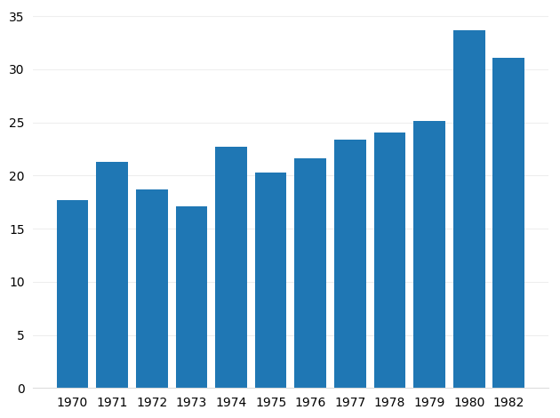
Create a high-resolution chart
The first thing we'll change is the size and resolution of the chart to make sure it looks good on all screens and can be copy/pasted easily into a presentation or website.
The first thing we'll do is to increase the resolution via an IPython default "retina" setting, which will output high-quality pngs. There are two ways to do this, both shown below.
# Increase the quality and resolution of our charts so we can copy/paste or just
# directly save from here.
# See:
# https://ipython.org/ipython-doc/3/api/generated/IPython.display.html
from IPython.display import set_matplotlib_formats
set_matplotlib_formats('retina', quality=100)

# You can also just do this in Colab/Jupyter, some "magic":
# %config InlineBackend.figure_format='retina'
Let's plot again, and make two more additions:
- Set the default size of the image to be a bit larger
- Use
tight_layout()to take advantage of all the space allocated to the figure
# Set default figure size.
plt.rcParams['figure.figsize'] = (8, 5)

fig, ax = plt.subplots()

ax.bar(
    x=np.arange(mpg.size),
    height=mpg['Miles_per_Gallon'],
    tick_label=mpg.index.strftime('%Y')
)

# Make the chart fill out the figure better.
fig.tight_layout()
Simple Axes: remove unnecessary lines
Our next step is to make the chart even simpler, but to also add back some horizontal gridlines. The latter is definitely optional, especially after the next step (we'll add text annotations for each bar value), but it does sometimes help make the chart more interpretable.
fig, ax = plt.subplots()

ax.bar(
    x=np.arange(mpg.size),
    height=mpg['Miles_per_Gallon'],
    tick_label=mpg.index.strftime('%Y')
)

# First, let's remove the top, right and left spines (figure borders)
# which really aren't necessary for a bar chart.
# Also, make the bottom spine gray instead of black.
ax.spines['top'].set_visible(False)
ax.spines['right'].set_visible(False)
ax.spines['left'].set_visible(False)
ax.spines['bottom'].set_color('#DDDDDD')

# Second, remove the ticks as well.
ax.tick_params(bottom=False, left=False)

# Third, add a horizontal grid (but keep the vertical grid hidden).
# Color the lines a light gray as well.
ax.set_axisbelow(True)
ax.yaxis.grid(True, color='#EEEEEE')
ax.xaxis.grid(False)

fig.tight_layout()
Looking pretty sweet right? Almost there...
Adding text annotations
If the specific value of each bar is relevant or meaningful (as opposed to just the general trend), it's often useful to annotate each bar with the value it represents. To do this in Matplotlib, you basically loop through each of the bars and draw a text element right above.
fig, ax = plt.subplots()

# Save the chart so we can loop through the bars below.
bars = ax.bar(
    x=np.arange(mpg.size),
    height=mpg['Miles_per_Gallon'],
    tick_label=mpg.index.strftime('%Y')
)

# Axis formatting.
ax.spines['top'].set_visible(False)
ax.spines['right'].set_visible(False)
ax.spines['left'].set_visible(False)
ax.spines['bottom'].set_color('#DDDDDD')
ax.tick_params(bottom=False, left=False)
ax.set_axisbelow(True)
ax.yaxis.grid(True, color='#EEEEEE')
ax.xaxis.grid(False)

# Grab the color of the bars so we can make the
# text the same color.
bar_color = bars[0].get_facecolor()

# Add text annotations to the top of the bars.
# Note, you'll have to adjust this slightly (the 0.3)
# with different data.
for bar in bars:
  ax.text(
      bar.get_x() + bar.get_width() / 2,
      bar.get_height() + 0.3,
      round(bar.get_height(), 1),
      horizontalalignment='center',
      color=bar_color,
      weight='bold'
  )

fig.tight_layout()
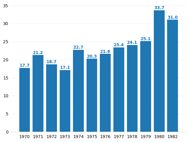
It's a little much maybe, but is a great option to keep in mind when the value is important.
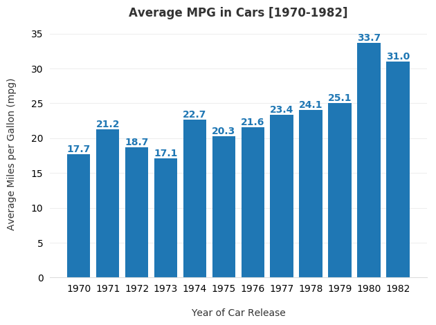
Finishing Touches: add nicely formatted labels and title
Up til now the plot hasn't had any labels or a title, so let's add those now. In many cases, axis labels or a title actually aren't needed, so always ask yourself whether they're redundant or necessary.
fig, ax = plt.subplots()

# Save the chart so we can loop through the bars below.
bars = ax.bar(
    x=np.arange(mpg.size),
    height=mpg['Miles_per_Gallon'],
    tick_label=mpg.index.strftime('%Y')
)

# Axis formatting.
ax.spines['top'].set_visible(False)
ax.spines['right'].set_visible(False)
ax.spines['left'].set_visible(False)
ax.spines['bottom'].set_color('#DDDDDD')
ax.tick_params(bottom=False, left=False)
ax.set_axisbelow(True)
ax.yaxis.grid(True, color='#EEEEEE')
ax.xaxis.grid(False)

# Add text annotations to the top of the bars.
bar_color = bars[0].get_facecolor()
for bar in bars:
  ax.text(
      bar.get_x() + bar.get_width() / 2,
      bar.get_height() + 0.3,
      round(bar.get_height(), 1),
      horizontalalignment='center',
      color=bar_color,
      weight='bold'
  )

# Add labels and a title. Note the use of `labelpad` and `pad` to add some
# extra space between the text and the tick labels.
ax.set_xlabel('Year of Car Release', labelpad=15, color='#333333')
ax.set_ylabel('Average Miles per Gallon (mpg)', labelpad=15, color='#333333')
ax.set_title('Average MPG in Cars [1970-1982]', pad=15, color='#333333',
             weight='bold')

fig.tight_layout()
Extra Credit: change the font
# Download the fonts we want from Github into our Colab-local font directory.
!wget --recursive --no-parent 'https://github.com/google/fonts/raw/master/apache/opensans/OpenSans-Regular.ttf' -P /usr/local/lib/python3.6/dist-packages/matplotlib/mpl-data/fonts/ttf
!wget --recursive --no-parent 'https://github.com/google/fonts/raw/master/apache/opensans/OpenSans-Light.ttf' -P /usr/local/lib/python3.6/dist-packages/matplotlib/mpl-data/fonts/ttf
!wget --recursive --no-parent 'https://github.com/google/fonts/raw/master/apache/opensans/OpenSans-SemiBold.ttf' -P /usr/local/lib/python3.6/dist-packages/matplotlib/mpl-data/fonts/ttf
!wget --recursive --no-parent 'https://github.com/google/fonts/raw/master/apache/opensans/OpenSans-Bold.ttf' -P /usr/local/lib/python3.6/dist-packages/matplotlib/mpl-data/fonts/ttf

# Use Matplotlib's font manager to rebuild the font library.
import matplotlib as mpl
mpl.font_manager._rebuild()

# Use the newly integrated Roboto font family for all text.
plt.rc('font', family='Open Sans')

fig, ax = plt.subplots()

# Save the chart so we can loop through the bars below.
bars = ax.bar(
    x=np.arange(mpg.size),
    height=mpg['Miles_per_Gallon'],
    tick_label=mpg.index.strftime('%Y')
)

# Axis formatting.
ax.spines['top'].set_visible(False)
ax.spines['right'].set_visible(False)
ax.spines['left'].set_visible(False)
ax.spines['bottom'].set_color('#DDDDDD')
ax.tick_params(bottom=False, left=False)
ax.set_axisbelow(True)
ax.yaxis.grid(True, color='#EEEEEE')
ax.xaxis.grid(False)

# Add text annotations to the top of the bars.
bar_color = bars[0].get_facecolor()
for bar in bars:
  ax.text(
      bar.get_x() + bar.get_width() / 2,
      bar.get_height() + 0.3,
      round(bar.get_height(), 1),
      horizontalalignment='center',
      color=bar_color,
      weight='bold'
  )

# Add labels and a title.
ax.set_xlabel('Year of Car Release', labelpad=15, color='#333333')
ax.set_ylabel('Average Miles per Gallon (mpg)', labelpad=15, color='#333333')
ax.set_title('Average MPG in Cars [1970-1982]', pad=15, color='#333333',
             weight='bold')

fig.tight_layout()
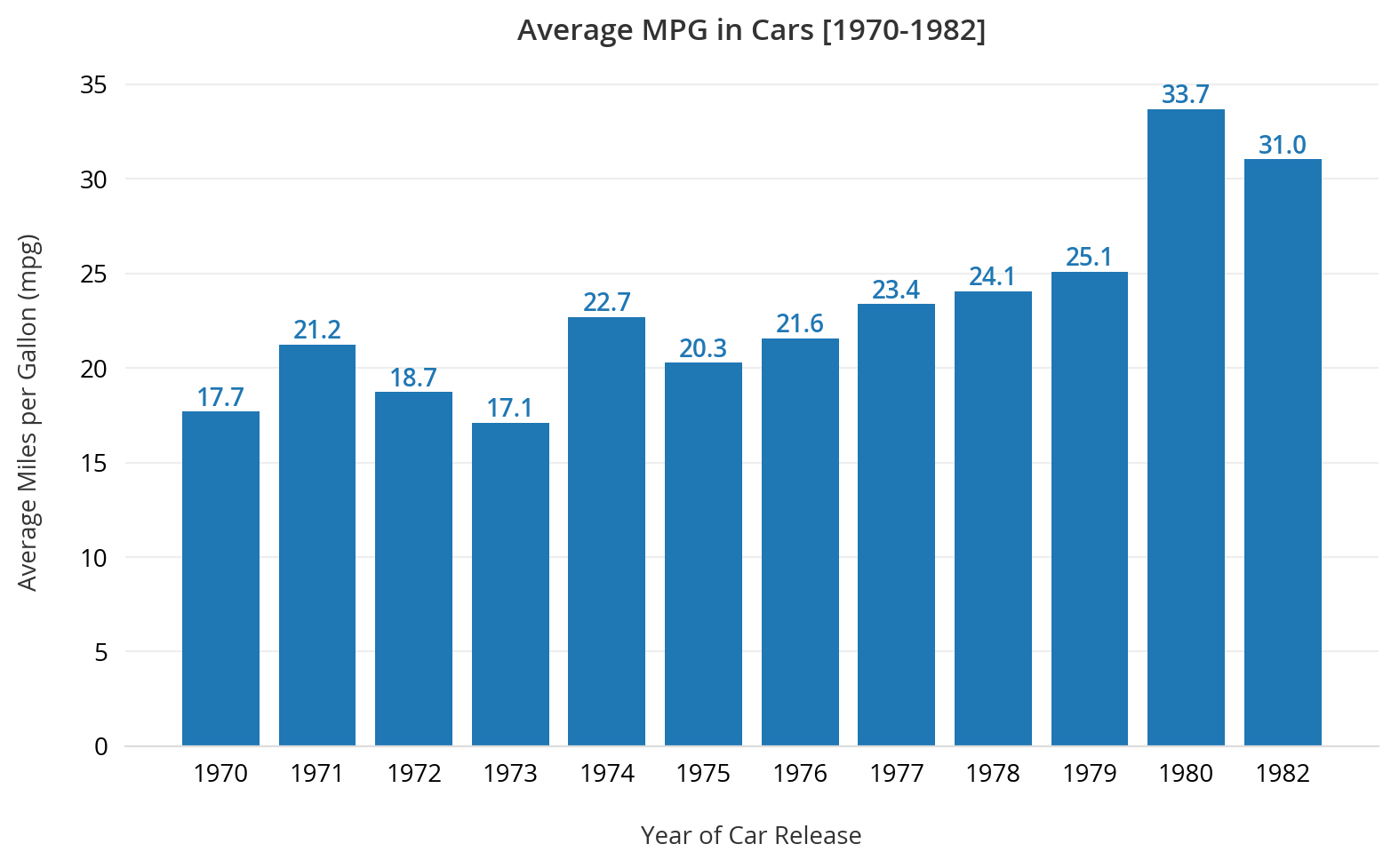
Beautiful no? Maybe could still use a small tweak here or there, but in general, much cleaner than where we started. Have thoughts on ways to make it better? Let me know.