
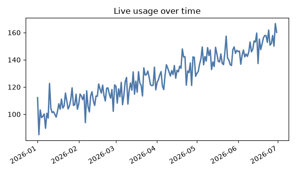
Matplotlib
How to Embed Matplotlib Figures in Tkinter / PyQt GUIs
Embed Matplotlib figures in Tkinter and PyQt applications with FigureCanvasTkAgg and FigureCanvasQTAgg.
Embed Matplotlib figures in Tkinter and PyQt applications with FigureCanvasTkAgg and FigureCanvasQTAgg.
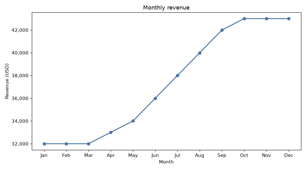
Generate PDF data reports with embedded Python charts using matplotlib's PdfPages.
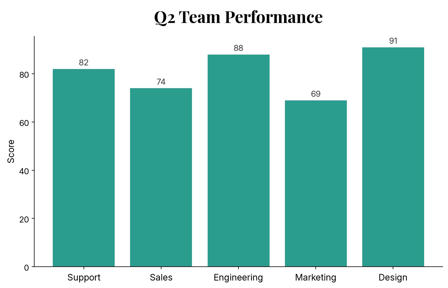
Use a custom font, like one downloaded from Google Fonts, in Matplotlib charts instead of the default DejaVu Sans.
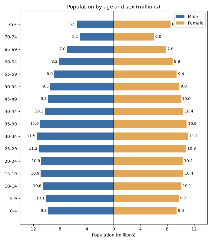
Draw a population pyramid in Python with Matplotlib using mirrored horizontal bar charts.
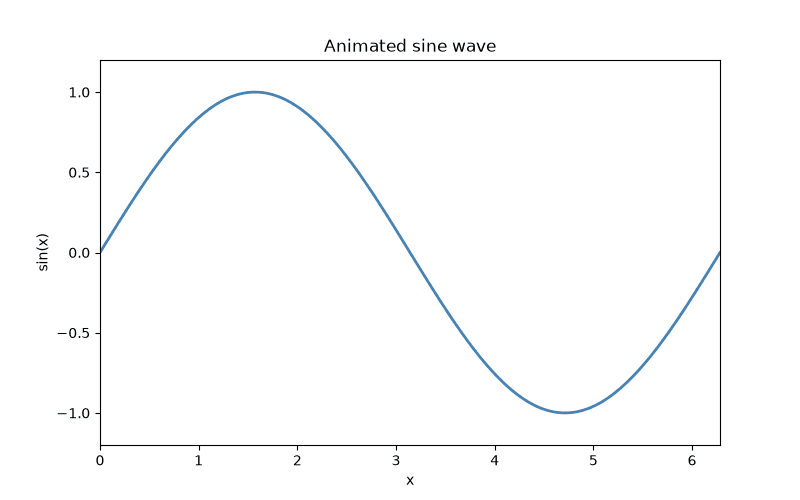
A practical Matplotlib workflow for creating animations and exporting them as GIF or MP4 files.
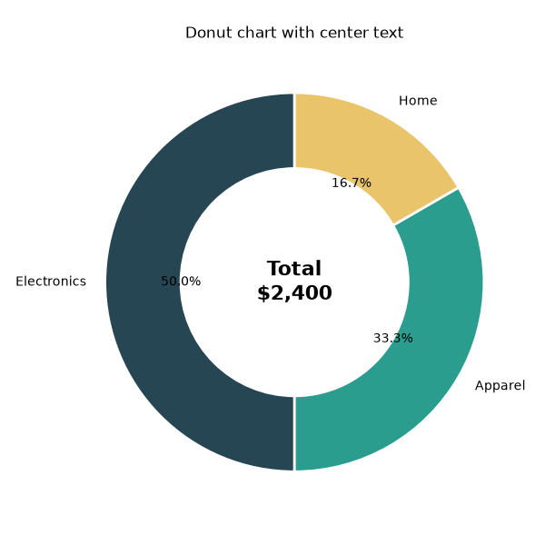
Make a donut chart in Matplotlib and add a centered label with ax.text.
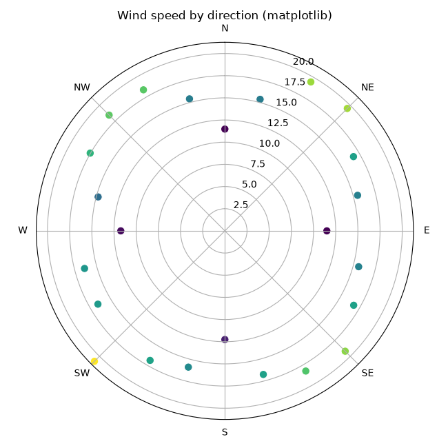
Create polar scatter plots in Matplotlib and Plotly to show points by angle and radius.
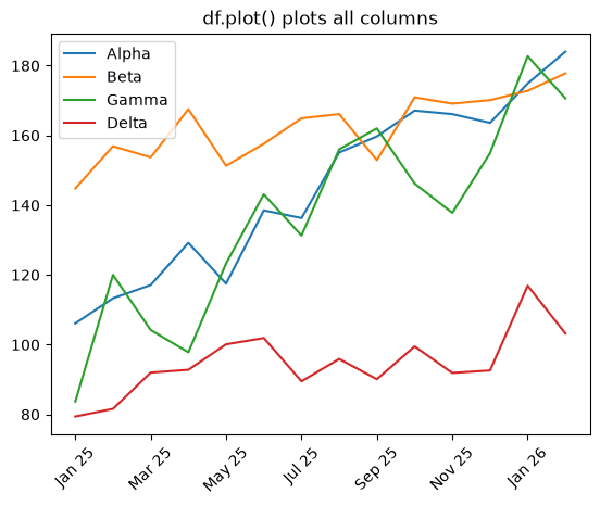
Plot multiple DataFrame columns on one line chart in Pandas with df.plot and per-column colors and styles.
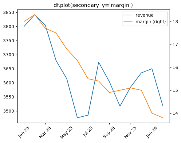
Plot a secondary y-axis in Pandas with df.plot(secondary_y=...) or ax.twinx().
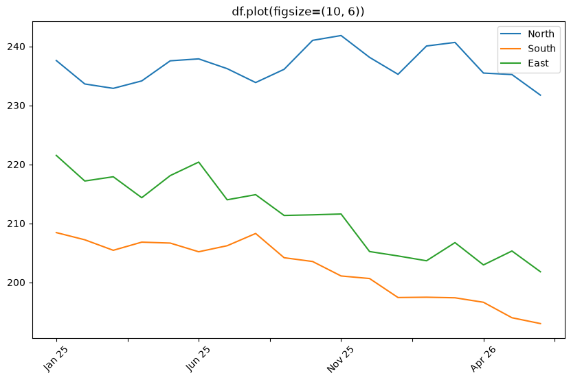
Change the figure size for Pandas df.plot() charts with figsize, plt.subplots, and rcParams.
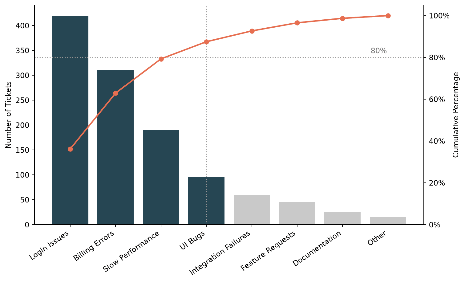
Build a Pareto chart in Matplotlib, combining a sorted bar chart with a cumulative percentage line to visualize the 80/20 rule.
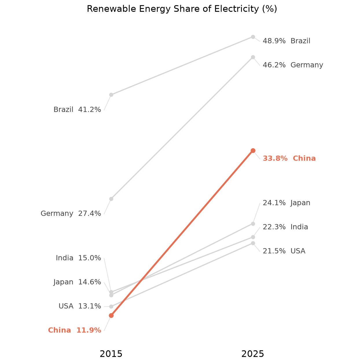
Build a slope chart in Matplotlib for comparing a value across two time points, including label decluttering and highlighting a category.
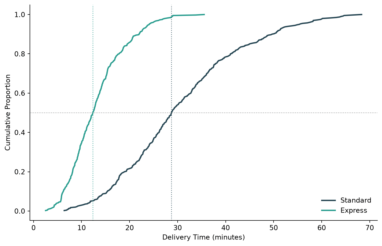
Plot an empirical cumulative distribution function (CDF) in Python, comparing a manual Matplotlib version with Seaborn's ecdfplot.
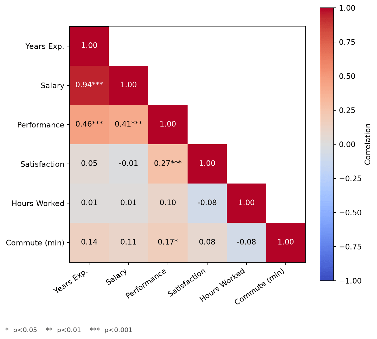
Build a correlation matrix heatmap in Matplotlib with rich annotations, including significance stars and a properly zero-centered color scale.
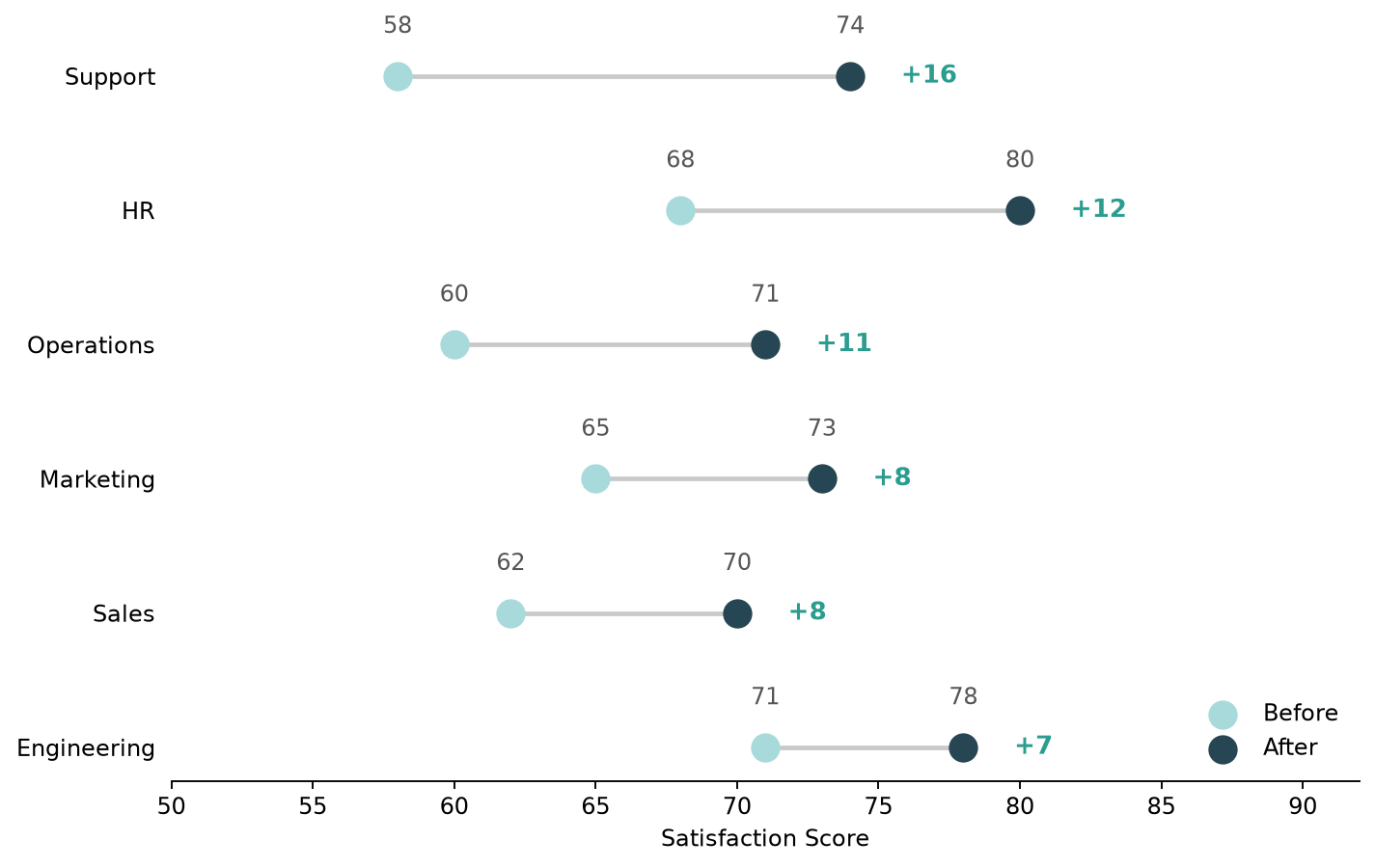
Build a dumbbell plot (dot-and-line chart) in Python with both Matplotlib and Plotly, and compare the two approaches.
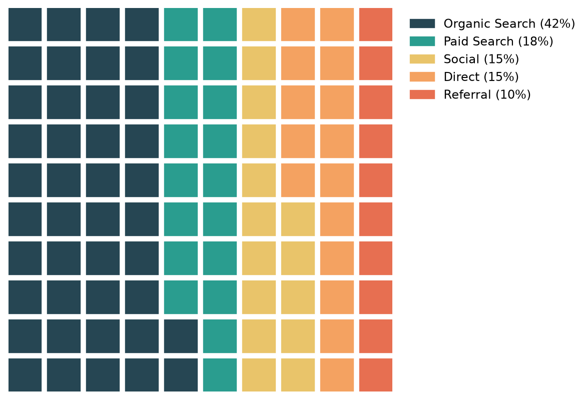
Build waffle charts (square pie charts) in Python with the PyWaffle library, including icons and custom layouts.
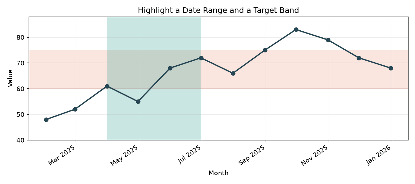
Highlight a date range or a rectangular area in Matplotlib plots with axvspan and axhspan.
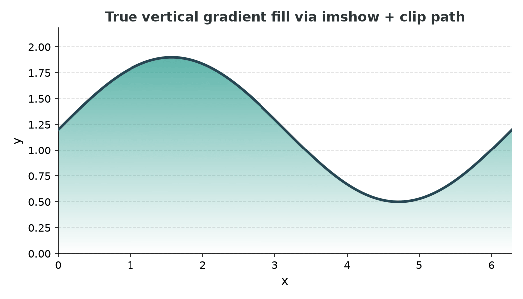
Add shaded areas and true vertical gradient fills under Matplotlib line plots using fill_between and imshow with a clip path.
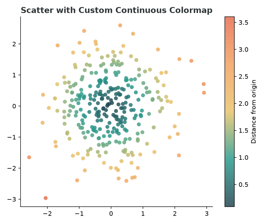
Create continuous and discrete custom colormaps in Matplotlib from a list of hex colors and apply them to scatter plots and heatmaps.
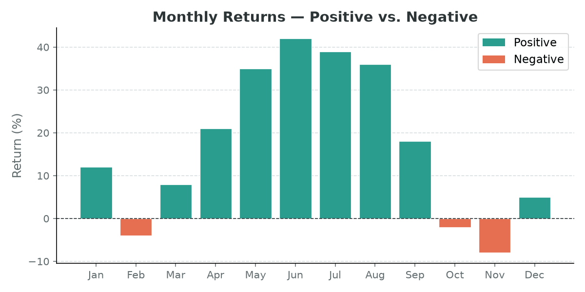
Color each bar in a Matplotlib bar chart individually — by threshold, colormap gradient, or to highlight a specific value.