
A slope chart plots two time points on the x-axis, one line per category running between them, with the category name and value labeled directly at each end rather than through a legend. The slope of each line is the whole point: a steep upward line is immediate visual shorthand for "this grew a lot," and lines crossing each other shows a change in rank between the two points, both of which a table of the same numbers would leave you to work out by comparison.
Quick Example
Two x-positions, one line per category between them, with ax.text() doing the labeling that a legend would otherwise handle.
import matplotlib.pyplot as plt

fig, ax = plt.subplots(figsize=(7.5, 7.5))
x_left, x_right = 0, 1

for _, row in df.iterrows():
    ax.plot([x_left, x_right], [row["2015"], row["2025"]],
            color="#7a7a7a", linewidth=1.8, marker="o")
    ax.text(x_left - 0.05, row["2015"], f"{row['country']}  {row['2015']:.1f}%", ha="right", va="center")
    ax.text(x_right + 0.05, row["2025"], f"{row['2025']:.1f}%  {row['country']}", ha="left", va="center")

ax.set_xticks([x_left, x_right])
ax.set_xticklabels(["2015", "2025"])
ax.set_yticks([])
for spine in ["top", "right", "left", "bottom"]:
    ax.spines[spine].set_visible(False)
A first pass at this chart runs into a real problem the moment two categories land close together in value: their labels overlap and become unreadable, which is exactly what happens with USA, Japan, and India clustered near the bottom of this dataset.
Preventing overlapping labels
The fix is a small decluttering pass: sort the values, then push any labels that are closer together than some minimum gap apart from each other, while a thin leader line keeps each label visually connected to its actual point.
import numpy as np

def declutter(values, min_gap):
    order = np.argsort(values)
    sorted_vals = np.array(values)[order].astype(float)
    adjusted = sorted_vals.copy()
    for i in range(1, len(adjusted)):
        if adjusted[i] - adjusted[i - 1] < min_gap:
            adjusted[i] = adjusted[i - 1] + min_gap
    # re-center so the whole block doesn't drift away from the real values
    adjusted += sorted_vals.mean() - adjusted.mean()
    result = np.empty_like(adjusted)
    result[order] = adjusted
    return result

left_label_y = declutter(df["2015"].values, min_gap=3.2)
right_label_y = declutter(df["2025"].values, min_gap=3.2)
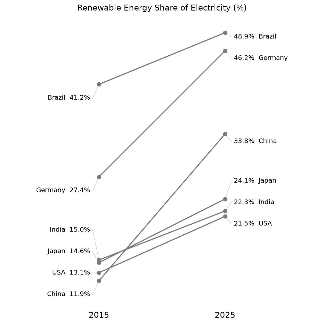
Each label now sits at its adjusted declutter() position instead of its true data value, with a short gray line connecting it back to the actual point on the slope. min_gap is in the same units as the data (percentage points here) and needs tuning to the font size in use; too small and labels still overlap, too large and labels drift noticeably far from their points.
Highlighting one line among many
Once there are more than four or five lines, a slope chart gets visually busy fast. Graying out every line except the one being discussed is a common, effective fix, borrowed from the same idea as an "annotation" in a bar chart.
highlight = {"China"}

for _, row in df.iterrows():
    is_hl = row["country"] in highlight
    ax.plot([x_left, x_right], [row["2015"], row["2025"]],
            color="#e76f51" if is_hl else "#d5d5d5",
            linewidth=2.6 if is_hl else 1.6,
            zorder=3 if is_hl else 2)
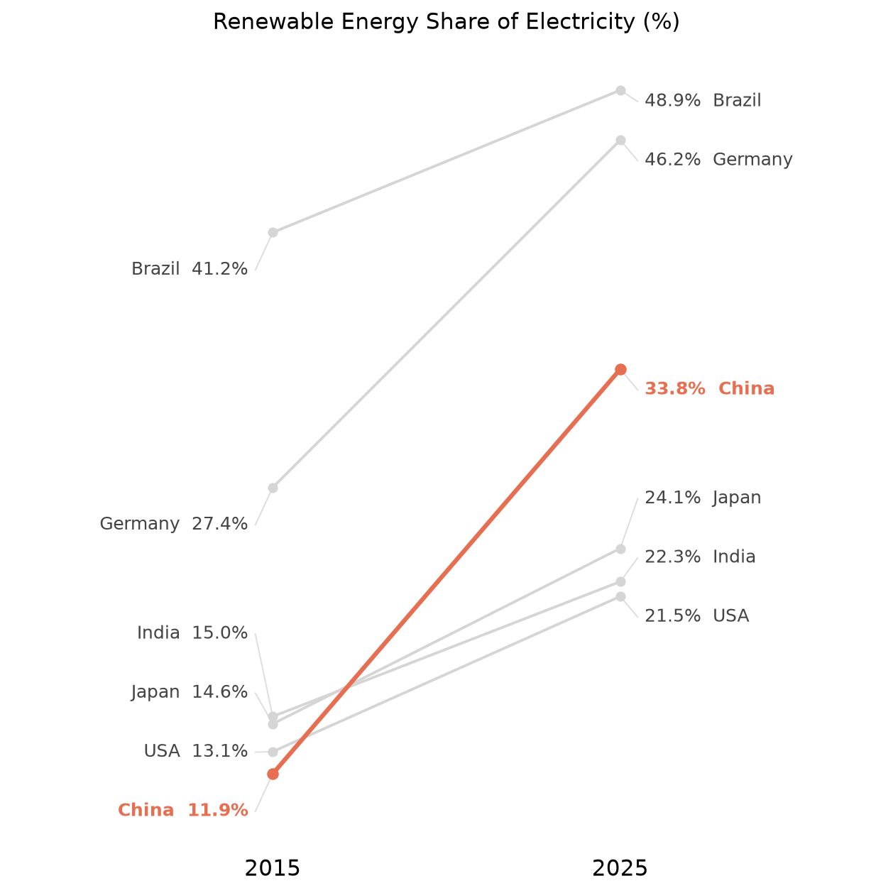
China's line was the steepest in the original chart, but it took real effort to spot among six similarly-styled lines; highlighted, it's the first thing the eye lands on. Match the label color and weight to the highlighted line's color (bold, colored text for China's two labels above) so the emphasis carries all the way through the chart, not just the line itself. zorder matters here too: draw the highlighted line last (or with a higher zorder) so it renders on top of the grayed-out ones rather than getting visually buried underneath a crossing line.
Practical Tips
- Label directly on the chart at both ends rather than using a legend; that's what makes a slope chart readable without the eye having to jump back and forth to a key.
- Always build in label decluttering once there's any realistic chance of two values landing close together; it's rarely optional in practice, not just an edge case.
- A short leader line from a decluttered label back to its real point keeps the chart honest, so a nudged label position never gets mistaken for the actual data.
- Highlight at most one or two lines at a time; graying out everything else works because it's rare, not because gray backgrounds are inherently better.
- A slope chart with dozens of categories stops being readable regardless of decluttering; past roughly 8-10 lines, consider a dumbbell plot sorted by change, or filtering to the categories that matter for the point being made.