Updated Jan 5, 2021: Added instructions on how to add grouped bar labels / text annotations
A bar chart is a great way to compare categorical data across one or two dimensions. More often than not, it's more interesting to compare values across two dimensions and for that, a grouped bar chart is needed.
Matplotlib does not make this super easy, but with a bit of repetition, you'll be coding up grouped bar charts from scratch in no time.
If you're looking for a nicely styled, grouped bar chart with text annotation labels for each bar and just want the code, scroll to the very bottom!
Get our data
# Load Matplotlib and data wrangling libraries.
import matplotlib.pyplot as plt
import numpy as np
import pandas as pd

# Load jobs dataset from Vega's dataset library.
from vega_datasets import data

# Let's use the jobs dataset for this since
# it has two dimensions we can compare across:
# job type and gender.
df = data.jobs()
df.head()
| count | job | perc | sex | year | |
|---|---|---|---|---|---|
| 0 | 708 | Accountant / Auditor | 0.000131 | men | 1850 |
| 1 | 1805 | Accountant / Auditor | 0.000214 | men | 1860 |
| 2 | 1310 | Accountant / Auditor | 0.000100 | men | 1870 |
| 3 | 2295 | Accountant / Auditor | 0.000125 | men | 1880 |
| 4 | 11753 | Accountant / Auditor | 0.000396 | men | 1900 |
Let's filter the data down a bit to get a more practical dataset for this example.
# Let's just look at the most recent data from 2000.
df = df.loc[df['year'] == 2000]

# Let's also just look at a sample of jobs since there
# are a bunch!
jobs = ['Actor', 'Bartender', 'Dentist', 'Engineer', 'Sailor', 'Scientist']
df = df.loc[df['job'].isin(jobs)]

# Note, the data is in "long" or "tidy" format, but wide can work too.
df.head()
| count | job | perc | sex | year | |
|---|---|---|---|---|---|
| 44 | 29975 | Actor | 0.000178 | men | 2000 |
| 59 | 25931 | Actor | 0.000154 | women | 2000 |
| 734 | 185678 | Bartender | 0.001104 | men | 2000 |
| 749 | 232073 | Bartender | 0.001380 | women | 2000 |
| 1844 | 141323 | Dentist | 0.000841 | men | 2000 |
A simple (but wrong) bar chart
Let's look at the number of people in each job, split out by gender.
With the grouped bar chart we need to use a numeric axis (you'll see why further below), so we create a simple range of numbers using np.arange to use as our x values.
We then use ax.bar() to add bars for the two series we want to plot: jobs for men and jobs for women.
fig, ax = plt.subplots(figsize=(12, 8))

# Our x-axis. We basically just want a list
# of numbers from zero with a value for each
# of our jobs.
x = np.arange(len(df.job.unique()))

b1 = ax.bar(x, df.loc[df['sex'] == 'men', 'count'])
b2 = ax.bar(x, df.loc[df['sex'] == 'women', 'count'])
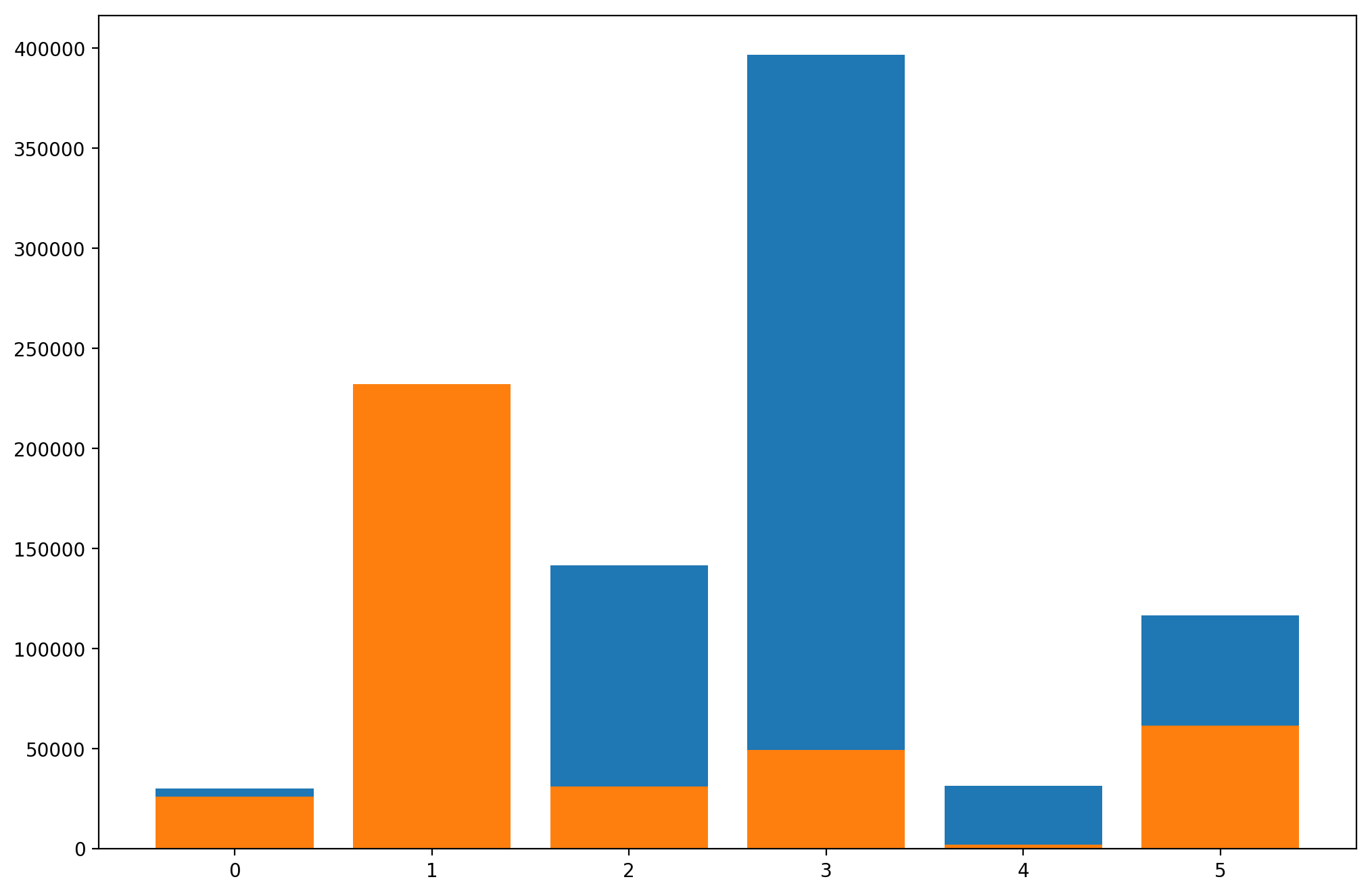
That doesn't look right. Matplotlib is just plotting the two bars on top of each other. Let's fix it!
A basic grouped bar chart
We do that by first setting bar_width. You can play around with the value here to make your chart look the way you want it to; the important thing is to set it and then use it when you are generating each bar: ax.bar(..., width=bar_width).
The most important thing however is to offset the x value of the second bar by bar_width. We do this simply by adding them together: x + bar_width. This is why it's important to use the numeric x-axis instead of a categorical one.
fig, ax = plt.subplots(figsize=(12, 8))
x = np.arange(len(df.job.unique()))

# Define bar width. We'll use this to offset the second bar.
bar_width = 0.4

# Note we add the `width` parameter now which sets the width of each bar.
b1 = ax.bar(x, df.loc[df['sex'] == 'men', 'count'],
            width=bar_width)
# Same thing, but offset the x by the width of the bar.
b2 = ax.bar(x + bar_width, df.loc[df['sex'] == 'women', 'count'],
            width=bar_width)

Things are looking pretty good but the x-axis labels are a bit messed up. They are numbers instead of job labels and they're not really centered.
Fixing the x-axis
To move the ticks to be centered, we just have to shift them by half the width of a bar, or bar_width / 2. We also just assign our labels (be a bit careful here to make sure you're assigning labels in the right order).
fig, ax = plt.subplots(figsize=(12, 8))
x = np.arange(len(df.job.unique()))
bar_width = 0.4
b1 = ax.bar(x, df.loc[df['sex'] == 'men', 'count'],
            width=bar_width)
b2 = ax.bar(x + bar_width, df.loc[df['sex'] == 'women', 'count'],
            width=bar_width)

# Fix the x-axes.
ax.set_xticks(x + bar_width / 2)
ax.set_xticklabels(df.job.unique())

Styling the chart
Lastly, let's just add some labels and styles and put it all together.
# Use Seaborn's context settings to make fonts larger.
import seaborn as sns
sns.set_context('talk')

# Create a grouped bar chart, with job as the x-axis
# and gender as the variable we're grouping on so there
# are two bars per job.
fig, ax = plt.subplots(figsize=(12, 8))

# Our x-axis. We basically just want a list
# of numbers from zero with a value for each
# of our jobs.
x = np.arange(len(df.job.unique()))

# Define bar width. We need this to offset the second bar.
bar_width = 0.4

b1 = ax.bar(x, df.loc[df['sex'] == 'men', 'count'],
            width=bar_width, label='Men')
# Same thing, but offset the x.
b2 = ax.bar(x + bar_width, df.loc[df['sex'] == 'women', 'count'],
            width=bar_width, label='Women')

# Fix the x-axes.
ax.set_xticks(x + bar_width / 2)
ax.set_xticklabels(df.job.unique())

# Add legend.
ax.legend()

# Axis styling.
ax.spines['top'].set_visible(False)
ax.spines['right'].set_visible(False)
ax.spines['left'].set_visible(False)
ax.spines['bottom'].set_color('#DDDDDD')
ax.tick_params(bottom=False, left=False)
ax.set_axisbelow(True)
ax.yaxis.grid(True, color='#EEEEEE')
ax.xaxis.grid(False)

# Add axis and chart labels.
ax.set_xlabel('Job', labelpad=15)
ax.set_ylabel('# Employed', labelpad=15)
ax.set_title('Employed Workers by Gender for Select Jobs', pad=15)

fig.tight_layout()
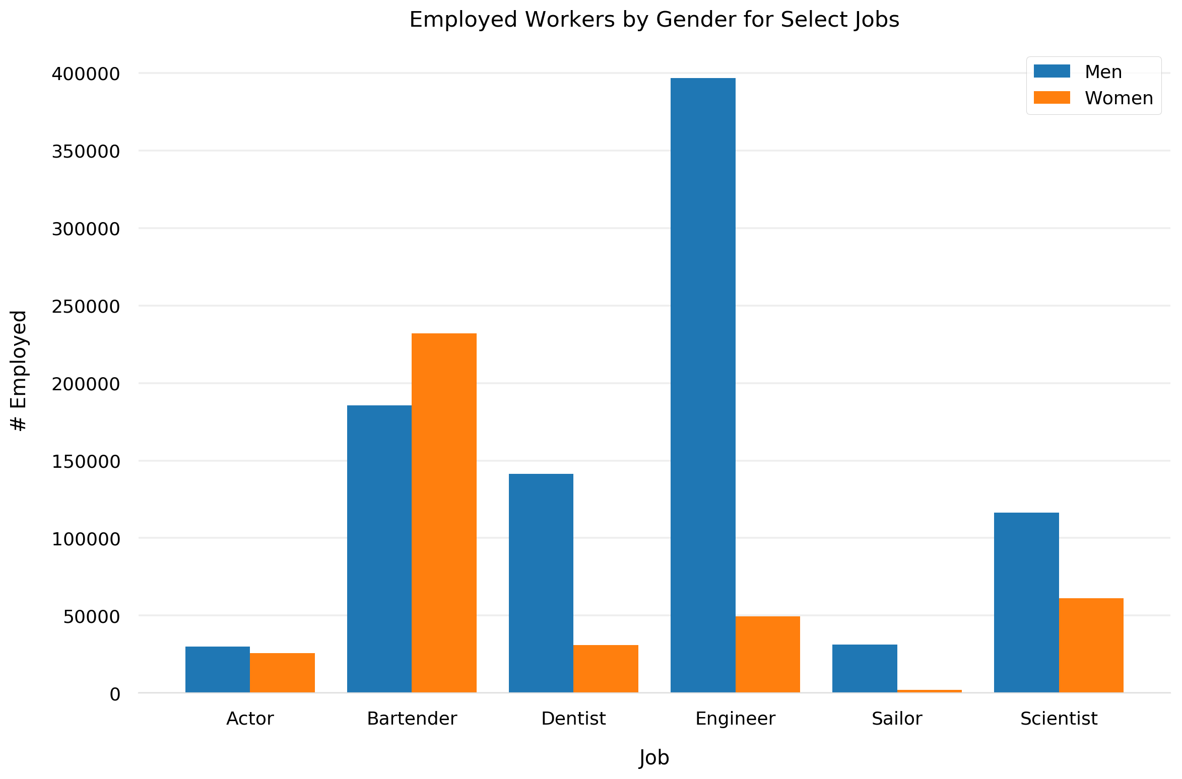
Beautiful. Looks like we need some female engineers :)
Adding Bar Labels / Text Annotations
Adding text labels / annotations to each bar in a grouped bar chart is near identical to doing it for a non-grouped bar chart. You just need to loop through each bar, figure out the right location based on the bar values, and place the text (optionally colored the same as the bar).
# You can just append this to the code above.

# For each bar in the chart, add a text label.
for bar in ax.patches:
  # The text annotation for each bar should be its height.
  bar_value = bar.get_height()
  # Format the text with commas to separate thousands. You can do
  # any type of formatting here though.
  text = f'{bar_value:,}'
  # This will give the middle of each bar on the x-axis.
  text_x = bar.get_x() + bar.get_width() / 2
  # get_y() is where the bar starts so we add the height to it.
  text_y = bar.get_y() + bar_value
  # If we want the text to be the same color as the bar, we can
  # get the color like so:
  bar_color = bar.get_facecolor()
  # If you want a consistent color, you can just set it as a constant, e.g. #222222
  ax.text(text_x, text_y, text, ha='center', va='bottom', color=bar_color,
          size=12)
