
A dumbbell plot (also called a dot-and-line chart) shows two values per category connected by a line, so a change between two points in time, or a gap between two groups, reads as a horizontal distance instead of a bar height. It's a good fit for before/after comparisons, like a metric measured pre- and post-intervention, where a grouped bar chart would make the actual size of the change harder to judge at a glance.
Neither Matplotlib nor Plotly has a dedicated dumbbell() function, but both build one cleanly from a handful of calls. This post covers a static version in Matplotlib and an interactive one in Plotly.
Matplotlib: Quick Example
Draw the connecting line first with hlines(), then plot each set of points on top with two scatter() calls.
import matplotlib.pyplot as plt
import numpy as np

y_pos = np.arange(len(df))

fig, ax = plt.subplots(figsize=(8, 5.2))
ax.hlines(y=y_pos, xmin=df["before"], xmax=df["after"], color="#c9c9c9", linewidth=2)
ax.scatter(df["before"], y_pos, color="#a8dadc", s=140, label="Before")
ax.scatter(df["after"], y_pos, color="#264653", s=140, label="After")

ax.set_yticks(y_pos)
ax.set_yticklabels(df["department"])
ax.set_xlabel("Satisfaction Score")
ax.legend(loc="lower right", frameon=False)
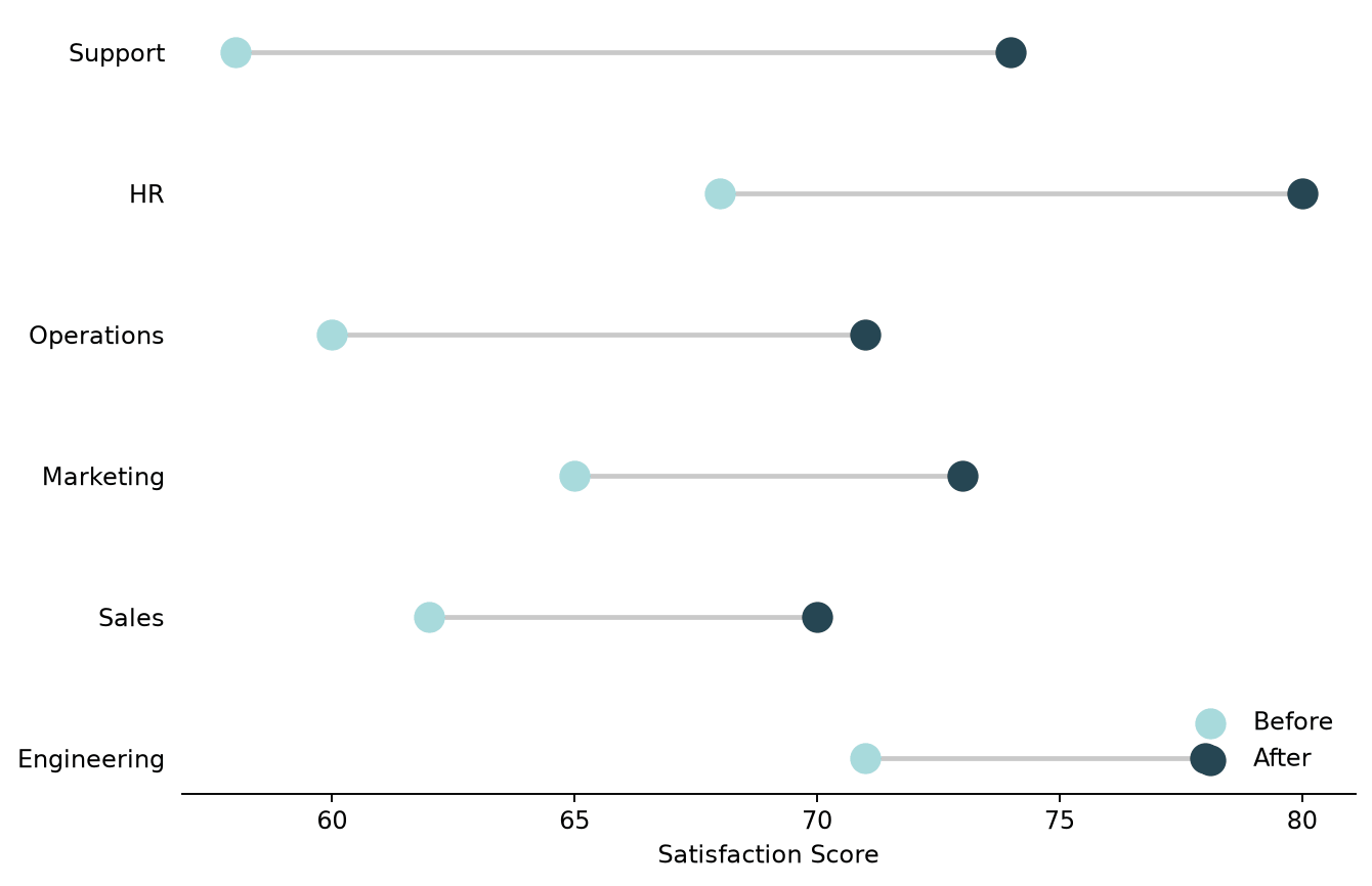
hlines() needs numeric y-positions, not category labels directly, which is why y_pos comes from np.arange() and the department names get applied afterward with set_yticklabels(). Drawing the line before the points (and z-ordering it underneath, matplotlib's default draw order) keeps it from cutting visibly across the markers.
Adding value labels and the size of the change
A dumbbell plot's real advantage over a bar chart is making the change itself readable, so labeling that change directly, rather than making someone eyeball the gap, is usually worth the extra code.
df["change"] = df["after"] - df["before"]
df = df.sort_values("change").reset_index(drop=True)

for yi, row in zip(y_pos, df.itertuples()):
    ax.text(row.before, yi + 0.28, f"{row.before}", ha="center", fontsize=10, color="#555555")
    ax.text(row.after, yi + 0.28, f"{row.after}", ha="center", fontsize=10, color="#555555")
    ax.text(row.after + 1.8, yi, f"+{row.change}", va="center", fontweight="bold", color="#2a9d8f")
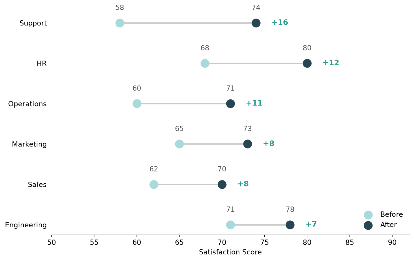
Two things do most of the work here: sorting by change instead of leaving the categories in their original order, and printing the +delta value at the end of each line. Together they turn the chart into something that answers "which department improved the most" on its own, without the reader needing to subtract two numbers per row.
Plotly: an interactive version
Plotly's approach is structurally the same, connecting line plus two sets of points, but built from go.Scatter traces added to a go.Figure, and it comes with hover tooltips for free.
import plotly.graph_objects as go

fig = go.Figure()

for _, row in df.iterrows():
    fig.add_trace(go.Scatter(
        x=[row["before"], row["after"]], y=[row["department"]] * 2,
        mode="lines", line=dict(color="lightgray", width=2), showlegend=False,
    ))

fig.add_trace(go.Scatter(
    x=df["before"], y=df["department"], mode="markers",
    marker=dict(color="#636efa", size=14), name="Before",
))
fig.add_trace(go.Scatter(
    x=df["after"], y=df["department"], mode="markers",
    marker=dict(color="#ef553b", size=14), name="After",
))

fig.update_layout(xaxis_title="Satisfaction Score")
fig.show()
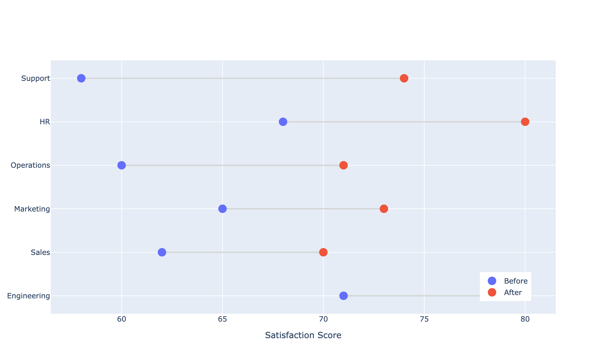
Each connecting line needs its own go.Scatter trace with mode="lines", since Plotly draws one continuous line per trace rather than accepting a list of independent segments the way hlines() does; that's the main extra step compared to the Matplotlib version. In exchange, every point is hoverable by default, showing its exact value without any labels cluttering the chart itself, which is the callout box shown on the HR point above.
Matplotlib vs Plotly
Both charts show the same information; the difference is what each library optimizes for. Matplotlib's version is a handful of lines, renders as a static image that drops into a PDF or a printed report with no extra dependencies, and every label placement is something you control by hand, including the delta annotations above. Plotly's version needs one trace per line segment, which is more setup code for the same chart, but the result is interactive out of the box: hover for exact values, zoom, and pan, which matters more for a dashboard or a notebook someone will explore themselves than for a chart headed into a static document.
Practical Tips
- Sort by the size of the change (
df.sort_values("change")), not by category name; the sort order is what makes the biggest movers easy to spot. - Draw the connecting line before the point markers so the line sits visually underneath them, not on top.
- Label the delta directly (
+16,-8) rather than relying on the reader to compare two dot positions by eye; that's the whole reason to reach for a dumbbell plot over a grouped bar chart. - In Plotly, one
go.Scatter(mode="lines")trace per row is needed for the connectors; there's no single call that draws every line segment at once the way Matplotlib'shlines()does. - Reach for Matplotlib when the chart is headed into a static report or paper; reach for Plotly when someone will be exploring the chart themselves and hover detail adds real value.