
DataFrame.corr() turns any table of numeric columns into a correlation matrix in one call, and imshow() turns that matrix into a heatmap in one more. The harder part is the annotation layer: which cells to label, how to mark which correlations are actually statistically meaningful, and making sure the color scale doesn't quietly mislead. This post covers all three, working with plain pandas and Matplotlib.
Quick Example
corr() on a numeric DataFrame gives the matrix directly; loop over it to draw each value as text on top of imshow().
import matplotlib.pyplot as plt

corr = df.corr()
labels = corr.columns

fig, ax = plt.subplots(figsize=(7, 6))
im = ax.imshow(corr, cmap="coolwarm", vmin=-1, vmax=1)

ax.set_xticks(range(len(labels)), labels=labels, rotation=35, ha="right")
ax.set_yticks(range(len(labels)), labels=labels)

for i in range(len(labels)):
    for j in range(len(labels)):
        val = corr.iloc[i, j]
        ax.text(j, i, f"{val:.2f}", ha="center", va="center",
                color="white" if abs(val) > 0.6 else "black")

fig.colorbar(im, ax=ax, label="Correlation")
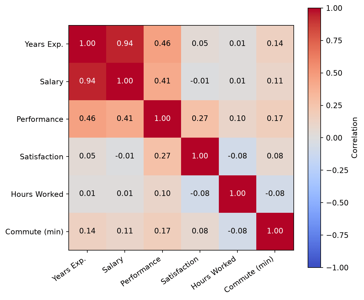
ax.text(j, i, ...) places each label at column j, row i, matching imshow()'s coordinate system directly, so no extra positioning logic is needed. The abs(val) > 0.6 check switches label color to white on the darkest cells so text doesn't disappear into a saturated red or blue background.
Mask the redundant upper triangle
A correlation matrix is symmetric, so the upper and lower triangles show identical information, and the diagonal is always 1. Masking the upper triangle removes that repetition without losing anything.
import numpy as np

mask = np.triu(np.ones_like(corr, dtype=bool), k=1)
corr_masked = np.ma.masked_where(mask, corr.values)

fig, ax = plt.subplots(figsize=(7.2, 6.2))
im = ax.imshow(corr_masked, cmap="coolwarm", vmin=-1, vmax=1)
# ... ticks and labels as above, skipping masked cells in the text loop
np.triu(..., k=1) masks strictly above the diagonal, which keeps the diagonal's 1.00 cells visible; drop k=1 to hide the diagonal too. np.ma.masked_where() produces a masked array that imshow() leaves blank wherever the mask is True, so those cells render as empty space instead of a distracting flat color.
Mark statistical significance
A correlation coefficient on its own doesn't say whether that relationship is likely real or just noise in a small sample. scipy.stats.pearsonr() returns a p-value alongside each correlation, which you can translate into the conventional asterisk notation and layer onto the same annotations.
from scipy.stats import pearsonr

def sig_stars(p):
    if p < 0.001:
        return "***"
    elif p < 0.01:
        return "**"
    elif p < 0.05:
        return "*"
    return ""

# One p-value per pair, alongside the existing correlation loop
_, p = pearsonr(df[col_i], df[col_j])
label = f"{corr.iloc[i, j]:.2f}{sig_stars(p)}"
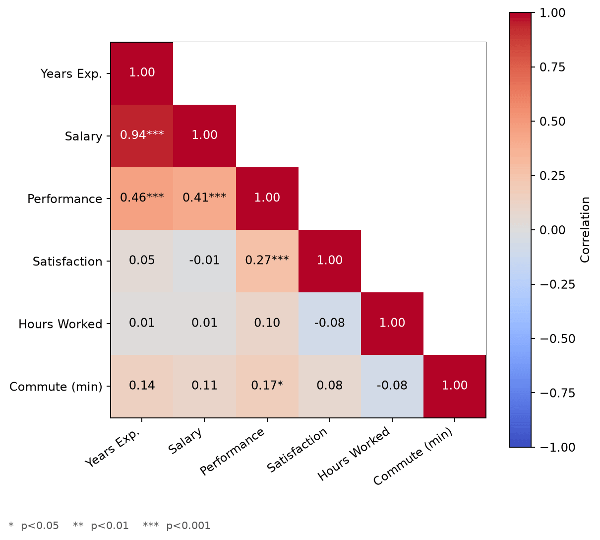
Combined with the triangle mask, this is usually the most useful version of the chart for anything beyond a quick exploratory look: a correlation of 0.17 with no stars is a much weaker claim than 0.94***, and printing both side by side means the reader doesn't have to cross-reference a separate p-value table to tell the two apart.
Center the color scale correctly
vmin=-1, vmax=1 is the safe default since it matches correlation's real range, but it isn't always the most informative choice. If every correlation in a particular matrix happens to be positive or near zero, that fixed range can make the whole chart look uniformly "warm," burying the actual spread in the data.
import matplotlib.colors as mcolors

norm = mcolors.TwoSlopeNorm(vmin=corr.values.min(), vcenter=0, vmax=corr.values.max())
im = ax.imshow(corr, cmap="coolwarm", norm=norm)
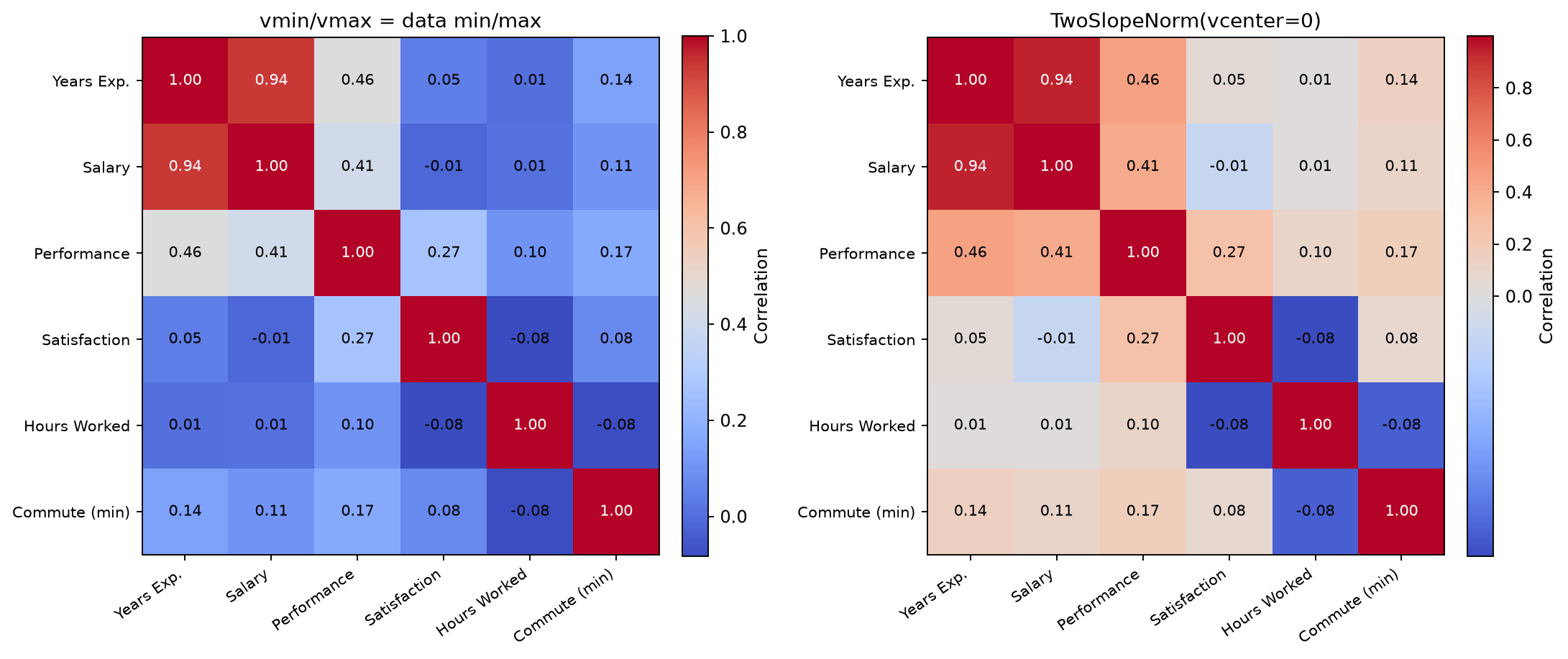
On the left, vmin and vmax are just this matrix's actual minimum and maximum (-0.08 and 0.94), which pushes the color midpoint away from zero: cells around 0.05 render as clearly blue even though they represent almost no correlation at all. TwoSlopeNorm fixes this by keeping 0 pinned to the color scale's true center regardless of where the data's min and max land, so a near-zero correlation reads as the neutral color it should be. Use vmin=-1, vmax=1 when comparing multiple correlation matrices against each other (so the color scale means the same thing in every chart), and TwoSlopeNorm when a single matrix needs its own contrast stretched to show its real spread.
Practical Tips
ax.text(j, i, ...)andimshow()share the same column-then-row coordinate order; get this backwards and every annotation lands transposed.- Mask with
np.triu(..., k=1)to drop the redundant upper triangle while keeping the diagonal; addk=0to hide the diagonal as well. - Significance stars from
scipy.stats.pearsonr()turn a correlation matrix into something closer to a real statistical result, not just a visual pattern; don't skip this for anything beyond casual exploration. - Use a fixed
vmin=-1, vmax=1when the chart needs to be compared against other correlation heatmaps; switch toTwoSlopeNorm(vcenter=0)when a single matrix's own contrast matters more than cross-chart consistency. - Keep the contrast check (
abs(val) > 0.6or similar) on label color; without it, dark cells swallow their own annotation text.