
Heatmaps are maybe a bit easier in Seaborn, but Matplotlib supports them too. The most useful starting point is imshow(): give it a two-dimensional array and it turns each value into a colored cell. It is a good fit for correlation matrices, score grids, and any data where every cell has the same size.
When the cells have meaningful numeric boundaries or irregular widths, use pcolormesh() instead. Both approaches give you control over labels, annotations, colorbars, and the color scale.
A simple heatmap with imshow()
This example shows orders by weekday and time of day. Each row is a weekday, each column is a time period, and the cell color represents the order count.
import numpy as np
import matplotlib.pyplot as plt

orders = np.array([
    [18, 31, 14],
    [22, 35, 19],
    [25, 38, 23],
    [24, 34, 21],
    [16, 28, 17],
])

days = ["Monday", "Tuesday", "Wednesday", "Thursday", "Friday"]
periods = ["Morning", "Afternoon", "Evening"]

fig, ax = plt.subplots(figsize=(7, 4))
image = ax.imshow(orders, cmap="YlGnBu", aspect="auto")

ax.set_xticks(range(len(periods)), labels=periods)
ax.set_yticks(range(len(days)), labels=days)
ax.set_title("Orders by weekday and time of day")

fig.colorbar(image, ax=ax, label="Orders")
plt.tight_layout()
plt.show()
imshow() returns an image object. Pass that object to fig.colorbar() so Matplotlib can build a colorbar using the same mapping between values and colors.
By default, the first row of an array appears at the top of the chart. That is usually natural for a table-like heatmap. If you need the first row at the bottom instead, set origin="lower".
image = ax.imshow(orders, cmap="YlGnBu", origin="lower", aspect="auto")
Add the values to each cell
Color shows the pattern quickly, but annotations help readers compare exact values. For a small heatmap, a nested loop is straightforward and gives you full control over the text.
fig, ax = plt.subplots(figsize=(7, 4))
image = ax.imshow(orders, cmap="YlGnBu", aspect="auto")

ax.set_xticks(range(len(periods)), labels=periods)
ax.set_yticks(range(len(days)), labels=days)

for row in range(orders.shape[0]):
    for column in range(orders.shape[1]):
        value = orders[row, column]
        text_color = "white" if value > 25 else "black"
        ax.text(
            column,
            row,
            value,
            ha="center",
            va="center",
            color=text_color,
        )

fig.colorbar(image, ax=ax, label="Orders")
ax.set_title("Orders by weekday and time of day")
plt.tight_layout()
plt.show()
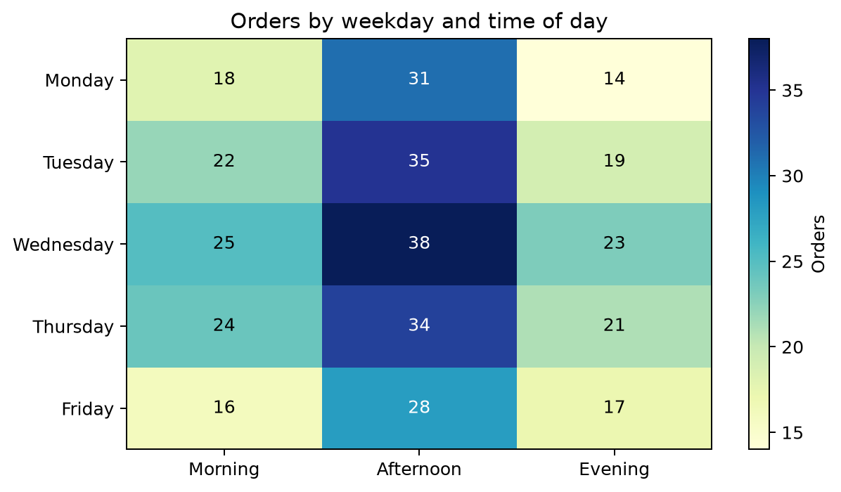
The loop coordinates match the array: column is the x-position and row is the y-position. The contrast check keeps the labels readable on the darker cells. For a large matrix, omit the annotations. Hundreds of numbers make the chart harder to read, not easier.
Add lines between cells
imshow() does not draw gridlines around cells. You can create them with minor ticks positioned between the cells.
fig, ax = plt.subplots(figsize=(7, 4))
image = ax.imshow(orders, cmap="YlGnBu", aspect="auto")

ax.set_xticks(range(len(periods)), labels=periods)
ax.set_yticks(range(len(days)), labels=days)

# Minor ticks sit halfway between the cells.
ax.set_xticks(np.arange(-0.5, len(periods), 1), minor=True)
ax.set_yticks(np.arange(-0.5, len(days), 1), minor=True)
ax.grid(which="minor", color="white", linewidth=1)
ax.tick_params(which="minor", bottom=False, left=False)

fig.colorbar(image, ax=ax, label="Orders")
plt.tight_layout()
plt.show()
Keep the lines subtle. They should make individual cells easier to follow without competing with the color encoding.
Make a correlation heatmap
Heatmaps are often used for correlations. Correlation values run from -1 to 1, so use a diverging colormap and center it on zero. That way, negative and positive values get visibly different colors.
import pandas as pd

measurements = pd.DataFrame(
    {
        "height_cm": [160, 165, 170, 172, 178, 181, 185],
        "weight_kg": [55, 61, 67, 68, 74, 79, 82],
        "weekly_runs": [4, 3, 2, 4, 2, 1, 1],
        "resting_hr": [58, 61, 66, 60, 68, 73, 75],
    }
)

correlations = measurements.corr()

fig, ax = plt.subplots(figsize=(6, 5))
image = ax.imshow(
    correlations,
    cmap="coolwarm",
    vmin=-1,
    vmax=1,
)

labels = correlations.columns
ax.set_xticks(range(len(labels)), labels=labels, rotation=30, ha="right")
ax.set_yticks(range(len(labels)), labels=labels)

for row in range(correlations.shape[0]):
    for column in range(correlations.shape[1]):
        ax.text(
            column,
            row,
            f"{correlations.iloc[row, column]:.2f}",
            ha="center",
            va="center",
        )

fig.colorbar(image, ax=ax, label="Correlation")
ax.set_title("Correlation between measurements")
plt.tight_layout()
plt.show()
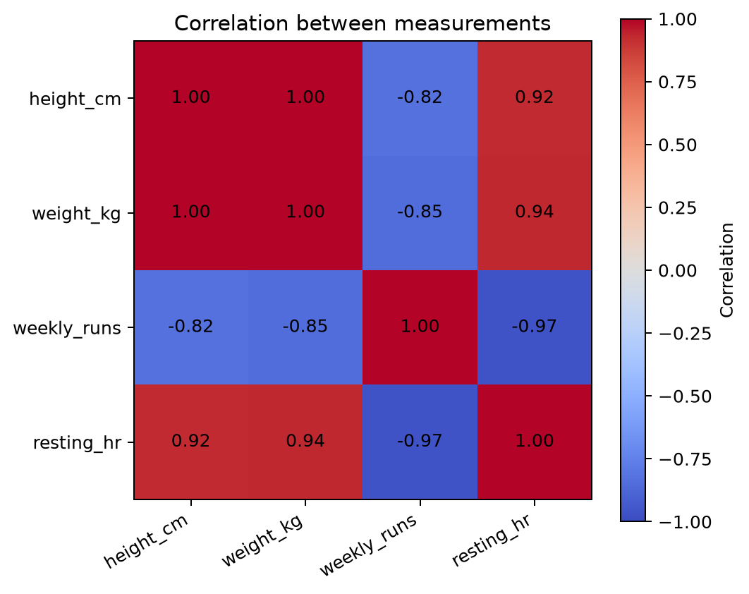
vmin=-1 and vmax=1 pin the two ends of the color scale to the possible correlation range. This matters if you create more than one correlation heatmap: the same color will keep the same meaning in every chart.
For changes from a baseline, profit and loss, or any other data with a meaningful zero, use the same idea with a scale that is symmetric around zero. If the data is only positive, such as counts or revenue, switch back to a sequential colormap like YlGnBu or viridis.
When pcolormesh() is the better choice
imshow() treats every cell as equally spaced. pcolormesh() lets you specify where each cell starts and ends, which is useful for numeric bins that are not evenly sized.
temperature = np.array([
    [12, 15, 18],
    [14, 19, 23],
])

# Cell edges, not centers. There are one more edges than cells.
hours = [0, 6, 18, 24]
altitudes = [0, 500, 2000]

fig, ax = plt.subplots(figsize=(7, 3.5))
mesh = ax.pcolormesh(
    hours,
    altitudes,
    temperature,
    cmap="magma",
    shading="flat",
)

fig.colorbar(mesh, ax=ax, label="Temperature (°C)")
ax.set_xlabel("Hour of day")
ax.set_ylabel("Altitude (m)")
ax.set_title("Temperature by hour and altitude band")
plt.tight_layout()
plt.show()
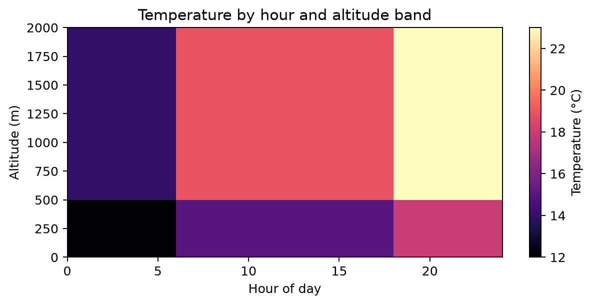
The temperature array has two rows and three columns. Its coordinate lists have three altitude edges and four hour edges, which define the boundaries of those six cells. With imshow(), the cells would all be the same width; here, the 6–18 hour band is visibly wider than the other bands.
Choose the right tool
Use imshow() when your data is a regular matrix and you want a compact chart with labels and annotations. Use pcolormesh() when the position or width of each bin contains information. In either case, the colorbar is part of the chart: label it with a unit and set fixed limits whenever readers will compare multiple heatmaps.