
A confusion matrix breaks a classifier's predictions down by what it got right and how it got things wrong, one row per true class and one column per predicted class. It's the chart to reach for once accuracy alone stops telling the full story, since it shows exactly which classes get confused for each other and whether errors lean in one direction. Python gives two natural ways to plot one: scikit-learn's built-in display, or a Seaborn heatmap built from the same numbers.
Quick Example
ConfusionMatrixDisplay.from_predictions() is the fastest path, going straight from true and predicted labels to a finished chart in one call.
from sklearn.metrics import ConfusionMatrixDisplay

ConfusionMatrixDisplay.from_predictions(
    y_test, y_pred, display_labels=["Stayed", "Churned"], cmap="Blues",
)
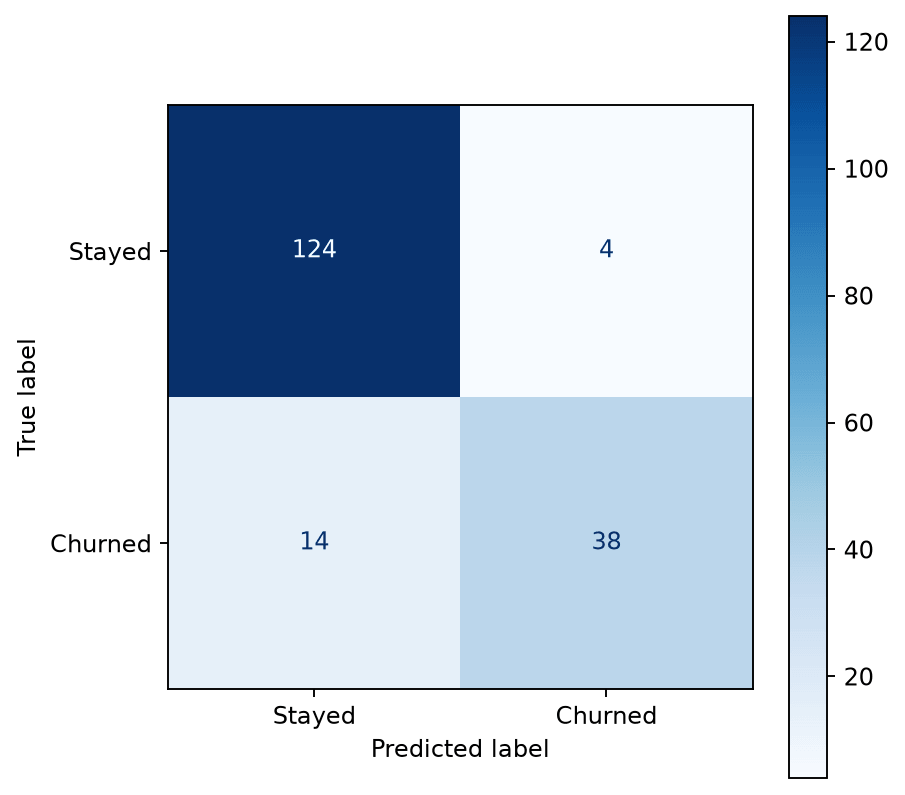
Reading it: rows are the true label, columns are the predicted label. The diagonal (124 and 38 here) is where the model agreed with reality; everything off the diagonal is a miss. This particular model rarely predicts a false churn (4 cases) but misses real churn more often (14 cases), which is a meaningfully different failure mode than accuracy alone would show.
Building the same chart with Seaborn
ConfusionMatrixDisplay is convenient, but a plain Seaborn heatmap() on the raw matrix gives more control over styling, and fits naturally alongside other Seaborn charts in the same notebook or report.
import seaborn as sns
from sklearn.metrics import confusion_matrix

cm = confusion_matrix(y_test, y_pred)

fig, ax = plt.subplots(figsize=(5.8, 5))
sns.heatmap(
    cm, annot=True, fmt="d", cmap="Blues",
    xticklabels=["Stayed", "Churned"], yticklabels=["Stayed", "Churned"],
    cbar_kws={"label": "Count"}, linewidths=0.5, linecolor="white", ax=ax,
)
ax.set_xlabel("Predicted label")
ax.set_ylabel("True label")
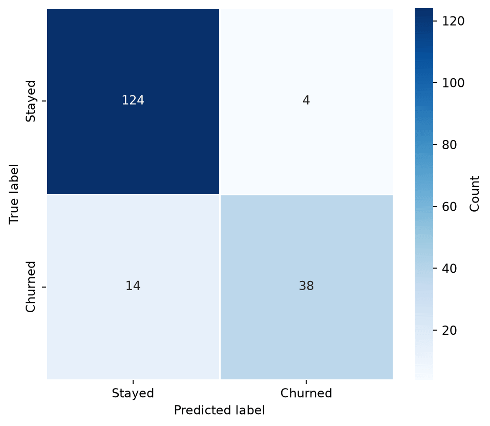
confusion_matrix() returns the plain NumPy array of counts, so it's the same underlying data as the quick example above, just handed to sns.heatmap() directly instead of through scikit-learn's display wrapper. This is the version to use once you need something ConfusionMatrixDisplay doesn't offer directly, like a custom color palette, annotation formatting, or dropping it into a FacetGrid alongside other charts.
Normalize to see error rates, not just counts
Raw counts favor whichever class shows up more often in the test set. Passing normalize="true" to confusion_matrix() converts each row to a percentage of that row's true total, which makes per-class error rates comparable even when the classes are imbalanced.
cm_norm = confusion_matrix(y_test, y_pred, normalize="true")

sns.heatmap(
    cm_norm, annot=True, fmt=".1%", cmap="Blues",
    xticklabels=["Stayed", "Churned"], yticklabels=["Stayed", "Churned"],
    vmin=0, vmax=1, cbar_kws={"label": "Share of true label"}, ax=ax,
)
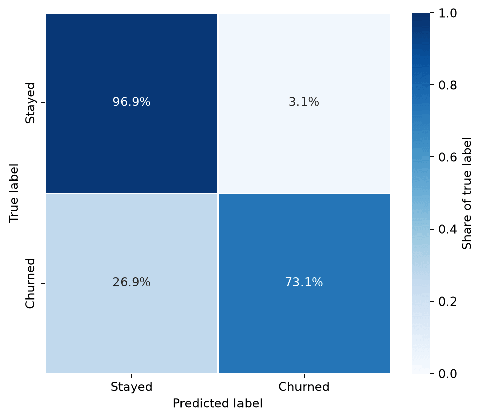
The raw counts (124 vs. 38) made the "Stayed" class look like the one the model handles best, which is true in absolute terms but hides the real story: the model catches 96.9% of customers who stay, but only 73.1% of customers who actually churn. Setting a fixed vmin=0, vmax=1 matters here too, the same way it does for correlation heatmaps, so the color scale means the same thing across every normalized confusion matrix you make.
Multi-class confusion matrices
Nothing changes structurally with more than two classes; the matrix just grows to match the number of categories, and reading it becomes more about scanning for which off-diagonal cells stand out.
class_labels = ["Electronics", "Apparel", "Home Goods", "Sports"]
cm = confusion_matrix(y_test, y_pred)

sns.heatmap(
    cm, annot=True, fmt="d", cmap="Blues",
    xticklabels=class_labels, yticklabels=class_labels, ax=ax,
)
ax.set_xlabel("Predicted category")
ax.set_ylabel("True category")
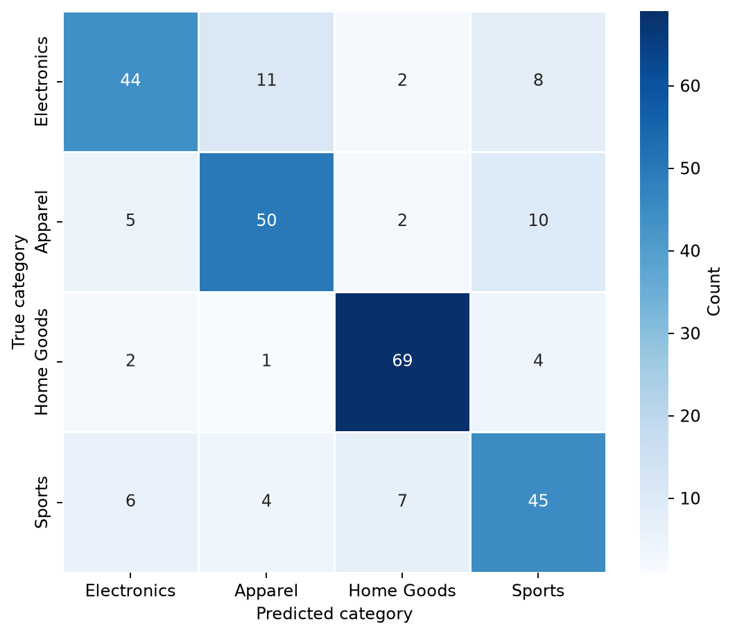
With four classes, a quick scan shows Apparel gets predicted as Sports more than any other confusion (10 cases), which is a more specific, actionable finding than a single overall accuracy score would surface. This is generally the real value of a confusion matrix over a summary metric: it points at which classes need attention, not just how often the model is right.
Practical Tips
ConfusionMatrixDisplay.from_predictions()is the quickest path when the default styling is good enough; switch toconfusion_matrix()plussns.heatmap()once custom colors, annotations, or a multi-plot layout are needed.- Normalize with
normalize="true"whenever classes are imbalanced; raw counts otherwise make the majority class look artificially well-handled. - Set a fixed
vmin=0, vmax=1on normalized matrices so the color scale is consistent and comparable across different models or runs. fmt="d"for raw counts,fmt=".1%"(or.0%) for normalized matrices; mismatching the format string to the data is a common source of a matrix full of"0".- For classes with long names, rotate
xticklabels(ax.tick_params(axis="x", rotation=45)) rather than shrinking the font to fit.