
Pandas
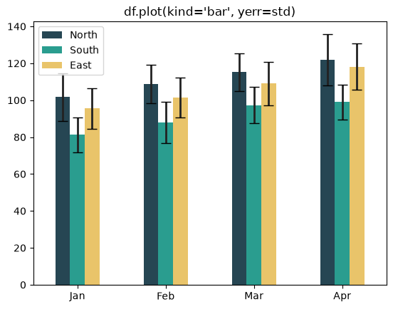
How to Add Error Bars to Pandas DataFrame Plots
Add error bars to Pandas DataFrame plots with yerr and xerr on df.plot.
Add error bars to Pandas DataFrame plots with yerr and xerr on df.plot.
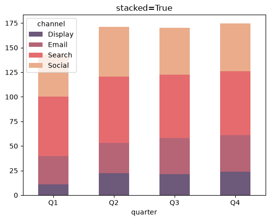
Plot stacked and unstacked bar charts in Pandas with df.plot and the stacked argument.
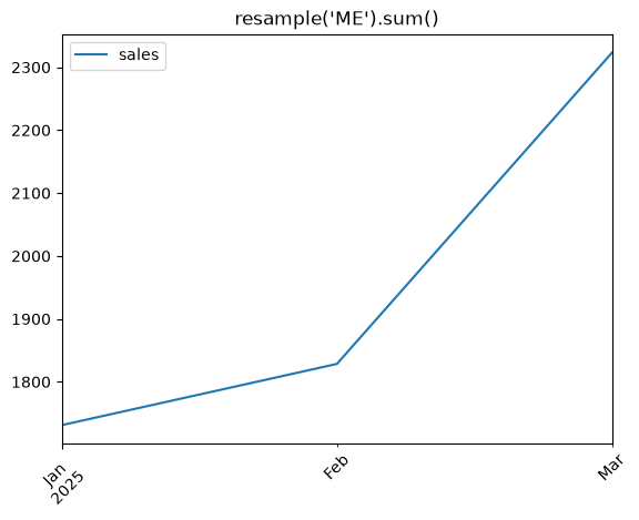
Resample time series data to a custom frequency in Pandas and plot the result with df.plot.
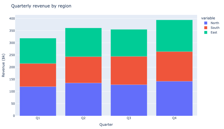
Switch the Pandas default plotting backend to Plotly so df.plot() returns interactive figures.
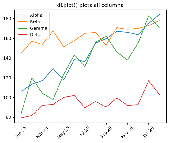
Plot multiple DataFrame columns on one line chart in Pandas with df.plot and per-column colors and styles.
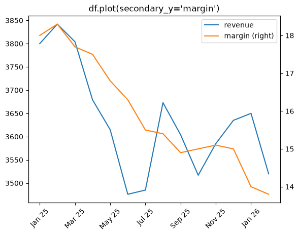
Plot a secondary y-axis in Pandas with df.plot(secondary_y=...) or ax.twinx().
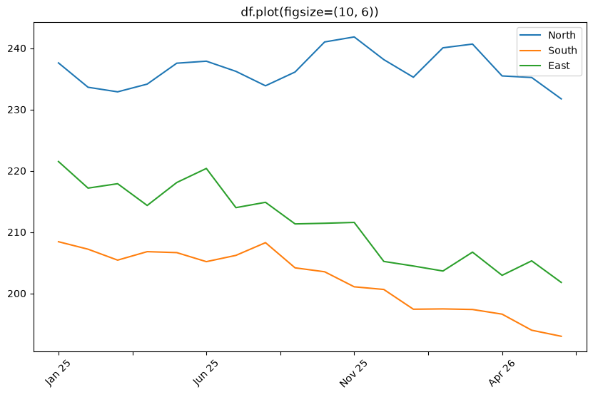
Change the figure size for Pandas df.plot() charts with figsize, plt.subplots, and rcParams.
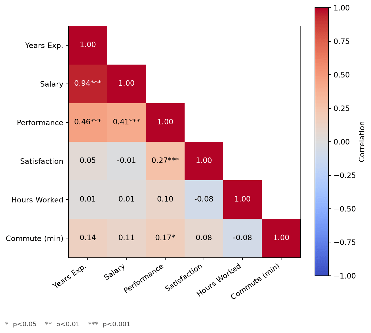
Build a correlation matrix heatmap in Matplotlib with rich annotations, including significance stars and a properly zero-centered color scale.
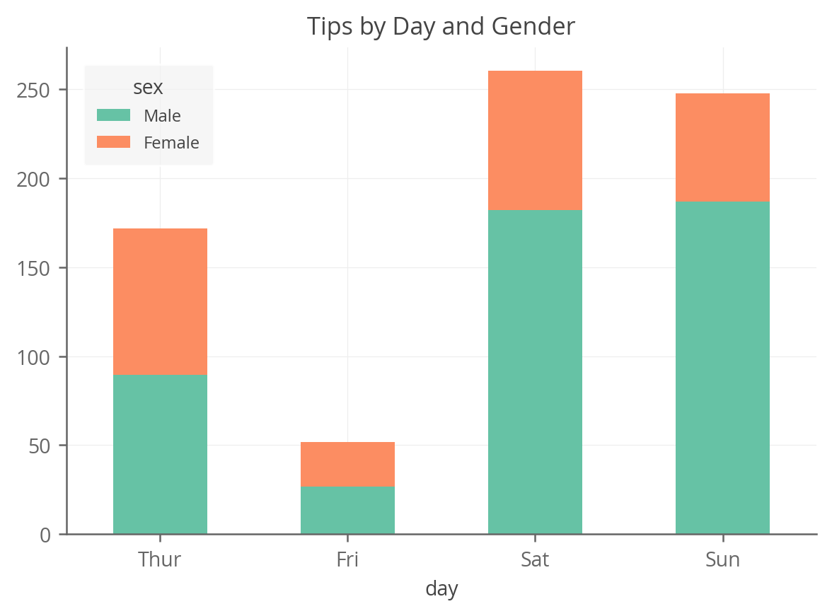
A complete guide to creating stacked bar charts in python using Pandas, Matplotlib, Seaborn, Plotnine and Altair