
Raw daily data is often too noisy to read clearly. Resample it to a coarser, custom frequency, then plot the aggregated series. Pandas handles both steps, and df.plot() renders the result on a proper time axis.
Quick Example
Resample daily data to weekly (or any offset) and plot the result.
import pandas as pd

weekly = df.resample("W").sum()

weekly.plot()
The key is a DatetimeIndex. Once the index holds real timestamps, resample() groups the rows into buckets of your chosen frequency, and df.plot() draws them in time order.
Start with a DatetimeIndex
resample() only works when the index is a DatetimeIndex (or PeriodIndex). Convert a plain date column first.
df["date"] = pd.to_datetime(df["date"])
df = df.set_index("date")
If a column already parses to dates, pd.to_datetime() normalizes it, and set_index() promotes it to the index. From here resample() has the time context it needs.
Choose a custom frequency
The frequency goes in as an offset string. Pandas understands a wide range of them:
df.resample("D").sum()   # daily
df.resample("B").sum()   # business days only
df.resample("W").sum()   # weekly, ending Sunday
df.resample("ME").sum()  # month-end
df.resample("QE").sum()  # quarter-end
df.resample("H").mean()  # hourly
You can scale an offset by a number to get custom buckets, like every two weeks or every ten days:
df.resample("2W").sum()   # biweekly
df.resample("10D").mean() # every ten days
The number of points in the plot is set by how coarse this frequency is. Daily data resampled monthly collapses to just a few points, which is the point.
Aggregate each bucket
Resample creates buckets but does not pick a value on its own. Choose an aggregation to collapse each bucket into a single number.
weekly_sum = df.resample("W").sum()    # total per week
monthly_avg = df.resample("ME").mean() # average per month
counts = df.resample("D").count()      # how many per day
Use sum for totals like revenue or units, mean for rates and temperatures, and count when you care about how many records fell into each bucket.
Plot the resampled series
Once aggregated, the series plots like any other, with the bucket timestamps on the x-axis.
weekly = df.resample("W").sum()
weekly.plot(rot=45)
Compare the spiky daily series with the smoothed weekly and monthly versions:
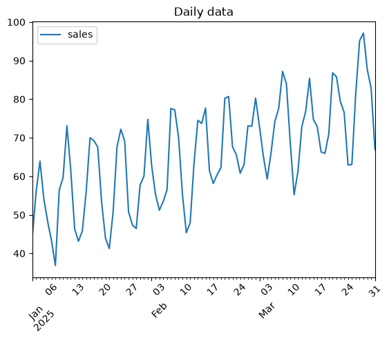
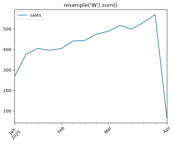
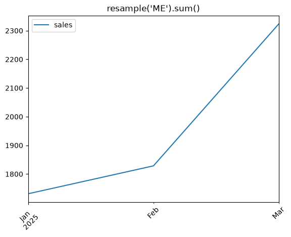
Aggregating to a coarser frequency smooths the noise and exposes the underlying trend, which is usually the story you care about.
Resample with a custom offset
Beyond the named offsets, combine a number with a base unit for an arbitrary bucket size.
biweekly = df.resample("2W").mean()
biweekly.plot(rot=45, lw=2)
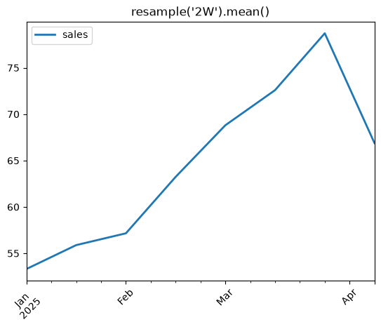
Biweekly buckets are "2W", every three months is "3ME", and so on. The label after the number is the base unit, so any unit you can type as "W", "ME", "D", or "H" can also carry a multiplier.
Practical Tips
- Always convert the index to
DatetimeIndexbefore callingresample(). - Pick the offset that matches your story:
"W"for weekly,"ME"for monthly,"QE"for quarterly. - Add a multiplier for custom buckets like
"2W"or"10D". - Choose
sumfor totals,meanfor averages, andcountfor record counts. - On recent pandas versions, use month-end
"ME"and quarter-end"QE"; the older"M"/"Q"aliases are deprecated.