
Pandas line charts are built for comparing several series at once: a single df.plot() call draws every numeric column on the same axes with an automatic legend, and a few arguments let you control how each line looks.
Quick Example
Call df.plot() with no extra arguments. It plots every numeric column as its own line on one axes with a legend.
import pandas as pd

df.plot()
That is the whole quick answer. Everything else in this post is about trimming which columns are drawn and styling the lines.
Plot every column by default
Pandas uses the DataFrame index as the x-axis and draws one line per numeric column. The column name becomes the legend label, and the index becomes the x labels.
df.plot(rot=45)
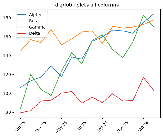
If your index is a date or a categorical string, pass rot to rotate the x labels so they do not crowd.
Choose which columns to plot
To draw only some columns, subset the DataFrame first, or use y to name the columns.
df[["Alpha", "Gamma"]].plot()

# Equivalent with the y argument.
df.plot(y=["Alpha", "Gamma"])
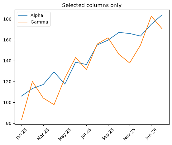
The y argument is handy when you want a small subset without copying columns around.
Set custom colors
Pass a list of colors to color and each line gets one in order.
df.plot(color=["#264653", "#2a9d8f", "#e9c46a", "#e76f51"])
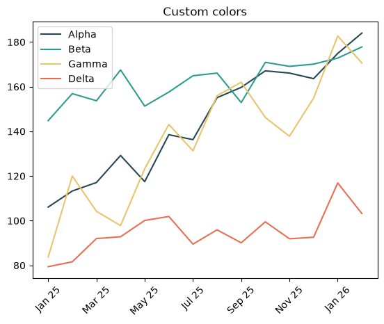
The list can use hex codes, color names, or tuple RGBA values, and it must match the number of columns you are plotting. Without a color, Pandas cycles Matplotlib's default color cycle.
Give each line its own style
For distinct line styles or markers, pass a style list so each column gets a different look. This helps when the chart must read clearly in print or for colorblind readers.
df.plot(style=["-o", "--s", ":^", "-.v"])
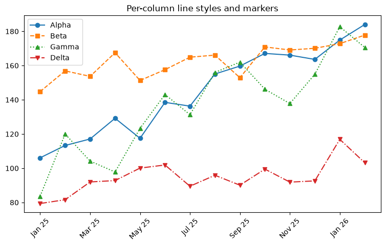
Each entry is a Matplotlib format string: "-o" is a solid line with circles, "--s" a dashed line with squares, ":^" a dotted line with triangles, and so on. Apply a single style to all lines by passing one style string.
Practical Tips
df.plot()draws every numeric column; subset or useyto narrow it down.- Give each column a distinct color or line style so overlapping series stay readable.
- Use
rotto fix crowded x tick labels. - Combine
df.plot()withcolor,style, andfigsizefor a clean chart in one call. - If one series is on a completely different scale, move it to a secondary axis so it is not squashed.