
TL;DR
Use ax.twinx() to create a secondary axes sharing the x-axis. To make the plot readable, color-code each axis, ticks, and spines to match the plotted data, and combine the legends.
import matplotlib.pyplot as plt

months = ['Jan', 'Feb', 'Mar', 'Apr', 'May', 'Jun', 'Jul', 'Aug', 'Sep', 'Oct', 'Nov', 'Dec']
temp = [5, 6, 9, 13, 17, 21, 24, 23, 19, 14, 9, 6]
precip = [70, 60, 52, 45, 30, 15, 10, 15, 35, 55, 75, 80]

fig, ax1 = plt.subplots(figsize=(8, 5))

# Left Y-axis (Temperature)
color_temp = '#2b5c8f'
line1, = ax1.plot(months, temp, color=color_temp, linewidth=2, marker='o', label='Temperature (°C)')
ax1.set_xlabel('Month', fontweight='bold', labelpad=10)
ax1.set_ylabel('Temperature (°C)', color=color_temp, fontweight='bold')
ax1.tick_params(axis='y', labelcolor=color_temp)
ax1.spines['left'].set_color(color_temp)

# Right Y-axis (Precipitation)
ax2 = ax1.twinx()
color_precip = '#d95f02'
line2, = ax2.plot(months, precip, color=color_precip, linewidth=2, marker='s', label='Precipitation (mm)')
ax2.set_ylabel('Precipitation (mm)', color=color_precip, fontweight='bold')
ax2.tick_params(axis='y', labelcolor=color_precip)
ax2.spines['right'].set_color(color_precip)

# Hide unused top spine and style bottom spine
for ax in [ax1, ax2]:
    ax.spines['top'].set_visible(False)

# Combine legends into a single box
lines = [line1, line2]
labels = [l.get_label() for l in lines]
ax1.legend(lines, labels, loc='upper center', shadow=True)

plt.title('Monthly Weather Data (Styled Dual Y-Axes)', fontsize=14, fontweight='bold', pad=15)
plt.show()
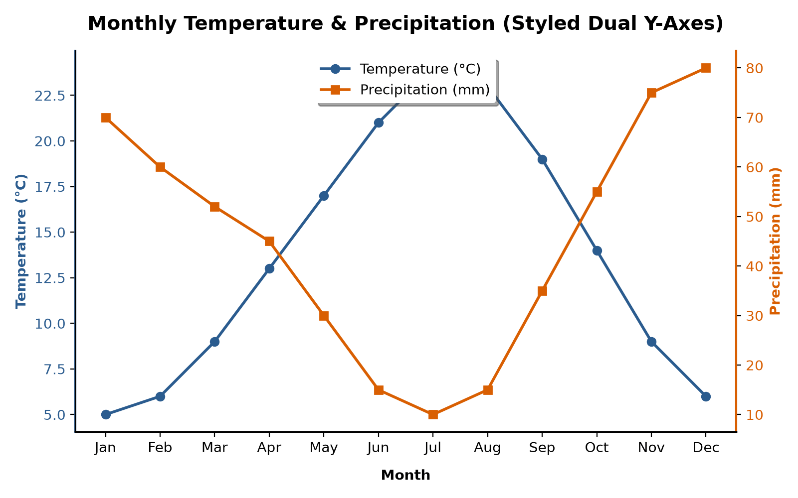
The Core Concept: ax.twinx()
When comparing two variables with different units or scales (such as temperature in Celsius and precipitation in millimeters), a single y-axis scale does not work.
Matplotlib provides ax.twinx() to solve this. It creates a secondary Axes object that overlays the original axes, sharing the x-axis but positioning its own y-axis on the right.
Basic Dual Y-Axis Plot
The default implementation plots the data and adds the secondary axis, but leaves the styling raw:
import matplotlib.pyplot as plt

fig, ax1 = plt.subplots(figsize=(8, 5))

# Temperature on left axis
ax1.plot(months, temp, color='blue', label='Temperature (°C)')
ax1.set_xlabel('Month')
ax1.set_ylabel('Temperature (°C)')

# Create the twin axis sharing the x-axis
ax2 = ax1.twinx()

# Precipitation on right axis
ax2.plot(months, precip, color='red', label='Precipitation (mm)')
ax2.set_ylabel('Precipitation (mm)')

# Default legends create separate overlapping boxes
ax1.legend(loc='upper left')
ax2.legend(loc='upper right')

plt.title('Monthly Weather Data (Basic Dual Y-Axes)')
plt.show()
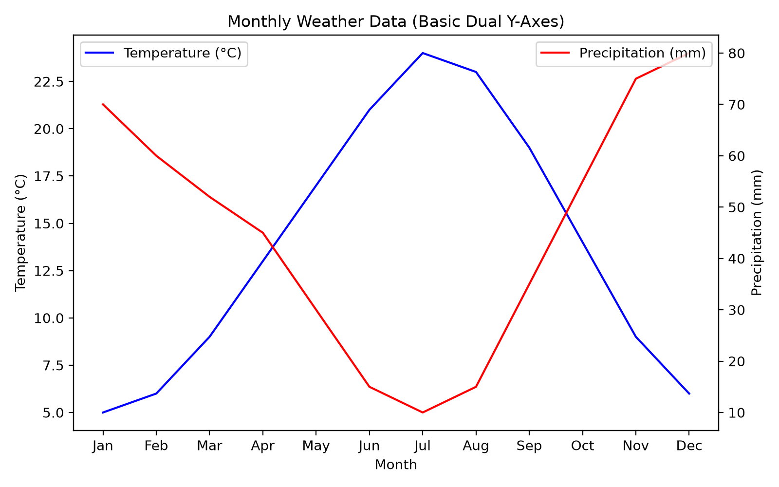
While this displays the data, it suffers from several readability issues:
1. The y-axis labels and tick marks do not clearly associate with the blue or red line.
2. The default legend() call on each axis creates two separate, overlapping legend boxes.
Styling Best Practices
Dual y-axis plots can confuse readers if they are not styled correctly. Follow these steps to clean up your charts.
1. Color-Code the Axes, Ticks, and Spines
By matching the color of the y-axis elements to the color of the corresponding plotted line, readers can instantly tell which scale to look at.
You can set these properties on each axis object:
# Style the left axis elements
ax1.set_ylabel('Temperature (°C)', color='#2b5c8f')
ax1.tick_params(axis='y', labelcolor='#2b5c8f')
ax1.spines['left'].set_color('#2b5c8f')

# Style the right axis elements
ax2.set_ylabel('Precipitation (mm)', color='#d95f02')
ax2.tick_params(axis='y', labelcolor='#d95f02')
ax2.spines['right'].set_color('#d95f02')
2. Combine the Legends
Because the lines are plotted on two separate axes objects (ax1 and ax2), calling ax.legend() on each will generate two independent legend boxes.
To merge them, collect the line objects and labels from both axes and pass them to a single legend call:
# Note the comma after line1 and line2 to unpack the list returned by ax.plot()
line1, = ax1.plot(months, temp, color='#2b5c8f', label='Temperature (°C)')
line2, = ax2.plot(months, precip, color='#d95f02', label='Precipitation (mm)')

# Group lines and labels
lines = [line1, line2]
labels = [l.get_label() for l in lines]

# Draw a single unified legend
ax1.legend(lines, labels, loc='upper center')
Sharing the Y-Axis with ax.twiny()
If you need to share the y-axis instead of the x-axis (for example, plotting the same variable against two different x-axis variables like depth and pressure), use ax.twiny().
The mechanics are identical to ax.twinx(), but the second x-axis will appear at the top of the plot:
fig, ax1 = plt.subplots()

# Base plot (bottom x-axis)
ax1.plot(x_data1, y_data, color='blue')
ax1.set_xlabel('Bottom X-Axis')

# Twin plot (top x-axis)
ax2 = ax1.twiny()
ax2.plot(x_data2, y_data, color='red')
ax2.set_xlabel('Top X-Axis')