
When two series have very different units or scales, putting them on the same y-axis flattens one of them. A secondary y-axis gives each series its own scale, so both are readable at once.
Quick Example
Pass the column name to secondary_y on df.plot() and Pandas draws that series on a second axis on the right.
import pandas as pd

df.plot(secondary_y="margin")
The first series uses the left axis, and the secondary_y series uses a new axis on the right, with its own scale.
Why you need a second axis
Consider monthly revenue in the thousands and a profit margin that stays between 15% and 25%. On one shared axis the margin line sits flat at the bottom because the revenue numbers dwarf it.
df.plot()
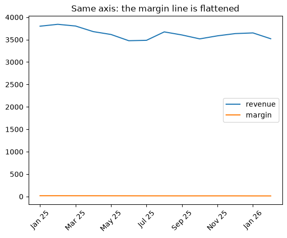
The relationship between the two is hidden. Splitting them onto separate axes fixes that.
Create the secondary axis with secondary_y
Adding secondary_y="margin" puts the margin on its own right-hand axis, so ups and downs in the margin are clearly visible next to the revenue trend.
df.plot(secondary_y="margin", rot=45)
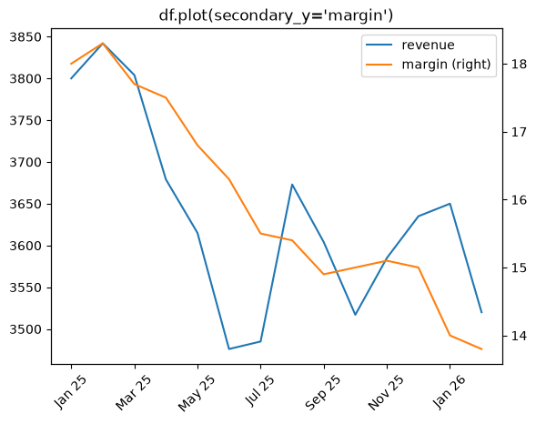
Pandas keeps the first column on the left and places every column in secondary_y on the right. Pass a list to send several columns over:
df[["revenue"]].plot(secondary_y=["margin", "tax_rate"])
Use the right sequence
To plot only one column normally and the others on the secondary axis, first subset the DataFrame so the primary column is alone before you pass secondary_y.
df[["revenue"]].plot(secondary_y=["margin"])
Otherwise Pandas treats all columns you did not name as the primary series. Selecting the primary column explicitly makes the split obvious.
More control with twinx()
When you want to style each axis independently, build the axes yourself with ax.twinx() and plot each series on its own.
import matplotlib.pyplot as plt

fig, ax = plt.subplots()
df["revenue"].plot(ax=ax, color="#264653", label="Revenue ($k)")
ax.set_ylabel("Revenue ($k)")

ax2 = ax.twinx()
df["margin"].plot(ax=ax2, color="#e76f51", label="Margin (%)")
ax2.set_ylabel("Margin (%)")
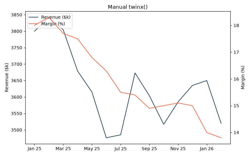
ax.twinx() returns a second axes sharing the x-axis. You get full control over each y label, color, and line style, and you have to combine the two legends yourself.
Combine a bar and a line
A common pattern is a bar chart for the large-valued series and a line on the secondary axis for the small one.
ax = df["revenue"].plot.bar(color="#2a9d8f", alpha=0.8)
df["margin"].plot(ax=ax, secondary_y=True, color="#0b7285", lw=2, marker="o")
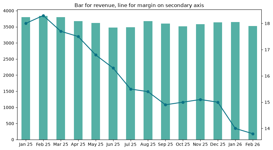
secondary_y=True in the second call attaches the line to a new right-hand axis, giving bars and line their own scales.
Practical Tips
- Use
secondary_y="column"for the quick one-liner, andsecondary_y=["a", "b"]for several. - Subset the DataFrame to the primary column before using
secondary_yso the split is explicit. - Reach for
ax.twinx()when you need separate labels, colors, or styling per axis. - Combine
secondary_y=Truewith a bar or line to mix chart types on one figure. - Keep units out of a shared legend or label each axis clearly so the two scales do not get confused.