
A bar chart with multiple series can be drawn side by side (unstacked, or grouped) or piled on top of each other (stacked). Pandas switches between the two with a single stacked argument on df.plot(kind="bar").
Quick Example
Grouped bars are the default; pass stacked=True to stack them.
import pandas as pd

df.plot(kind="bar")                  # unstacked (grouped)
df.plot(kind="bar", stacked=True)    # stacked
Both need the same wide DataFrame: one column per series, with the category on the index.
Set up wide data
Bar charts need one column per series. If your data is long (one row per quarter and channel), widen it first so each channel becomes a column.
wide = long.pivot(index="quarter", columns="channel", values="spend")
Each channel is now a column and each quarter is a row, which is exactly the shape df.plot(kind="bar") expects.
Unstacked (grouped) bars
The default, with stacked absent or False, draws one thin bar per series per category, grouped next to each other.
wide.plot(kind="bar", color=["#6d597a", "#b56576", "#e56b6f", "#eaac8b"], rot=0)
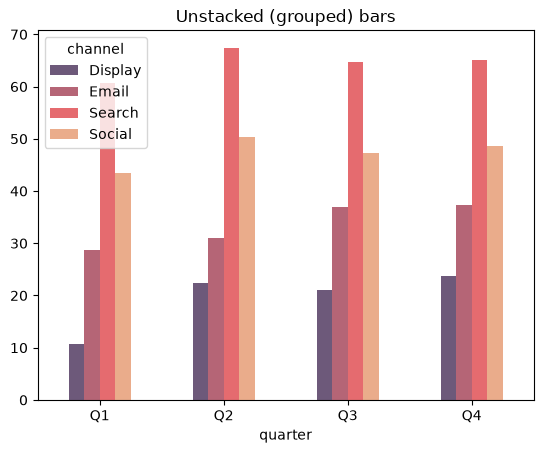
Grouped bars make it easy to compare series against each other within a single category, but they can get crowded when there are many series.
Stacked bars
Pass stacked=True and each category's series pile into a single bar whose total height is the sum.
wide.plot(kind="bar", stacked=True, color=palette, rot=0)
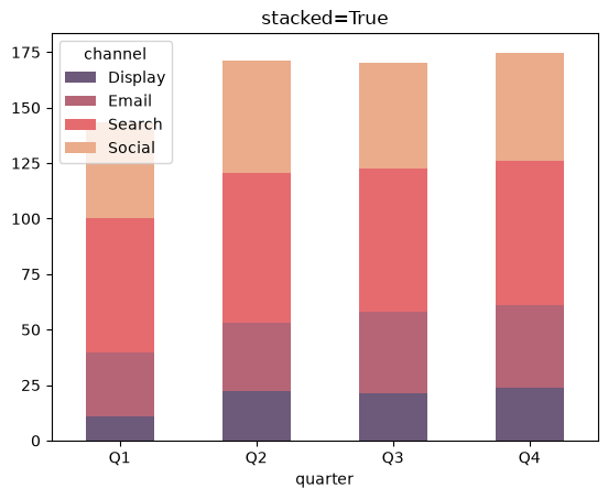
Stacked bars are ideal for showing a total per category alongside how it is split by series. The downside is that comparing the size of individual slices across categories is harder, because the slices do not share a common baseline.
Reshape with unstack()
If your data already sits in a MultiIndex, the unstack() method moves one index level into the columns, producing the wide form Pandas needs.
wide = long.set_index(["quarter", "channel"]).unstack("channel")["spend"]
Taken together, pivot and unstack are the two main ways to go from long to wide before plotting. Use whichever reads more naturally for your data.
Make a 100% stacked bar
To compare the share each series contributes rather than raw totals, normalize every category to sum to 100 first.
pct = wide.div(wide.sum(axis=1), axis=0) * 100
pct.plot(kind="bar", stacked=True, rot=0)
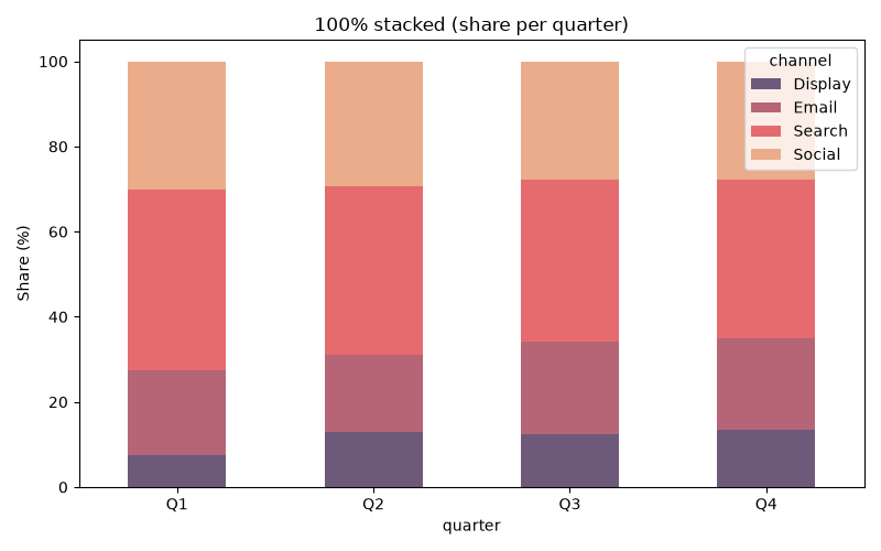
Now each bar is the same total height, and the segment heights show the percentage split per quarter. This is the chart for "how does the composition differ" instead of "how big is the total".
Try it horizontally
Swap kind="bar" for kind="barh" to draw the bars horizontally. Stacking works the same way.
wide.plot(kind="barh", stacked=True, color=palette)
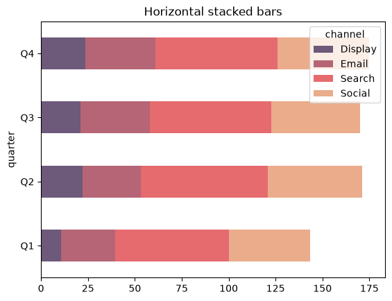
Horizontal stacked bars are handy when the category labels are long and would be cramped along the bottom.
Practical Tips
- Use grouped (unstacked) bars to compare series within each category.
- Use stacked bars to show totals and their breakdown.
unstack()orpivotto reshape long data into the wide form before plotting.- Normalize rows with
div(..., axis=0)to build a 100% stacked chart. - Swap to
kind="barh"when labels are long.