
Pandas df.plot() accepts yerr (and xerr) to draw error bars on bar and line charts. Pass a standard deviation, a column of errors, or a whole DataFrame and Pandas draws the caps for you.
Quick Example
Start with a daily DataFrame that has a DatetimeIndex. Here we simulate it so the post is fully reproducible; in practice you would often read it from a CSV.
import numpy as np
import pandas as pd

date = pd.date_range("2025-01-01", periods=120, freq="D")
trend = np.linspace(95, 130, 120)
daily = pd.DataFrame(
    {
        "North": trend + np.random.normal(0, 12, 120),
        "South": trend * 0.8 + np.random.normal(0, 10, 120),
        "East": trend * 0.95 + np.random.normal(0, 11, 120),
    },
    index=date,
)

# Aggregate to monthly mean and standard deviation.
groups = daily.resample("ME")   # month-end buckets
mean = groups.mean()            # bar heights
std = groups.std()              # error bars

mean.plot(kind="bar", yerr=std, capsize=4)
The mean and std DataFrames share the same index and columns, so Pandas knows exactly which error belongs to which bar.
Give df.plot its error values
The yerr argument accepts a scalar, a Series, or a DataFrame. A DataFrame is the most common, since each series gets its own set of errors.
mean.plot(kind="bar", yerr=std, capsize=4)
Here mean holds the bar heights and std holds the vertical error for each one. The two DataFrames must line up row for row.
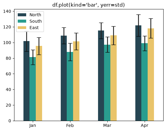
capsize adds a small crossbar to the top of each error line so the extent is easy to read. Without it, the vertical bars are thinner and harder to compare.
Make the error bars clearly visible
df.plot() draws the error bars, but most styling arguments like ecolor and elinewidth get forwarded to the bars or lines themselves, not to the error bars. To control the error bars directly, style the ErrorbarContainer artists after plotting. This colors each error bar to match its series and thickens the lines, which is how the charts in this post are made.
from matplotlib.container import ErrorbarContainer

palette = ["#264653", "#2a9d8f", "#e9c46a"]

ax = mean.plot(kind="line", yerr=std, marker="o", lw=2, capsize=5, color=palette)

for i, cont in enumerate(c for c in ax.containers
                         if isinstance(c, ErrorbarContainer)):
    color = palette[i % len(palette)]
    for group in cont.lines:
        for line in (group if isinstance(group, (list, tuple)) else [group]):
            if line is not None:
                line.set_color(color)
                line.set_linewidth(2)
The error bar for each series picks up that series' color, so on a multi-line chart the whiskers no longer read as one dark shape. In practice, capsize plus a slightly thicker default is often enough.
Use the standard deviation
A natural source of error bars is the spread of the underlying data. Aggregate your raw measurements by resampling or grouping, then compute both the mean and the standard deviation.
groups = daily.resample("ME")
mean = groups.mean()
std = groups.std()

mean.plot(kind="bar", yerr=std, capsize=4)
This is a clean way to show a summary value and how much the data varies around it.
Pass custom error values
yerr does not have to be a standard deviation. Provide a DataFrame (or Series) of whatever uncertainty you want to show, such as a fixed margin per cell.
custom = pd.DataFrame(
    {"North": [8, 8, 8, 8], "South": [6, 6, 6, 6], "East": [7, 7, 7, 7]},
    index=mean.index,
)

mean.plot(kind="bar", yerr=custom, capsize=4)
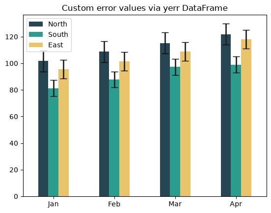
This is useful when the errors come from domain knowledge rather than the data itself.
Use xerr for horizontal bars
For a horizontal bar chart, the error runs along the x-axis, so swap yerr for xerr.
mean.plot(kind="barh", xerr=std, capsize=4)
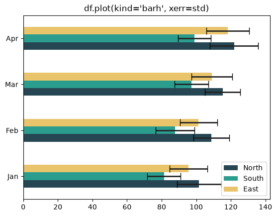
The same rules apply: give xerr a Series or DataFrame aligned to the data, and the bars get horizontal caps.
Add error bars to a line plot
Error bars work on line plots too. Pair yerr with markers so each point clearly shows its uncertainty.
mean.plot(kind="line", yerr=std, marker="o", lw=2, capsize=4)
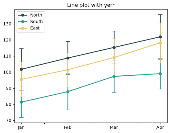
A line with error bars reads like a time series with confidence, which pairs well with the resample patterns covered elsewhere on the site.
Practical Tips
- Make sure the
yerr/xerrvalues line up with the data's index and columns. - Pass a DataFrame with the same shape as the plotted data for per-series errors.
- Add
capsizeso the error extent is clearly visible. - Use
yerron vertical charts andxerron horizontal (barh) charts. - Derive errors from a
groupby/resamplestd()for data-driven uncertainty.