In this post we'll walk through creating stacked bar charts in several of Python's most popular plotting libraries, including Pandas, Matplotlib, Seaborn, Plotnine and Altair. Jump to the section of interest using the links below:
For all the examples, we'll be using the tips dataset that's included
in Seaborn.
import seaborn as sns

# For some examples, we'll be able to use the raw data directly.
tips = sns.load_dataset('tips')
tips.head()
| total_bill | tip | sex | smoker | day | time | size | |
|---|---|---|---|---|---|---|---|
| 0 | 16.99 | 1.01 | Female | No | Sun | Dinner | 2 |
| 1 | 10.34 | 1.66 | Male | No | Sun | Dinner | 3 |
| 2 | 21.01 | 3.50 | Male | No | Sun | Dinner | 3 |
| 3 | 23.68 | 3.31 | Male | No | Sun | Dinner | 2 |
| 4 | 24.59 | 3.61 | Female | No | Sun | Dinner | 4 |
For some plotting libraries, it's much easier if we have data aggregated in a certain way. For Pandas, for instance, we want the x-axis variable as the DataFrame index and the stacking variable (gender in this case) we want as the DataFrame columns. So let's create that version of the data as well.
agg_tips = tips.groupby(['day', 'sex'])['tip'].sum().unstack().fillna(0)
agg_tips
| sex | Male | Female |
|---|---|---|
| day | ||
| Thur | 89.41 | 82.42 |
| Fri | 26.93 | 25.03 |
| Sat | 181.95 | 78.45 |
| Sun | 186.78 | 60.61 |
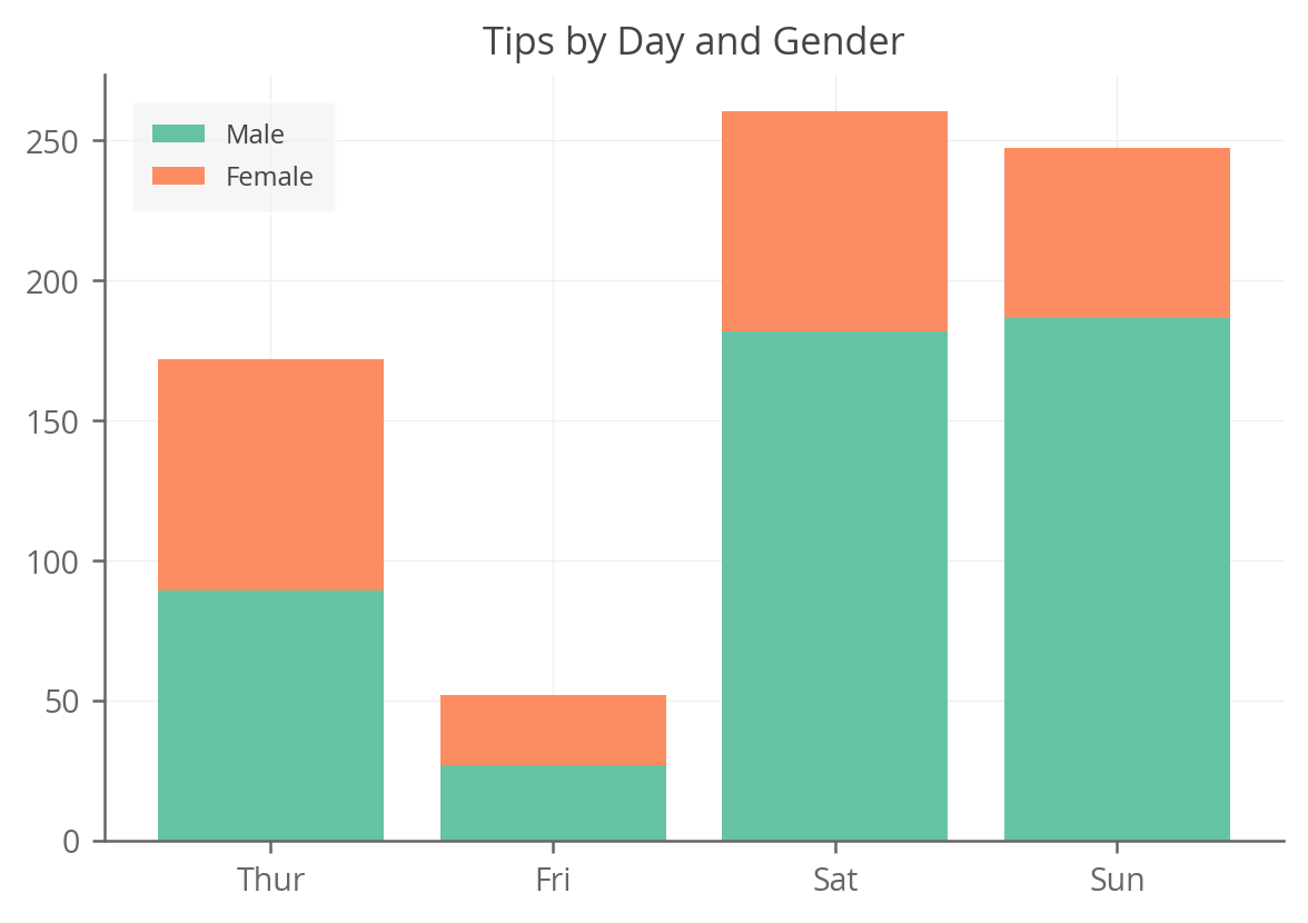
Pandas Stacked Bar Charts
We'll first show how easy it is to create a stacked bar chart in pandas,
as long as the data is in the right format (see how we created agg_tips
above).
from matplotlib import pyplot as plt

# Very simple one-liner using our agg_tips DataFrame.
agg_tips.plot(kind='bar', stacked=True)

# Just add a title and rotate the x-axis labels to be horizontal.
plt.title('Tips by Day and Gender')
plt.xticks(rotation=0, ha='center')

As you can see, if you have the data in the right format, creating a stacked bar chart in Pandas is extremely simple. And Pandas plot is just a wrapper around Matplotlib (as is Seaborn), so once the chart is created, you can edit it as you would any other Matplotlib chart.
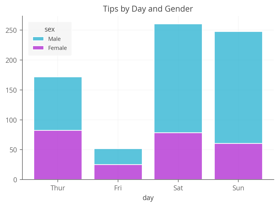
Matplotlib Stacked Bar Charts
For a more detailed version of this example, see the Stacked Bar Charts in Matplotlib post.
Now we can see what it looks like when we have to do this directly in Matplotlib, which takes a bit more work, but is explicit and flexible.
Really all we need to do is plot a set of bar charts for every "layer"
in our stack. And for each layer, start the bottom of the bar at the
top of the previous one. We do this using the aptly named bottom arg
in the bar() method.
from matplotlib import pyplot as plt

fig, ax = plt.subplots()
# First plot the 'Male' bars for every day.
ax.bar(agg_tips.index, agg_tips['Male'], label='Male')
# Then plot the 'Female' bars on top, starting at the top of the 'Male'
# bars.
ax.bar(agg_tips.index, agg_tips['Female'], bottom=agg_tips['Male'],
       label='Female')
ax.set_title('Tips by Day and Gender')
ax.legend()
As you can see, the result is nearly identical to the pandas plot. While
it has a few more lines of code, it's also more flexible. We used the
agg_tips dataframe, but the data could have been in other formats and
we could have done this just as easily.
What if instead of stacking two layers, you're stacking a dozen? You can
just use a for loop and continually increment bottom like this:
import numpy as np
from matplotlib import pyplot as plt

fig, ax = plt.subplots()

# Initialize the bottom at zero for the first set of bars.
bottom = np.zeros(len(agg_tips))

# Plot each layer of the bar, adding each bar to the "bottom" so
# the next bar starts higher.
for i, col in enumerate(agg_tips.columns):
  ax.bar(agg_tips.index, agg_tips[col], bottom=bottom, label=col)
  bottom += np.array(agg_tips[col])

ax.set_title('Tips by Day and Gender')
ax.legend()
That gives the exact same output as above but is more flexible, DRY and reusable.
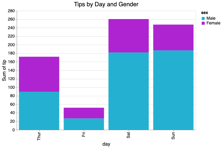
Seaborn Stacked Bar Charts
Next we'll look at Seaborn, a wrapper library around Matplotlib that often makes plotting in python much less verbose. In this case, surprisingly, Seaborn fails to deliver a nice and purposeful stacked bar chart solution (as far as I can tell at leaset). Their recommended approach is not very intuitive and I much prefer the pandas or raw Matplotlib version.
That being said, it's possible to actually do this very succintly using
Seaborn's hist() method for histograms. The trick is to just use the
weight parameter to give the "counts" their true value.
import seaborn as sns

ax = sns.histplot(
    tips,
    x='day',
    # Use the value variable here to turn histogram counts into weighted
    # values.
    weights='tip',
    hue='sex',
    multiple='stack',
    palette=['#24b1d1', '#ae24d1'],
    # Add white borders to the bars.
    edgecolor='white',
    # Shrink the bars a bit so they don't touch.
    shrink=0.8
)

ax.set_title('Tips by Day and Gender')
# Remove 'Count' ylabel.
ax.set_ylabel(None)
Pretty cool and succint right? It also uses the raw data so no data transformation is needed. A bit hacky though, so maybe best to use another approach until Seaborn provides something better out of the box.
Plotnine Stacked Bar Charts
Plotnine, a near clone of R's fantastic ggplot2 library, makes this
pretty easy if you're familiar with the ggplot2 syntax.
from plotnine import *

(ggplot(tips, aes('day', 'tip', fill='sex'))
 + geom_bar(stat='identity', position='stack')
 + ggtitle('Tips by Day and Gender')
)

Altair Stacked Bar Charts
Lastly, we create the stacked bar plot using Altair, which is somewhat similar to plotnine in terms of data structure expectations and methods.
import altair as alt

# The main functionality; a bit more verbose due to needing to
# reorder the days and using custom colors.
bars = alt.Chart(tips).mark_bar().encode(
    x=alt.X('day', sort=['Thur', 'Fri', 'Sat', 'Sun']),
    y='sum(tip)',
    color=alt.Color('sex', scale=alt.Scale(domain=['Male', 'Female'],
                                           range=['#24b1d1', '#ae24d1']))
)
# This is just formatting and styling.
bars.properties(
    width=600,
    height=400,
    title='Tips by Day and Gender'
).configure_axis(
    labelFontSize=14,
    titleFontSize=16,
    titleFontWeight=400
).configure_title(
    fontSize=20,
    fontWeight=400
).configure_legend(
    labelFontSize=14,
    titleFontSize=14
)
So who wins? In my opinion, if you're comfortable with some slight data wrangling, it's Pandas. It's short, simple, and gives you the flexibility of editing and finalizing the plot with Matplotlib if needed.
Hope this was helpful. Also make sure to check out our deeper dive into creating and styling stacked bar charts in Matplotlib.