
TL;DR
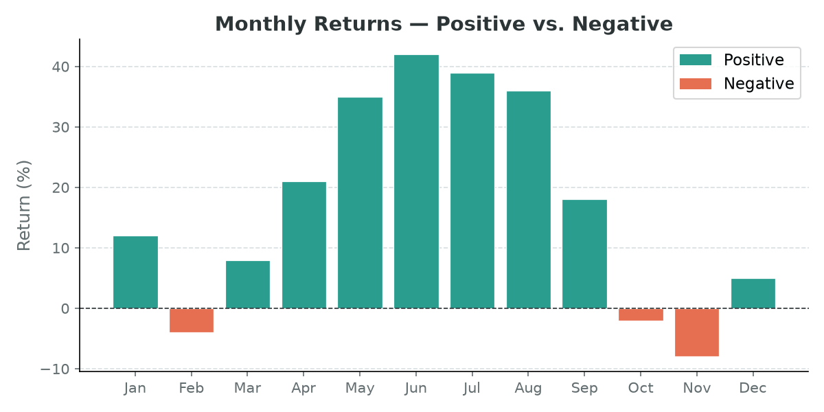
Pass a list of colors — one per bar — to the color argument:
colors = ['#2A9D8F' if v >= 0 else '#E76F51' for v in values]
ax.bar(categories, values, color=colors)
Approach 1 — Threshold coloring
The simplest pattern: a list comprehension maps each value to a color based on a condition.
import matplotlib.pyplot as plt
from matplotlib.patches import Patch

categories = ['Jan', 'Feb', 'Mar', 'Apr', 'May', 'Jun',
              'Jul', 'Aug', 'Sep', 'Oct', 'Nov', 'Dec']
values = [12, -4, 8, 21, 35, 42, 39, 36, 18, -2, -8, 5]

colors = ['#2A9D8F' if v >= 0 else '#E76F51' for v in values]

fig, ax = plt.subplots(figsize=(8, 4))
ax.bar(categories, values, color=colors, edgecolor='white', linewidth=0.6)
ax.axhline(0, color='#2d3436', linewidth=0.8, linestyle='--')

# Manual legend since bars share the same artist
legend_elements = [
    Patch(facecolor='#2A9D8F', label='Positive'),
    Patch(facecolor='#E76F51', label='Negative'),
]
ax.legend(handles=legend_elements)
plt.tight_layout()
plt.show()
Note that ax.bar() does not automatically generate legend entries when you pass a color list, so you need to create Patch handles manually.
Approach 2 — Colormap gradient
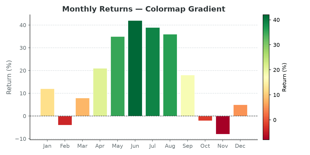
Map values to a continuous colormap using matplotlib.colors.Normalize and a colormap like RdYlGn. This works well when the magnitude matters, not just the sign.
import matplotlib.cm as cm
import matplotlib.colors as mcolors

norm = mcolors.Normalize(vmin=min(values), vmax=max(values))
cmap = cm.RdYlGn
colors = [cmap(norm(v)) for v in values]

fig, ax = plt.subplots(figsize=(8, 4))
ax.bar(categories, values, color=colors, edgecolor='white', linewidth=0.6)

# Add a colorbar for reference
sm = cm.ScalarMappable(cmap=cmap, norm=norm)
sm.set_array([])
plt.colorbar(sm, ax=ax, label='Return (%)', pad=0.02)

plt.tight_layout()
plt.show()
ScalarMappable is needed to attach a colorbar to bars — unlike imshow or scatter, bar() does not return a mappable object directly.
Approach 3 — Highlight a single bar
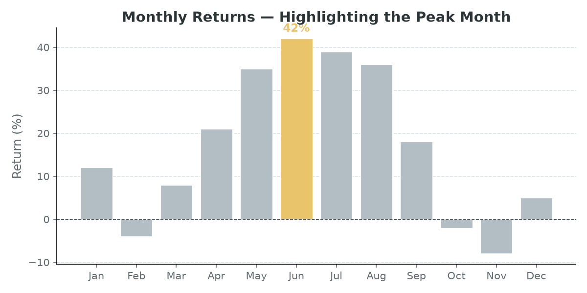
Sometimes you just want to call out one bar — the maximum, a target month, a specific category — and mute the rest.
max_idx = values.index(max(values))

colors = [
    '#E9C46A' if i == max_idx else '#b2bec3'
    for i in range(len(values))
]

fig, ax = plt.subplots(figsize=(8, 4))
ax.bar(categories, values, color=colors, edgecolor='white', linewidth=0.6)

# Label the peak bar directly
ax.text(
    max_idx, values[max_idx] + 1,
    f'{values[max_idx]}%',
    ha='center', va='bottom',
    fontsize=11, fontweight='bold', color='#E9C46A'
)
plt.tight_layout()
plt.show()
Changing colors after the fact
If you already have a bar chart and want to update colors without redrawing, iterate over the bar container:
bars = ax.bar(categories, values)

for bar, val in zip(bars, values):
    bar.set_color('#2A9D8F' if val >= 0 else '#E76F51')