
A waffle chart breaks a whole into a grid of equally-sized squares, colored proportionally by category, like a pie chart reshaped into a grid. It reads more precisely than a pie chart since counting squares is more intuitive than comparing angles, and it stays readable even with several categories. PyWaffle is a small, focused library built on matplotlib that handles the whole layout for you.
pip install pywaffle
Quick Example
Waffle is a matplotlib Figure subclass, so you pass it to plt.figure() as FigureClass rather than calling a normal plotting function.
import matplotlib.pyplot as plt
from pywaffle import Waffle

data = {
    "Organic Search": 42,
    "Paid Search": 18,
    "Social": 15,
    "Direct": 15,
    "Referral": 10,
}

fig = plt.figure(
    FigureClass=Waffle,
    rows=10,
    columns=10,
    values=data,
    colors=["#264653", "#2a9d8f", "#e9c46a", "#f4a261", "#e76f51"],
    labels=[f"{k} ({v}%)" for k, v in data.items()],
    legend={"loc": "upper left", "bbox_to_anchor": (1.02, 1), "frameon": False},
)
plt.show()
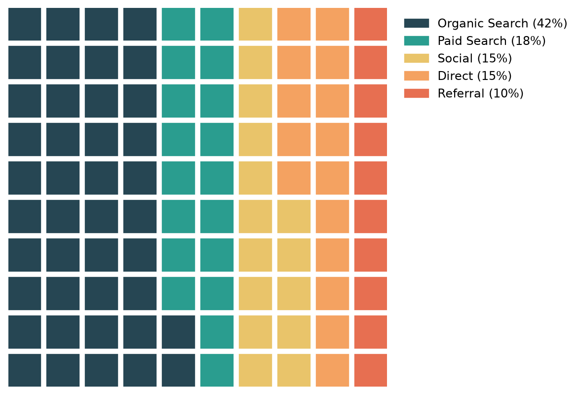
A 10 x 10 grid is the simplest case: 100 squares, so each square is worth exactly one percentage point. values accepts a dict (keys become labels automatically) or a plain list of numbers if labels aren't needed.
How the grid is sized
Only one of rows or columns is required; PyWaffle works out the other one from the total of values and the figure's aspect ratio. If values doesn't add up to rows * columns, PyWaffle scales the numbers proportionally to fit rather than requiring you to pre-calculate percentages yourself.
fig = plt.figure(FigureClass=Waffle, rows=5, columns=10, values=[48, 46, 6])
Here the raw values (which sum to 100) get scaled down to fit the 50 available blocks, coming out as roughly 24, 23, and 3. This is convenient for raw counts, like a headcount or a list of survey responses, without doing the percentage math up front.
Block arranging style
By default, PyWaffle fills blocks left-to-right, bottom-to-top, wrapping to a new row exactly like reading text, which means a category can end partway across a row and the next category picks up right where it left off. block_arranging_style="snake" changes this to a boustrophedon pattern, reversing direction on every row.
fig = plt.figure(
    FigureClass=Waffle, rows=5, columns=10, values=data,
    block_arranging_style="snake",
)
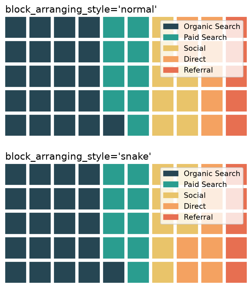
The actual proportions are identical in both; only the path the fill takes through the grid changes. "snake" tends to keep a category's blocks looking more like a single contiguous shape when it spans more than one row, since consecutive rows connect on the same side instead of jumping back to the start.
Plotting with icons instead of squares
PyWaffle can swap the plain squares for Font Awesome icons, which is its signature feature: pass an icon name (or a list, one per category) to icons.
fig = plt.figure(
    FigureClass=Waffle, rows=5, columns=10, values=data,
    colors=["#264653", "#2a9d8f", "#e9c46a", "#f4a261", "#e76f51"],
    icons=["magnifying-glass", "dollar-sign", "share-nodes", "arrow-right", "link"],
    icon_legend=True, font_size=18,
)
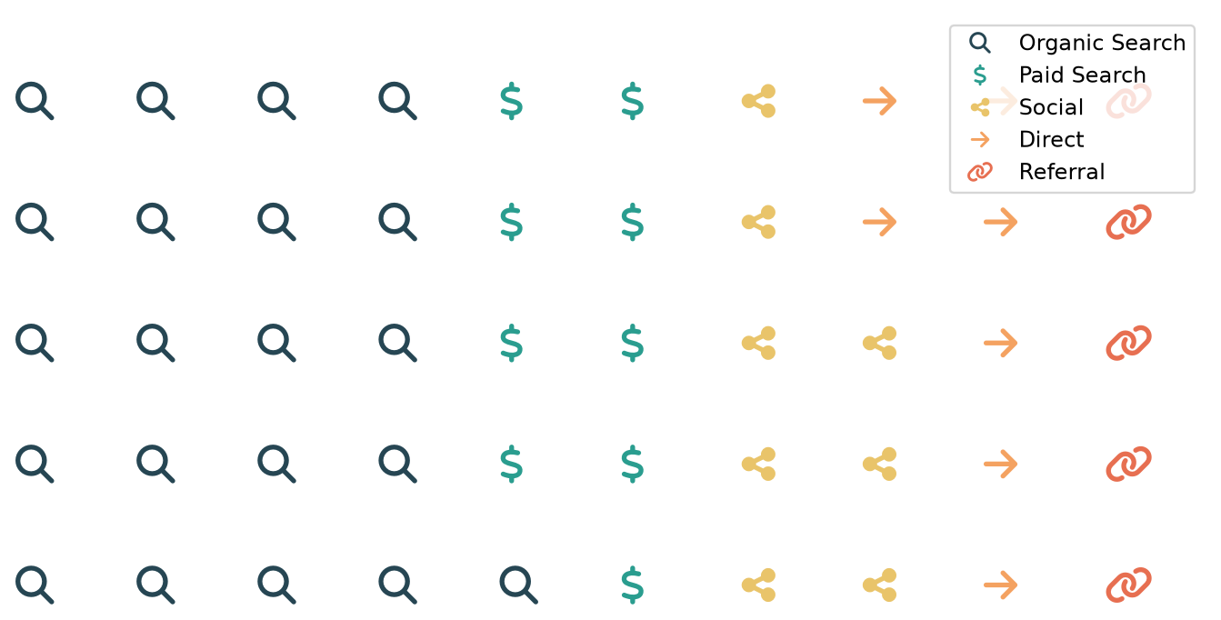
Each block renders as the actual icon glyph rather than a plain square. icon_legend=True swaps the legend's color swatches for a small copy of each category's icon, and font_size controls icon size once icons are in use (block-sizing arguments like block_aspect_ratio are ignored in icon mode).
Multiple waffle charts in one figure
PyWaffle does have a plots argument for laying out several waffles as small multiples on one figure, but it sizes each one off the whole figure's aspect ratio rather than its own cell, so a wide figsize squashes every subplot's rows down into short, wonky slivers. A more reliable approach is to build the subplot grid yourself with plt.subplots() and draw each waffle onto its own axis with the Waffle.make_waffle() classmethod, which plots onto an existing ax instead of creating a new figure.
import matplotlib.pyplot as plt
import matplotlib.patches as mpatches
from pywaffle import Waffle

colors = ["#264653", "#2a9d8f", "#e9c46a", "#f4a261", "#e76f51"]
months = {"January": january_data, "February": february_data, "March": march_data}

fig, axes = plt.subplots(1, 3, figsize=(11, 4.3))

for ax, (month, data) in zip(axes, months.items()):
    ax.set_aspect("equal")
    Waffle.make_waffle(ax=ax, rows=10, values=data, colors=colors)
    ax.set_title(month, fontsize=14)

# One shared legend for all three waffles, instead of repeating it per plot.
handles = [mpatches.Patch(color=c, label=k) for c, k in zip(colors, january_data.keys())]
fig.legend(handles=handles, loc="lower center", ncol=5, frameon=False,
           bbox_to_anchor=(0.5, -0.02))
fig.tight_layout(rect=[0, 0.06, 1, 1])
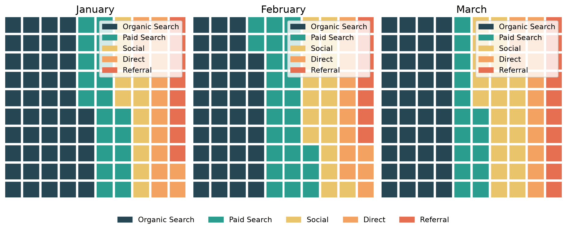
Because each ax now comes from a normal plt.subplots() call, figsize controls the real shape of each waffle instead of being divided up implicitly, and ax.set_aspect("equal") keeps every block a true square regardless of how wide or narrow the overall figure is. Building one fig.legend() from a manual list of Patch handles also avoids three redundant per-plot legends crowding the figure.
Practical Tips
- Use a
10 x 10grid whenever the data is already percentages; each square is worth exactly 1%, which makes the chart easy to read at a glance. - PyWaffle rescales
valuesautomatically to fit the grid, so raw counts work directly without pre-converting to percentages. - Reach for
block_arranging_style="snake"when a category's blocks span more than one row and you want them to read as a single connected shape. - Icon mode ignores block-sizing arguments (
block_aspect_ratio,interval_ratio_x,interval_ratio_y); usefont_sizeto size icons instead. - For small multiples, build your own
plt.subplots()grid and draw onto each axis withWaffle.make_waffle(ax=ax, ...)rather than PyWaffle'splotsargument, which sizes subplots off the whole figure's aspect ratio and can squash them.