
TL;DR
Use axvspan for vertical date-range shading and axhspan for horizontal value bands.
import matplotlib.pyplot as plt
import matplotlib.dates as mdates
import pandas as pd
import numpy as np

dates = pd.date_range('2024-01-01', periods=12, freq='ME')
values = np.random.uniform(40, 85, len(dates))

fig, ax = plt.subplots(figsize=(8, 4))
ax.plot(dates, values, marker='o')
ax.axvspan(dates[2], dates[5], color='#2A9D8F', alpha=0.25)
ax.axhspan(55, 70, color='#E76F51', alpha=0.2)
plt.show()
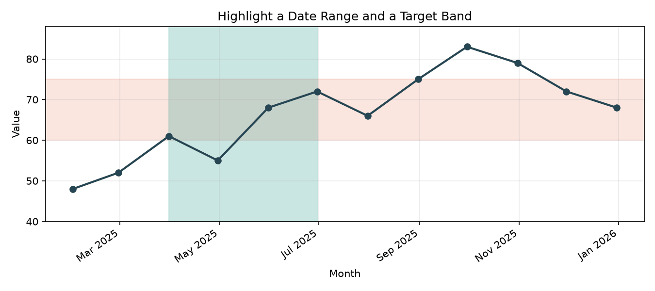
Highlight a date range with axvspan
axvspan(start_date, end_date, ...) fills the region between two x-axis positions. If your x-axis uses dates, pass datetime/Timestamp values directly.
import matplotlib.pyplot as plt
import matplotlib.dates as mdates
import pandas as pd

dates = pd.date_range('2025-01-01', periods=8, freq='ME')
sales = [120, 135, 128, 145, 150, 162, 155, 170]

fig, ax = plt.subplots(figsize=(8, 4))
ax.plot(dates, sales, marker='o', color='#264653')
ax.axvspan(dates[2], dates[4], color='#2A9D8F', alpha=0.25)

ax.set_title('Sales with Highlighted Promotion Period')
ax.set_xlabel('Month')
ax.set_ylabel('Sales')
ax.xaxis.set_major_formatter(mdates.DateFormatter('%b %Y'))
fig.autofmt_xdate()
plt.tight_layout()
plt.show()
Use alpha for transparency so the line remains visible through the shaded range.
Emphasize a value band with axhspan
axhspan(ymin, ymax, ...) shades a horizontal band across the full x-axis. This is useful for target zones, acceptable ranges, or risk thresholds.
fig, ax = plt.subplots(figsize=(8, 4))
ax.plot(dates, sales, marker='o', color='#E76F51')
ax.axhspan(135, 155, color='#E76F51', alpha=0.15)

ax.set_title('Sales with Target Band')
ax.set_xlabel('Month')
ax.set_ylabel('Sales')
ax.xaxis.set_major_formatter(mdates.DateFormatter('%b %Y'))
fig.autofmt_xdate()
plt.tight_layout()
plt.show()
A subtle fill can keep the focus on the line while still calling attention to the band.
Combine both spans for emphasis
Vertical and horizontal spans work together, which is great for highlighting a date range only when values are inside a particular band.
fig, ax = plt.subplots(figsize=(8, 4))
ax.plot(dates, sales, marker='o', color='#264653')
ax.axvspan(dates[1], dates[3], color='#2A9D8F', alpha=0.2)
ax.axhspan(138, 150, color='#E76F51', alpha=0.15)

ax.set_title('Promotion Window and Target Band')
ax.set_xlabel('Month')
ax.set_ylabel('Sales')
ax.xaxis.set_major_formatter(mdates.DateFormatter('%b %Y'))
fig.autofmt_xdate()
plt.tight_layout()
plt.show()
Draw a custom rectangular highlight with patches.Rectangle
If you want a boxed region instead of a full-column or full-row band, use a rectangle patch.
import matplotlib.dates as mdates
import matplotlib.patches as patches

fig, ax = plt.subplots(figsize=(8, 4))
ax.plot(dates, sales, marker='o', color='#264653')

rect = patches.Rectangle(
    (mdates.date2num(dates[2]), 132),
    mdates.date2num(dates[5]) - mdates.date2num(dates[2]),
    18,
    color='#2A9D8F',
    alpha=0.2,
    linewidth=0,
)
ax.add_patch(rect)

ax.set_title('Custom Highlight Rectangle')
ax.set_xlabel('Month')
ax.set_ylabel('Sales')
ax.xaxis.set_major_formatter(mdates.DateFormatter('%b %Y'))
fig.autofmt_xdate()
plt.tight_layout()
plt.show()
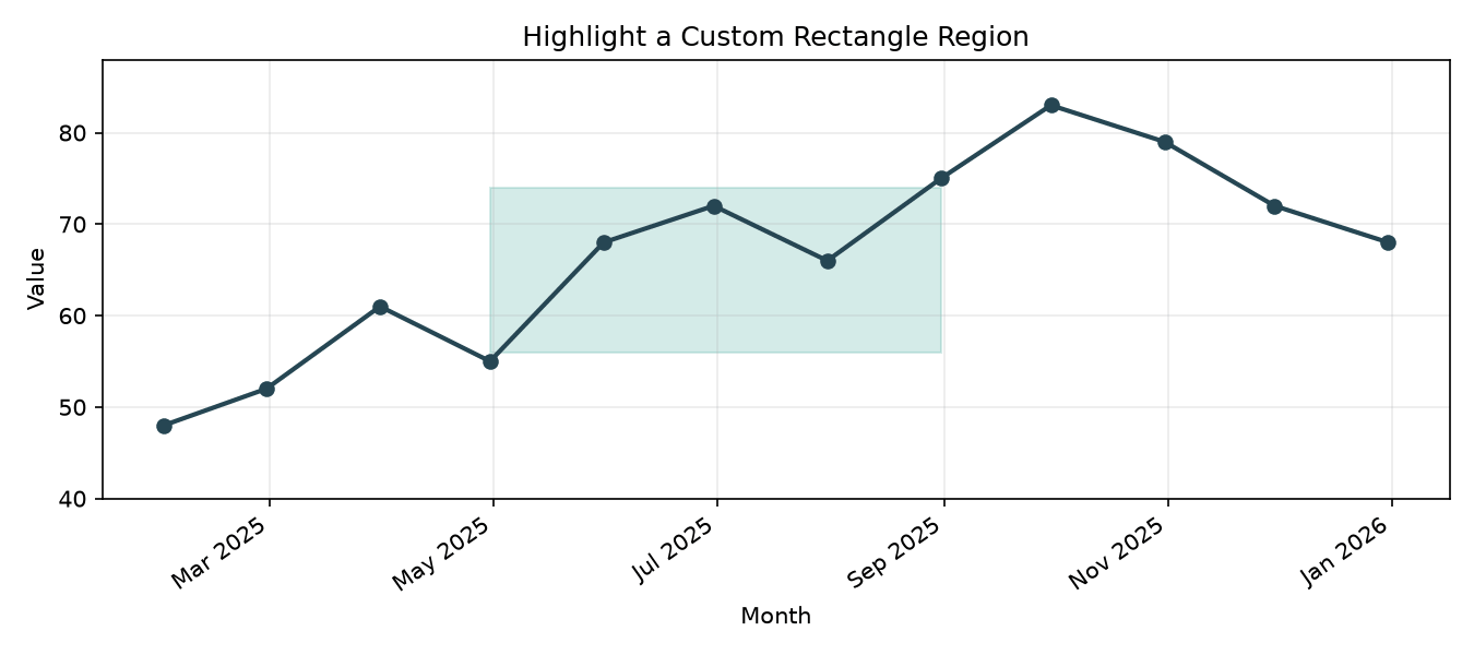
axvspan and axhspan are ideal for quick high-level highlights, while Rectangle gives you precise control over both x and y bounds.
Styling and layering tips
zordercontrols whether the span appears in front of or behind lines: higher values appear on top.- Use
alpha=0.1–0.3for non-distracting highlights. - Match spans to line colors for a coherent visual theme.
- Use
edgecolor='none'orlinewidth=0for a cleaner filled region.
Wrap-up
For timeline-driven visuals, axvspan makes it easy to show dates that matter. For thresholds and bands, axhspan keeps the emphasis horizontal and readable. If you need a more specific box, patches.Rectangle gives you the same idea with exact bounds.