
TL;DR
ax.plot(x, y, color='#2A9D8F', lw=2)
ax.fill_between(x, y, alpha=0.25, color='#2A9D8F')
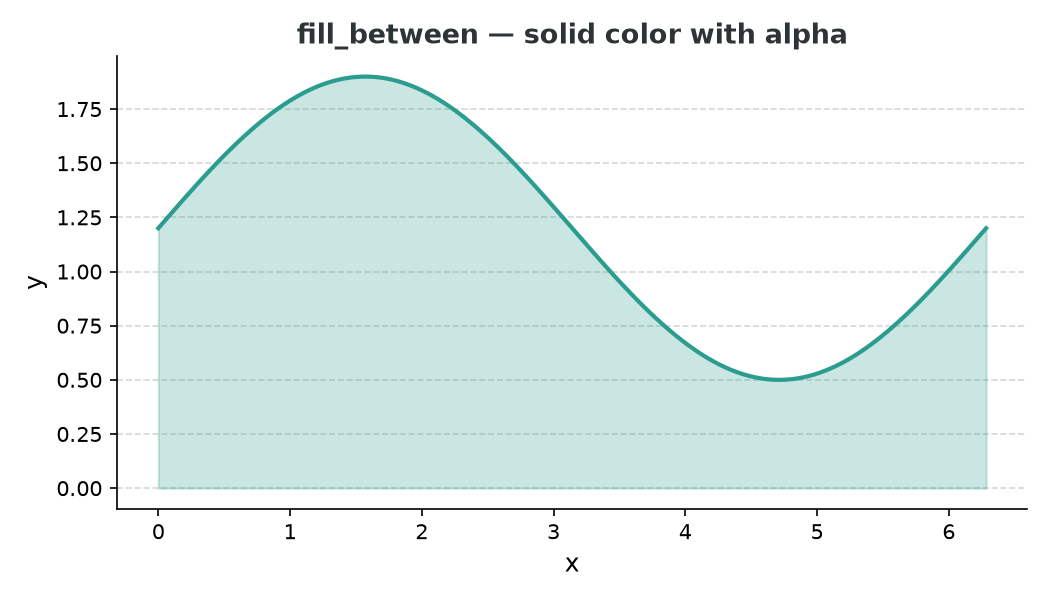
fill_between — the quick option
ax.fill_between(x, y1, y2=0) fills the region between your line and a baseline (zero by default). It is the fastest way to add a shaded area.
import matplotlib.pyplot as plt
import numpy as np

x = np.linspace(0, 2 * np.pi, 300)
y = np.sin(x) * 0.7 + 1.2

fig, ax = plt.subplots(figsize=(7, 4))
ax.plot(x, y, color='#2A9D8F', lw=2)
ax.fill_between(x, y, alpha=0.25, color='#2A9D8F')
plt.show()
The alpha argument controls how transparent the fill is. Values around 0.2–0.35 look natural for most chart styles.
True vertical gradient with imshow + clip path
fill_between produces a flat, uniform colour. For a gradient that fades from opaque at the line to transparent at the baseline, use imshow clipped to the area under the curve.
import matplotlib.pyplot as plt
import matplotlib.colors as mcolors
from matplotlib.colors import LinearSegmentedColormap
from matplotlib.patches import Polygon
import numpy as np

x = np.linspace(0, 2 * np.pi, 300)
y = np.sin(x) * 0.7 + 1.2

fig, ax = plt.subplots(figsize=(7, 4))
ax.plot(x, y, color='#264653', lw=2.5, zorder=3)

# Gradient: transparent at bottom, teal at top
cmap_fill = LinearSegmentedColormap.from_list(
    'fill_grad',
    [(0, mcolors.to_rgba('#2A9D8F', alpha=0)),
     (1, mcolors.to_rgba('#2A9D8F', alpha=0.75))],
)

gradient = np.linspace(0, 1, 256).reshape(-1, 1)
im = ax.imshow(
    gradient,
    extent=[x.min(), x.max(), 0, y.max()],
    aspect='auto',
    origin='lower',
    cmap=cmap_fill,
    zorder=2,
)

# Clip the image to the polygon formed by the line and baseline
verts = list(zip(x, y)) + [(x[-1], 0), (x[0], 0)]
clip_path = Polygon(verts, closed=True, transform=ax.transData)
im.set_clip_path(clip_path)

ax.set_xlim(x.min(), x.max())
ax.set_ylim(0, y.max() * 1.15)
plt.tight_layout()
plt.show()
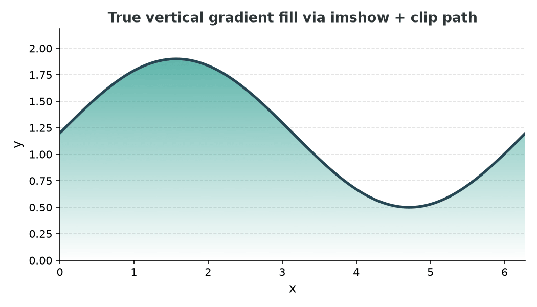
How it works:
- A
256 × 1gradient array maps 0 → transparent to 1 → opaque teal. imshowrenders that gradient over the full axes area.- A
Polygontraced along the line and back to baseline is used as a clip path, so only the area under the curve is visible.
Shading between two lines with a condition
fill_between accepts a where argument to shade only where a condition is true — useful for showing which of two series is higher:
y2 = np.cos(x) * 0.5 + 1.2

ax.plot(x, y,  color='#2A9D8F', lw=2, label='Upper')
ax.plot(x, y2, color='#E76F51', lw=2, label='Lower')

ax.fill_between(x, y, y2, where=(y >= y2), alpha=0.25, color='#2A9D8F', label='Upper > Lower')
ax.fill_between(x, y, y2, where=(y <  y2), alpha=0.25, color='#E76F51', label='Lower > Upper')

ax.legend()
plt.show()
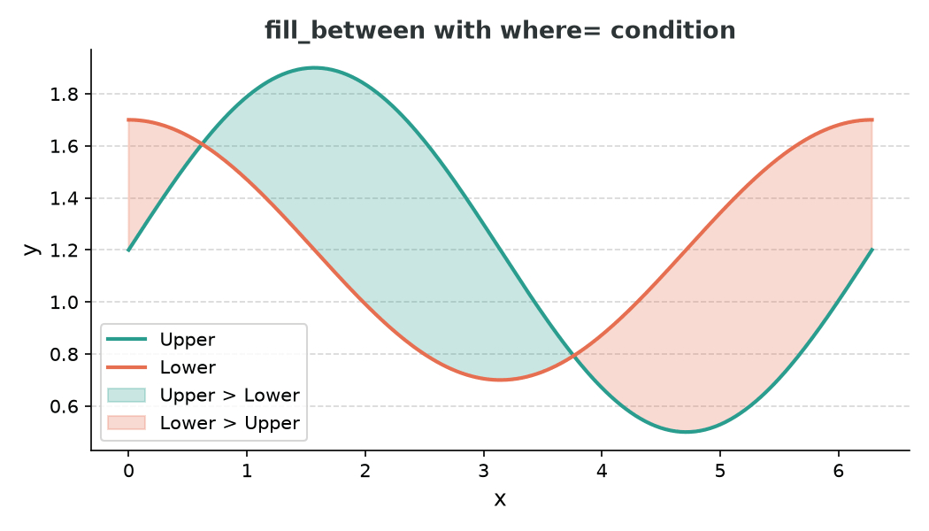
Interpolating the crossing point
By default, fill_between uses the raw data points, which can leave a small unshaded gap right where the lines cross. Pass interpolate=True to fix that:
ax.fill_between(x, y, y2, where=(y >= y2), alpha=0.25,
                color='#2A9D8F', interpolate=True)