
Seaborn
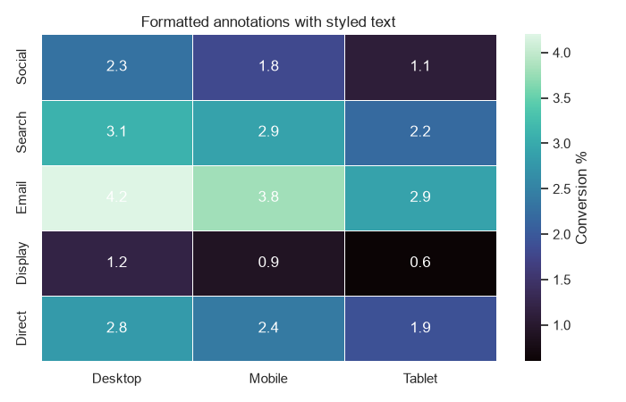
How to Style Seaborn Heatmaps (Annotate Values, Masking)
Style Seaborn heatmaps by annotating values, formatting labels, and masking cells you want to hide.
Style Seaborn heatmaps by annotating values, formatting labels, and masking cells you want to hide.
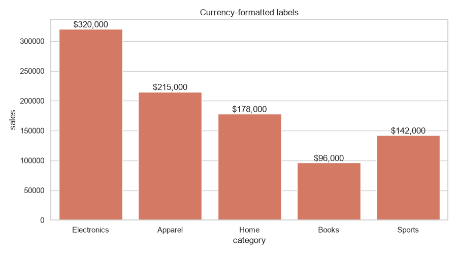
Add data values on top of Seaborn bar plots with ax.bar_label and custom formatting.
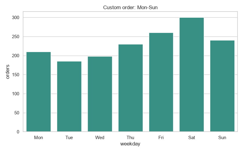
Control the x-axis category order in Seaborn with order=, CategoricalDtype, and hue_order.
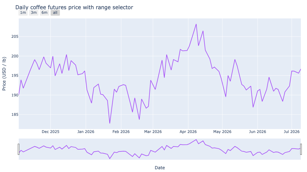
Add range sliders and selector buttons to a time series in Plotly to make long histories scrubbable.
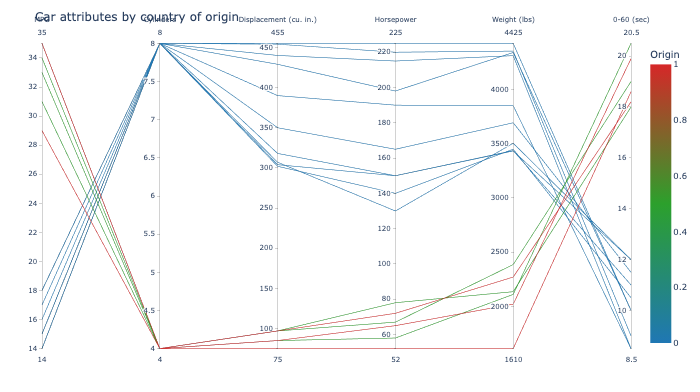
Build parallel coordinates plots in Plotly to compare many numeric variables at once.
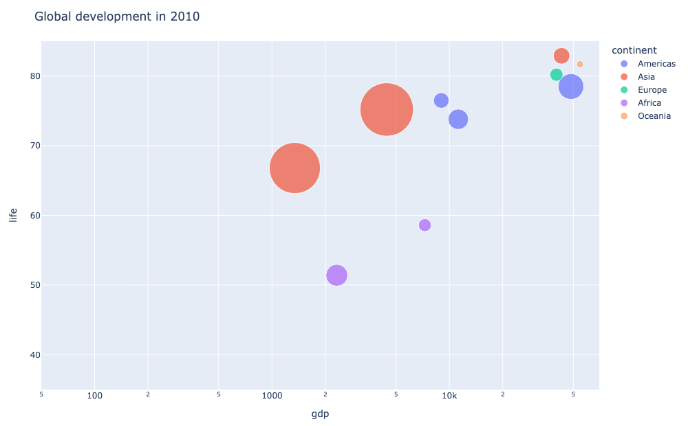
Build animated bubble charts over time in Plotly with px.scatter and animation_frame.
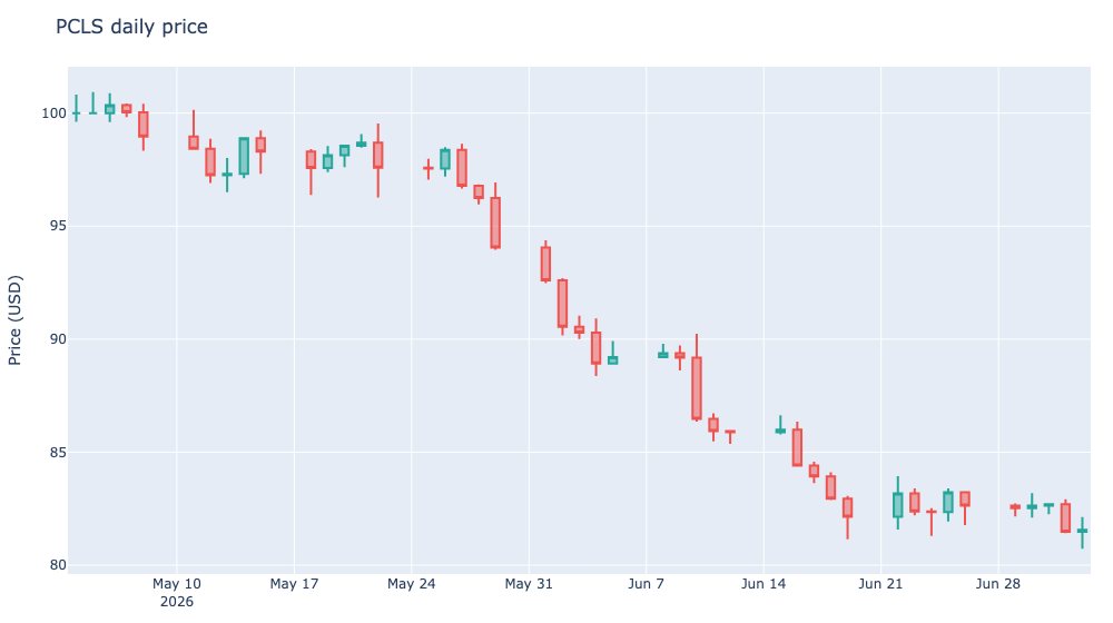
Build interactive candlestick charts in Plotly with go.Candlestick to visualize OHLC price data.
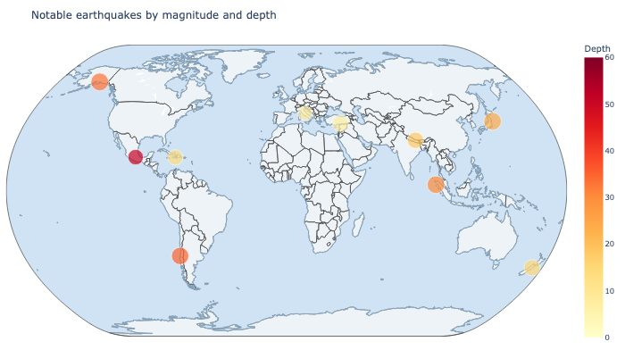
Plot geospatial maps in Plotly with scatter_geo and choropleth, no Mapbox token required.
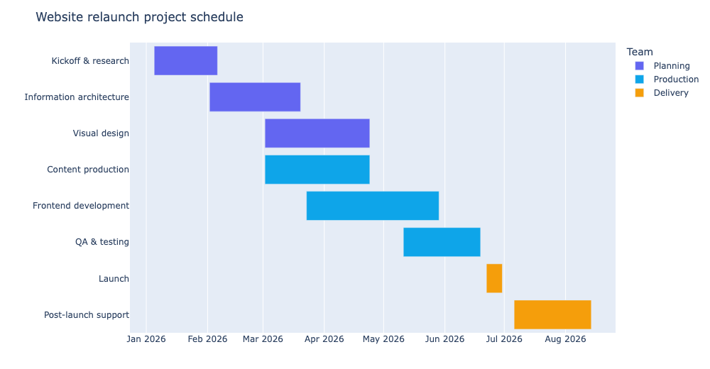
Build Gantt / timeline charts in Plotly with px.timeline to visualize project schedules.
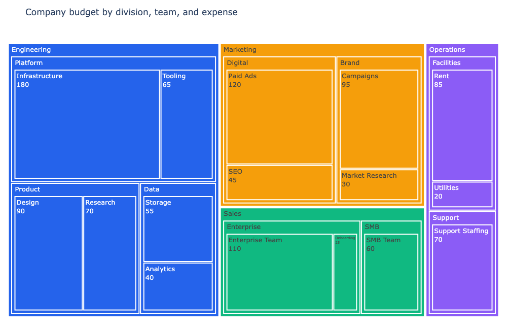
Build a treemap in Plotly and color each level of the hierarchy with its own palette.
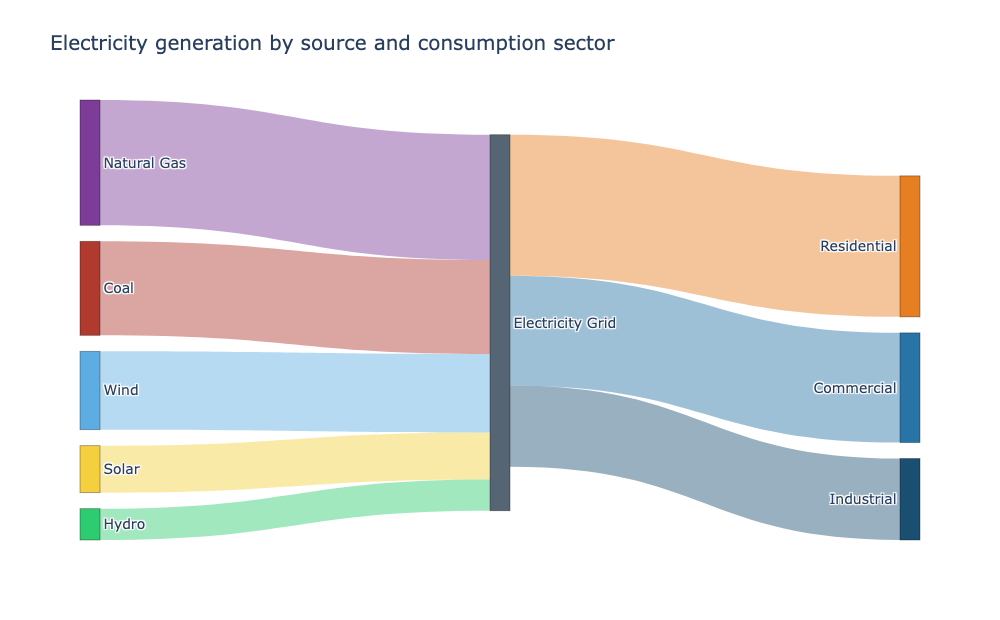
Build interactive Sankey diagrams in Plotly to trace flows between nodes.
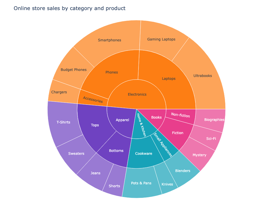
Build interactive sunburst charts in Plotly to show hierarchical data as nested rings.
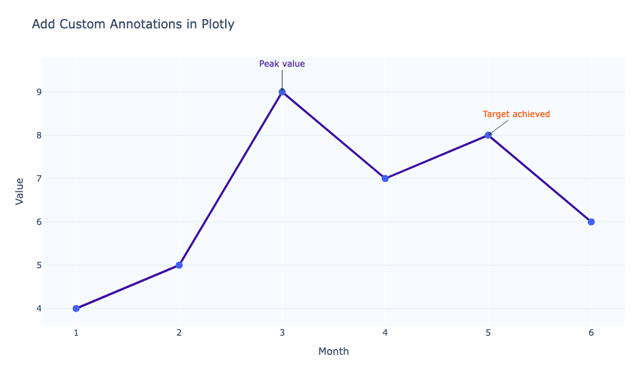
Add custom annotations to Plotly charts to label points, highlight ranges, and explain insights.
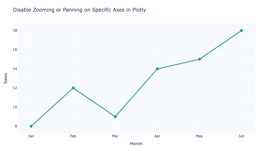
Disable zooming or panning on individual Plotly axes using fixedrange, dragmode, and axis settings.
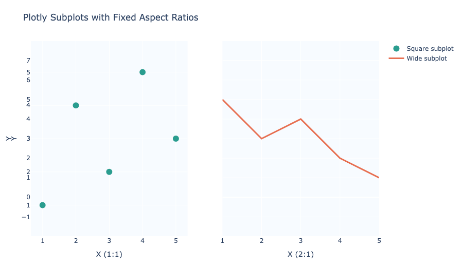
Keep Plotly subplot axes proportional by fixing aspect ratios with scaleanchor and scaleratio.
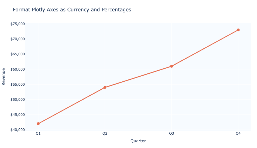
Format Plotly axis labels as percentages or currency using tickformat, tickprefix, and ticksuffix.
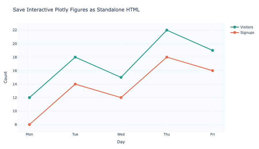
Save Plotly figures as standalone HTML files for interactive sharing and offline viewing.
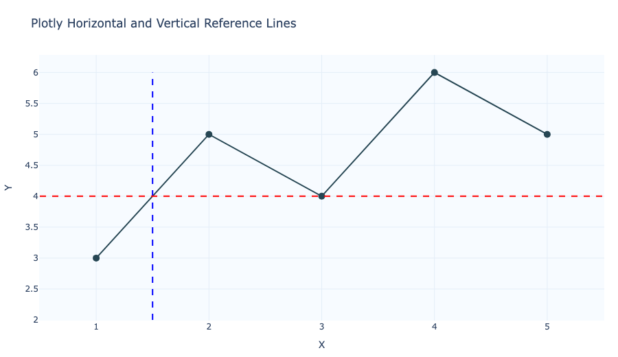
Add horizontal and vertical reference lines to Plotly charts with add_hline, add_vline, or layout.shapes.
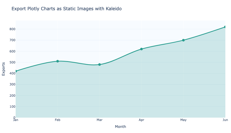
Export Plotly charts to static PNG, JPEG, SVG, or PDF files using Kaleido.
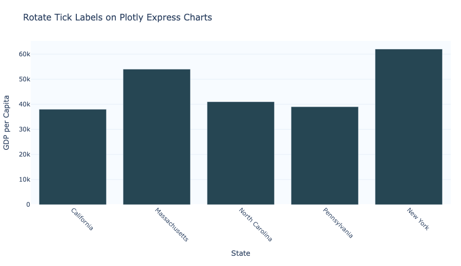
Rotate tick labels in Plotly Express charts to keep axis values readable and avoid overlap.