How to Add Custom Annotations in Plotly
Add custom annotations to Plotly charts to label points, highlight ranges, and explain insights.
Disable zooming or panning on individual Plotly axes using fixedrange, dragmode, and axis settings.
Keep Plotly subplot axes proportional by fixing aspect ratios with scaleanchor and scaleratio.
Format Plotly axis labels as percentages or currency using tickformat, tickprefix, and ticksuffix.
Save Plotly figures as standalone HTML files for interactive sharing and offline viewing.
Add horizontal and vertical reference lines to Plotly charts with add_hline, add_vline, or layout.shapes.
Export Plotly charts to static PNG, JPEG, SVG, or PDF files using Kaleido.
Rotate tick labels in Plotly Express charts to keep axis values readable and avoid overlap.
Learn how to position Plotly legends using layout.legend and flexible placement options.
Hide Plotly's modebar toolbar using config.displayModeBar or layout.modebar settings.
Change Plotly background colors with plot_bgcolor and paper_bgcolor.
Customize Plotly hover tooltips with hovertemplate for precise formatting.
Highlight a date range or a rectangular area in Matplotlib plots with axvspan and axhspan.
Add shaded areas and true vertical gradient fills under Matplotlib line plots using fill_between and imshow with a clip path.
Create continuous and discrete custom colormaps in Matplotlib from a list of hex colors and apply them to scatter plots and heatmaps.
Color each bar in a Matplotlib bar chart individually — by threshold, colormap gradient, or to highlight a specific value.
Switch the look of any Matplotlib chart in one line with built-in style sheets like ggplot, dark_background, seaborn, and fivethirtyeight.
Export Matplotlib plots as PNGs with a fully or partially transparent background using savefig and patch alpha settings.
How to use hex color codes and custom RGB tuples to give Matplotlib charts a polished, on-brand look.
Use LaTeX math notation in Matplotlib titles, axis labels, legends, and annotations with raw strings and mathtext.
Quick guide to styling the main title, subtitle, and footnote of a Matplotlib figure.
Step-by-step guide to drawing straight and curved callout arrows using plt.annotate in Matplotlib.
Quick guide on adding descriptive text labels and callout annotations to data points in Matplotlib.
Quick guide on formatting a Matplotlib legend into multiple columns using the ncol parameter.
Learn how to reorder legend items and overwrite label names in Matplotlib without modifying the source data.
Quick guide to changing the legend title text, title font size, and item font size in Matplotlib.
Learn how to position your Matplotlib legend outside of the chart area using bbox_to_anchor.
Quick tutorial on formatting date axis labels in Matplotlib using mdates.DateFormatter and MonthLocator.
Clear tutorial on removing the outer border (spines) from a Matplotlib chart for a clean, modern aesthetic.
Quick guide to changing the size, weight, color, and font style of tick labels in Matplotlib.
Learn how to use ax.twinx() to plot two datasets with different scales on a shared X-axis.
Reverse the direction of Matplotlib x-axes and y-axes.
Automatically adjust Matplotlib subplot spacing and margins with tight_layout.
Move Matplotlib x-axis and y-axis spines to the center of a chart.
Use logarithmic scales on Matplotlib x-axes and y-axes.
Format Matplotlib axis tick labels as currency or percentages.
Hide axis ticks, tick labels, axis labels, or an entire Matplotlib axis.
Set x-axis and y-axis limits in Matplotlib with xlim, ylim, set_xlim, and set_ylim.
Create and customize heatmaps directly in Matplotlib with imshow() and pcolormesh().
Build clear Seaborn heatmaps, from a simple matrix to annotated correlation charts.
Setting plot titles and subtitles in Matplotlib
Setting colors, color cycles, and colormaps in Matplotlib
How to use subplots in Matplotlib to create multiple plots in a single figure
Annotating a Matplotlib chart with horizontal and vertical lines
Adding a legend to a plot in Matplotlib and customizing the look and placement of it
A quick tutorial of how to create waterfall charts in python, using Matplotlib and Plotly.
Using Matplotlib, Seaborn, Altair and Plotly to create a line chart with a confidence interval
Learn how to customize and show the grid in Matplotlib charts
Plotting stacked bar charts with labels in Matplotlib
A complete guide to creating stacked bar charts in python using Pandas, Matplotlib, Seaborn, Plotnine and Altair
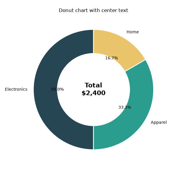
Creating pie charts with labels, custom styles and custom colors in Matplotlib
How to change the figure and plot size in Matplotlib
A look at all the ways you can rotate axis labels in Matplotlib
A short tutorial on creating and customizing violin plots in Seaborn
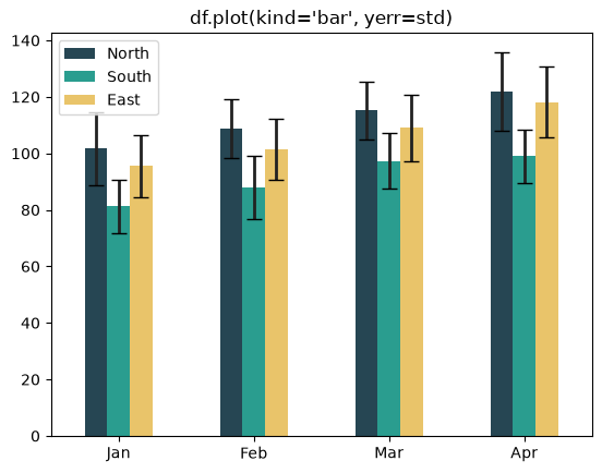
A few examples of how to create grouped bar charts (with labels) in Matplotlib
Transforming the default Matplotlib bar chart into a simple, stylish visualization
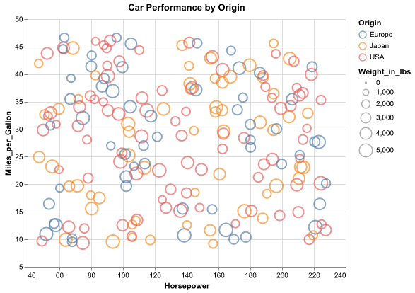
A brief introduction to the Altair Python visualization library