
If you already know ggplot2, the default Plotnine theme can feel a little different. The syntax is familiar, but the styling is not quite the same out of the box. That is usually easy to fix with a custom theme.
The goal here is not to fight the grammar of graphics. It is to make your Plotnine chart look like a native ggplot2 chart without changing the underlying data or geometry.
Quick Example
from plotnine import (
    aes,
    geom_point,
    geom_smooth,
    ggplot,
    labs,
    theme,
    element_line,
    element_rect,
    element_text,
)

from plotnine.data import mtcars

plot = (
    ggplot(mtcars, aes('wt', 'mpg', color='factor(cyl)'))
    + geom_point(size=3, alpha=0.8)
    + geom_smooth(method='lm', se=False, size=0.8)
    + labs(
        title='Miles per gallon vs. weight',
        x='Weight',
        y='MPG',
        color='Cylinders',
    )
    + theme(
        plot_title=element_text(size=14, weight='bold'),
        axis_title=element_text(size=11),
        axis_text=element_text(size=10, color='#333333'),
        panel_background=element_rect(fill='white', color='white'),
        plot_background=element_rect(fill='white', color='white'),
        panel_grid_major=element_line(color='#d9d9d9', size=0.7),
        panel_grid_minor=element_line(color='#ececec', size=0.5),
        axis_line=element_line(color='#333333', size=0.8),
        legend_background=element_rect(fill='white', color='white'),
        legend_key=element_rect(fill='white', color='white'),
        strip_background=element_rect(fill='white', color='white'),
        text=element_text(color='#333333'),
    )
)

plot.save('custom-theme-plotnine-ggplot2.png', dpi=200)
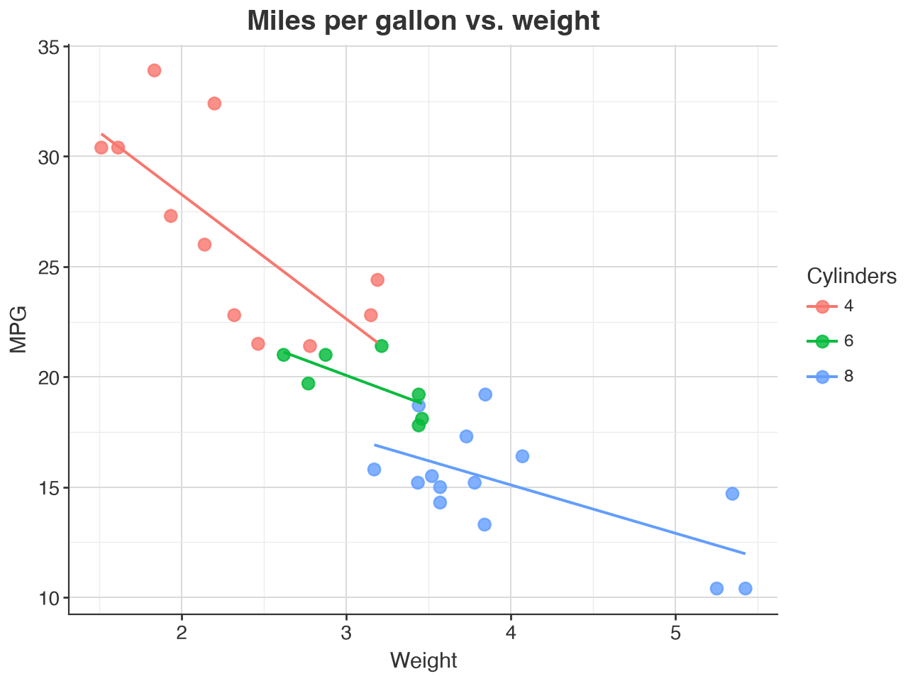
This is the sort of styling recipe I use when I want a Plotnine chart to feel immediately familiar to someone coming from ggplot2 in R.
What is different in the default theme?
The main differences are usually small but noticeable:
- gridlines are heavier or lighter than expected
- the panel background is not the same gray as
ggplot2 - axis and label colors may be too dark or too light
- legends and strips can look more stylized than the base
ggplot2theme
The closest visual match to the default ggplot2 look is a white panel with subtle gray grid lines and darker axis lines. That is the combination I usually aim for.
Building the custom theme step by step
A good Plotnine theme is just a set of element_* objects applied to the plot. The key objects here are element_rect(), element_line(), and element_text().
from plotnine import theme, element_rect, element_line, element_text

custom_theme = theme(
    plot_background=element_rect(fill='white', color='white'),
    panel_background=element_rect(fill='white', color='white'),
    panel_grid_major=element_line(color='#d9d9d9', size=0.7),
    panel_grid_minor=element_line(color='#eeeeee', size=0.5),
    axis_line=element_line(color='#333333', size=0.8),
    axis_title=element_text(color='#333333', size=11),
    axis_text=element_text(color='#333333', size=10),
    legend_background=element_rect(fill='white', color='white'),
    legend_key=element_rect(fill='white', color='white'),
    text=element_text(color='#333333'),
)
The nice thing about this approach is that it stays compact. You can drop the theme into any Plotnine plot, and it will keep the same look across scatter, line, and bar charts.
Matching ggplot2 more closely
If you want to push the visual match a little further, you can also tune the title and strip styling:
from plotnine import theme, element_text, element_rect, element_line

custom_theme = theme(
    plot_title=element_text(size=14, weight='bold', color='#333333'),
    axis_title=element_text(size=11, color='#333333'),
    axis_text=element_text(size=10, color='#333333'),
    panel_grid_major=element_line(color='#d9d9d9', size=0.7),
    panel_grid_minor=element_line(color='#f0f0f0', size=0.4),
    strip_background=element_rect(fill='white', color='white'),
    legend_title=element_text(size=10, color='#333333'),
    legend_text=element_text(size=9, color='#333333'),
    panel_border=element_rect(color='white', fill='white'),
    axis_line_x=element_line(color='#333333', size=0.8),
    axis_line_y=element_line(color='#333333', size=0.8),
)
This is especially helpful if your plots are meant to look like they came straight from an R notebook or a polished analytical report.
Reusing the same theme
The cleanest pattern is to define a theme once and then reuse it across multiple charts:
from plotnine import ggplot, aes, geom_line, labs

GGPLOT2_STYLE = theme(
    plot_background=element_rect(fill='white', color='white'),
    panel_background=element_rect(fill='white', color='white'),
    panel_grid_major=element_line(color='#d9d9d9', size=0.7),
    axis_line=element_line(color='#333333', size=0.8),
    axis_title=element_text(size=11),
    axis_text=element_text(size=10),
    legend_background=element_rect(fill='white', color='white'),
)

(
    ggplot(data, aes('x', 'y'))
    + geom_line()
    + labs(x='X axis', y='Y axis')
    + GGPLOT2_STYLE
)
This keeps your code readable and makes it easy to apply a consistent look across a notebook or a dashboard.
Practical tips
- Start with a white panel and gray gridlines before changing anything else.
- Use a dark gray or black axis line for a more native
ggplot2feel. - Keep the grid lines subtle; heavy grid lines can make the plot look busy.
- If the whole theme feels too dark, lower the contrast on the text and grid colors rather than changing the whole chart structure.