Many data scientists, analysts and visualization gurus start their careers (or academic work) using the R language and statistical framework. And the large majority of those people, this author included, become intimately familiar with R's most popular visualization library: ggplot2. The syntax of most Python visualization libraries is pretty different from ggplot2, so to make the transition easier, there have been a few attempts at recreating ggplot2 in Python.
The most recent of those efforts is plotnine [documentation, github], a library that describes itself as A grammar of graphics for Python (also known as: a clone of ggplot2).
A Basic Chart
Even though usually frowned upon due to polluting the global namespace, the common way to import the library so you can use it as you would in R is via from plotnine import *. If you're using Google Colaboratory environment, as of this post, plotnine is not included so you'll have to download it using the command !pip install plotnine.
# Load plotnine.
from plotnine import *

# Import vega datasets and load iris dataset.
from vega_datasets import data

df = data.iris()

# Create a simple scatter plot.
# Note, the parens wrapping the statement allow you to use `+` at the end of the line
# without escaping with a backslash.
(ggplot(df, aes('petalWidth', 'petalLength')) +
  geom_point())
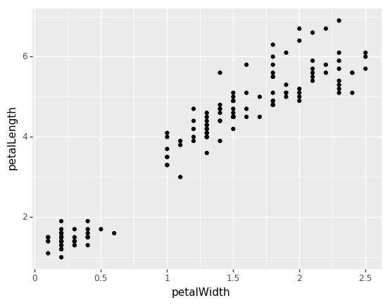
Let's break that down quickly:
- Use
ggplot()to create the base figure. ggplot()takes your data as its first argument and the "aesthetic mapping" as the second; basically, how you want to map your data to the figure and axes.aes()defines your mapping, the first argument being thexand the second they. You can also explicitly map, e.g. `aes(x='petalWidth', y='petalLength')- We add layers to the plot using the plus sign
+; the main layer here being the points we want to add for each x, y pair. We usegeom_point()to do that.
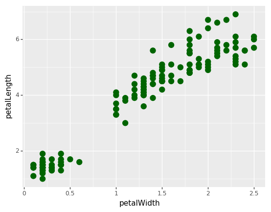
Simple Style Changes
Style changes are easy and intuitive in Plotnine. For the marks themselves, just add arguments to the geom_<type>() function.
(ggplot(df, aes('petalWidth', 'petalLength')) +
  geom_point(color='darkgreen', size=4)
)
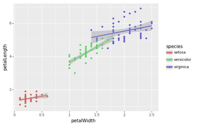
Adding More Dimensions to the Aesthetic
What about adding another dimension to the chart, e.g. the species of the flower? Again, it's very simple and pretty intuitive: we just add another mapping to the aesthetic (aes()). For example, aes(..., color='species') to map different colors to the species column of the dataset.
Just to see how powerful the grammar of graphics is, let's add trendlines with confidence bands as well via adding on stat_smooth(method='lm').
(ggplot(df, aes('petalWidth', 'petalLength', color='species')) +
  geom_point() +
  stat_smooth(method='lm')
)
This library is immensely powerful with an intuitive and consistent API. There are many more things to show which we'll follow up with in future posts. Hope that gives you a basic feel for plotnine.