
A plain scatter() call draws one marker per point, which works fine at a few thousand points and falls apart well before a million: points stack on top of each other, dense regions turn into solid blobs with no internal structure, and the render itself gets slow. Datashader takes a completely different approach: it bins every point into a fixed-resolution grid first, then converts that grid straight into an image. The pipeline's speed comes from that reordering, aggregating millions of points into a few hundred thousand pixels is fast, where drawing millions of individual markers is not.
The problem: overplotting
Before the fix, it's worth seeing what breaks. Even a fraction of a 2-million-point dataset overwhelms a normal scatter plot.
import matplotlib.pyplot as plt

fig, ax = plt.subplots()
ax.scatter(df["x"], df["y"], s=3, alpha=0.3)
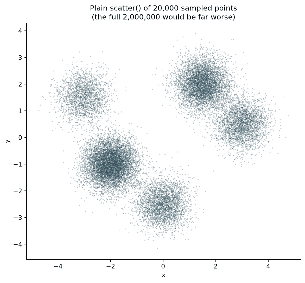
Even at a fraction of the full dataset, the densest clusters are already just solid patches; whatever internal structure they have (a concentrated core versus a spread-out edge) is invisible, since every marker on top of another one adds nothing but a slightly darker overlap.
Quick Example
Datashader's core pipeline is three calls: a Canvas to define the output resolution, .points() to aggregate the data onto that grid, and tf.shade() to turn the aggregated grid into a color image.
import datashader as ds
import datashader.transfer_functions as tf

canvas = ds.Canvas(plot_width=800, plot_height=800)
agg = canvas.points(df, "x", "y")
img = tf.shade(agg, cmap=["black", "yellow", "white"], how="log")
tf.set_background(img, "black")
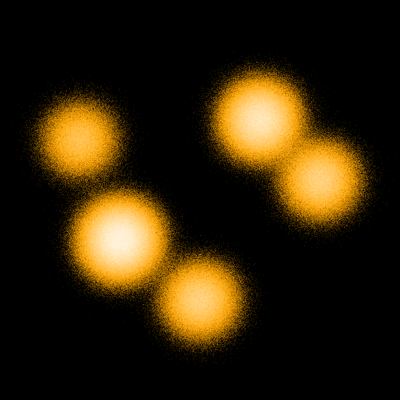
This is the full 2 million points, not a sample, rendered in roughly the time a scatter plot of a few thousand points would take. Canvas never touches individual markers; .points() bins every row into whichever pixel it falls into and counts how many landed there, and tf.shade() maps those counts to color. The result is closer to a heatmap than a scatter plot, which is exactly the point: density is what actually survives at this scale.
Linear vs. log color scaling
How those per-pixel counts map to color matters as much as the binning itself. tf.shade()'s how argument controls that mapping, and the default matters more than it looks like it should.
tf.shade(agg, cmap=["black", "yellow", "white"], how="linear")
tf.shade(agg, cmap=["black", "yellow", "white"], how="log")  # default
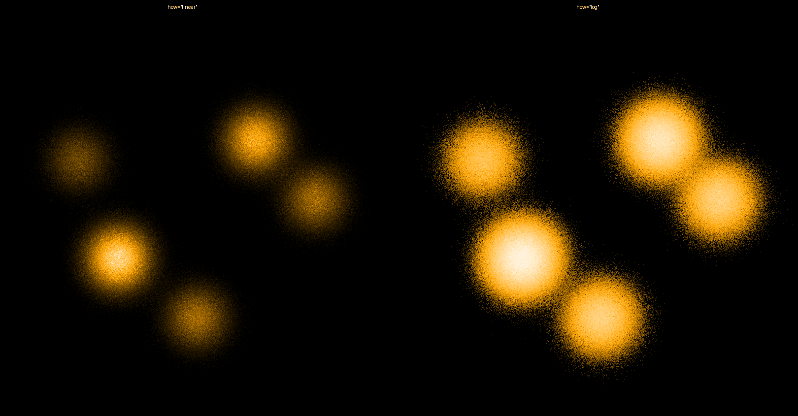
With "linear", a handful of very dense pixels stretch the color range so far that everything else compresses into near-black, which is exactly the same washing-out problem overplotting causes, just moved into the color mapping instead of the marker layout. "log" compresses that range logarithmically, so the faint outer edges of every cluster stay visible without blowing out the bright centers. Datashader's actual default is "eq_hist" (histogram equalization), which goes a step further than log scaling and is usually the best starting point; reach for "log" or "linear" deliberately once you understand what "eq_hist" is doing.
Coloring by category
Aggregating with ds.count_cat() instead of the default count keeps a categorical column's identity through the pipeline, so each pixel can be colored by whichever category is most common there rather than by a single count.
agg = canvas.points(df, "x", "y", ds.count_cat("cluster"))

color_key = {
    "Cluster A": "#e41a1c", "Cluster B": "#377eb8",
    "Cluster C": "#4daf4a", "Cluster D": "#ff7f00",
}
img = tf.shade(agg, color_key=color_key)
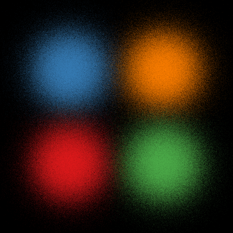
count_cat produces a 3D aggregate (x, y, and category) instead of a flat 2D grid, and color_key maps each category value to a specific color the same way a palette dict would in Seaborn. Where two categories' points overlap in the same pixel, Datashader blends their colors proportionally rather than just picking one, which is visible as the softer, mixed-color edges where clusters touch.
Practical Tips
- Datashader renders a fixed-resolution image, not a vector plot;
plot_width/plot_heightonCanvasset that resolution directly, and it's worth matching to the actual pixel size the image will be displayed at. - Default to
how="eq_hist"(Datashader's own default) unless there's a specific reason to reach for"log"or"linear"; it generally reveals structure across the widest range of datasets without tuning. count_catplus acolor_keydict is the categorical equivalent ofhuein Seaborn; use it whenever a category, not just density, is part of the story.- The output of
tf.shade()is a plain image (img.to_pil()converts it to a standard PIL image), so it composites fine with Matplotlib (ax.imshow(img.to_pil())) for adding axis labels, titles, or overlays Datashader doesn't draw itself. - Datashader integrates with HoloViews and Bokeh for pan-and-zoom interactivity where the image re-renders at the new resolution on every zoom; the plain
Canvas/points/shadepipeline covers the static-image case this post focuses on.